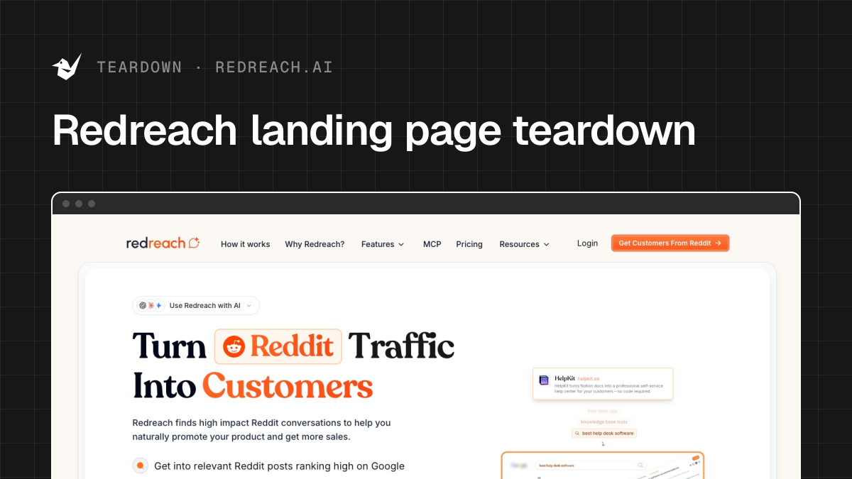
Redreach landing page teardown

Alex · Founder of Magpie AI
Published · 6 min read
A teardown of Redreach (opens in a new tab), as it was on 20th Nov 2026. I publish these to teach, never to knock the makers. Magpie AI isn't installed on their site, so its engine has only worked from public-facing data.
In short
Redreach's page proves its product well. I'd change three things first: a headline about finding buyers, not traffic; a quieter chip so the button gets seen; a search title that doesn't repeat.
Contents
- What Redreach gets right
- The headline promises traffic you don't have yet
- The line under the headline can say where the buyers are
- Call to action
- Where eyes go first
- Big numbers need their working shown
- How the brand comes across
- Three steps that say what goes in
- Features worth naming in the heading
- Lead with the time it saves
- The search title says its name twice
- What I can't judge from outside
What Redreach gets right#
Redreach shows its product doing the job before it asks for anything: a little way down, it lists the kind of Reddit questions it finds for you, each with a relevance score, so "Best email marketing tool for our growing SaaS?" sits on the page as a buying signal you can picture yourself answering. The quote by the button names a person, a company and a figure, the kind of testimonial that works, and a whole section, "The Honest Truth About Reddit Automation", answers the fear of getting banned before anyone has to ask.
- Works
Example Reddit questions show the product at work.
Showing the output beats describing it, so keep them near the top.
- Works
The quote by the button names a person, company and number.
Keep it there. A named figure by the button beats a row of stars.
- Works
A whole section answers the fear of getting banned.
It answers the doubt before a buyer has to raise it.
The headline promises traffic you don't have yet#
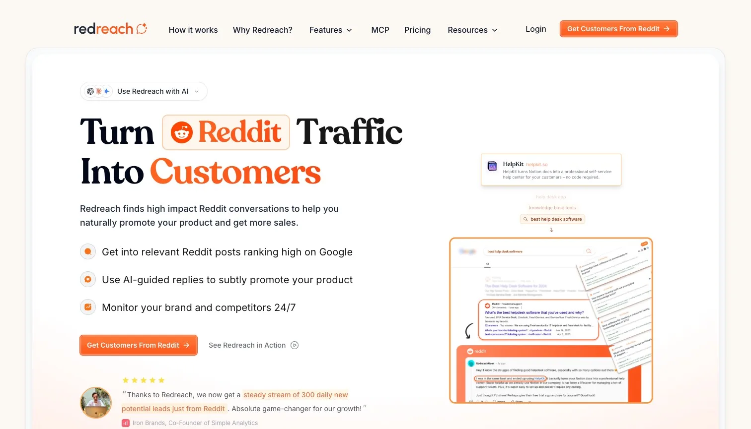
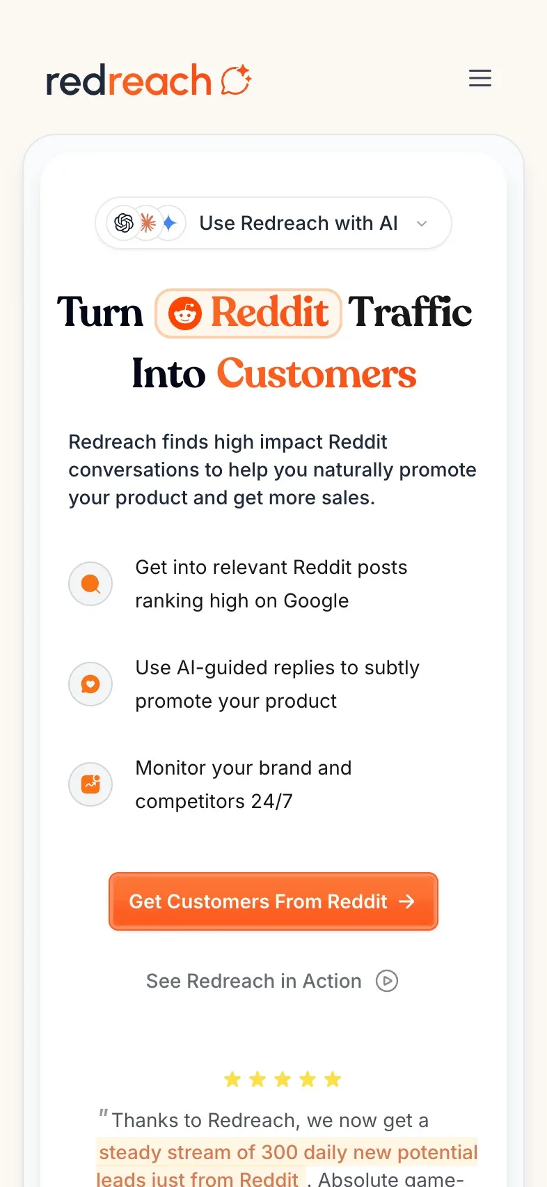
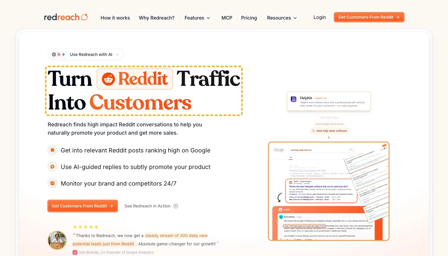
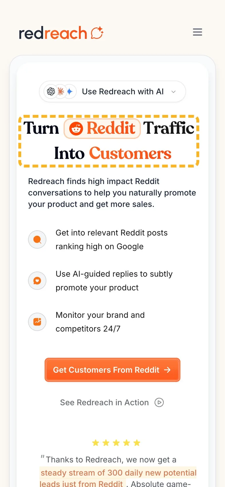
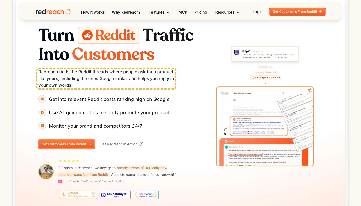
"Turn Reddit Traffic Into Customers" names an outcome, which is the right instinct. The trouble is the starting point it assumes. I think someone shopping for this tool usually has no Reddit traffic to turn yet; that's the problem they came to solve. What Redreach does, by its own account, is find the threads where people are already asking for a product like yours.
So I'd put that in the headline. Jakob Nielsen found people have time for 28% of a page's words at most, and 20% is likelier (Nielsen Norman Group, 2008 (opens in a new tab)). On the first screen, the headline is the line most of them do get to.
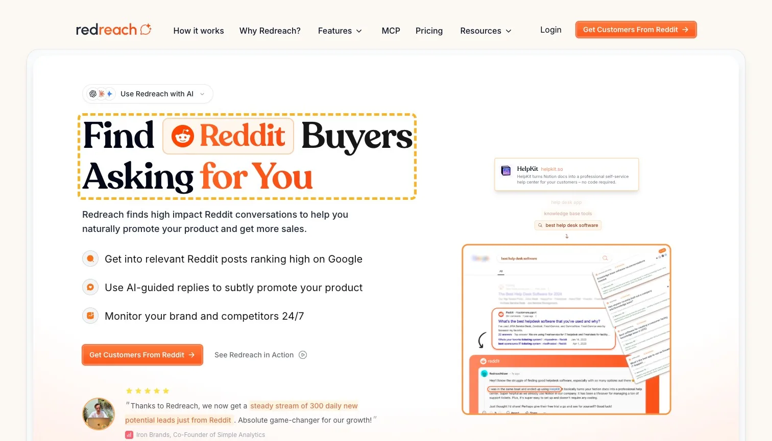
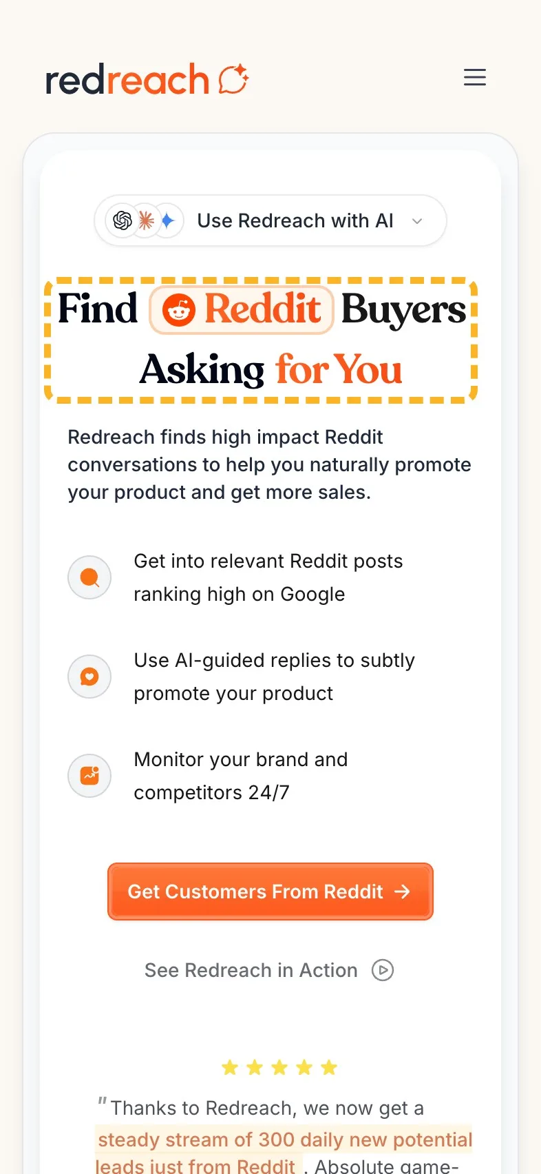
 Current
Turn Reddit Traffic Into Customers
Magpie recommends
Find Reddit Buyers Asking for You
Why it works. It says what the product does on day one, in a buyer's words.
The new words keep the headline's own look, the pill around Reddit and the orange words that end it, so the only change you see is what it says.
The line under the headline can say where the buyers are#
The line under a headline should add what the headline leaves out. Here it says Redreach finds "high impact Reddit conversations", which is close, but high impact is a phrase plenty of pages use. Saying which conversations, and that some of them rank on Google, tells a visitor why this beats searching Reddit themselves.
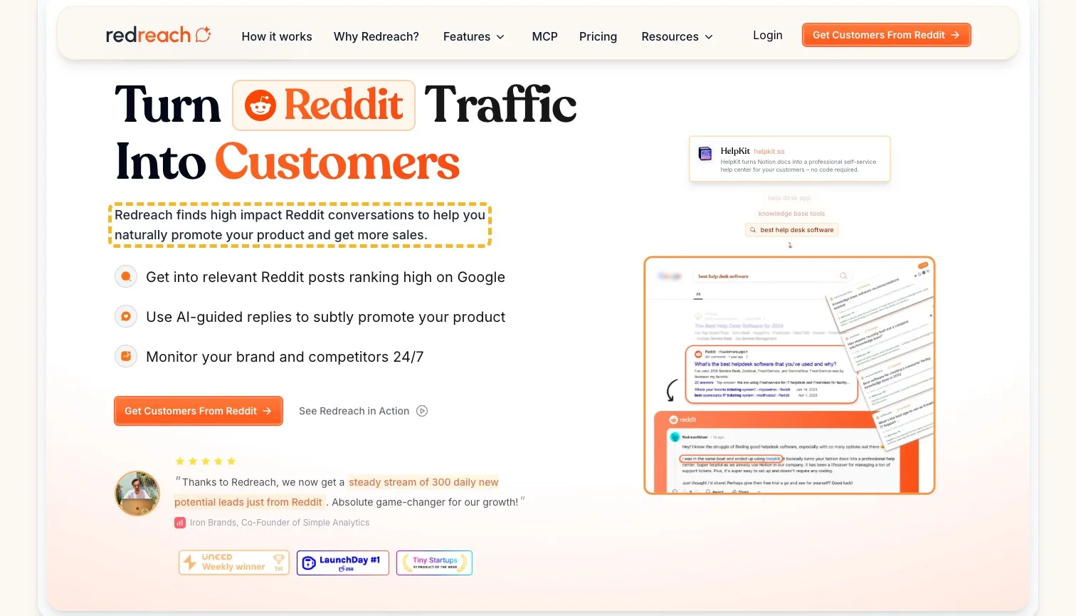
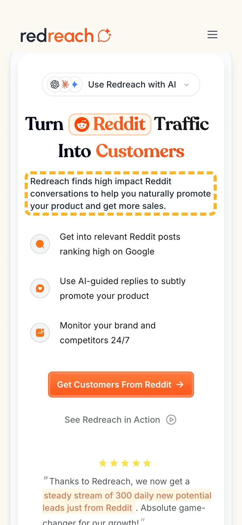
- Current
Redreach finds high impact Reddit conversations to help you naturally promote your product and get more sales.
Magpie recommends
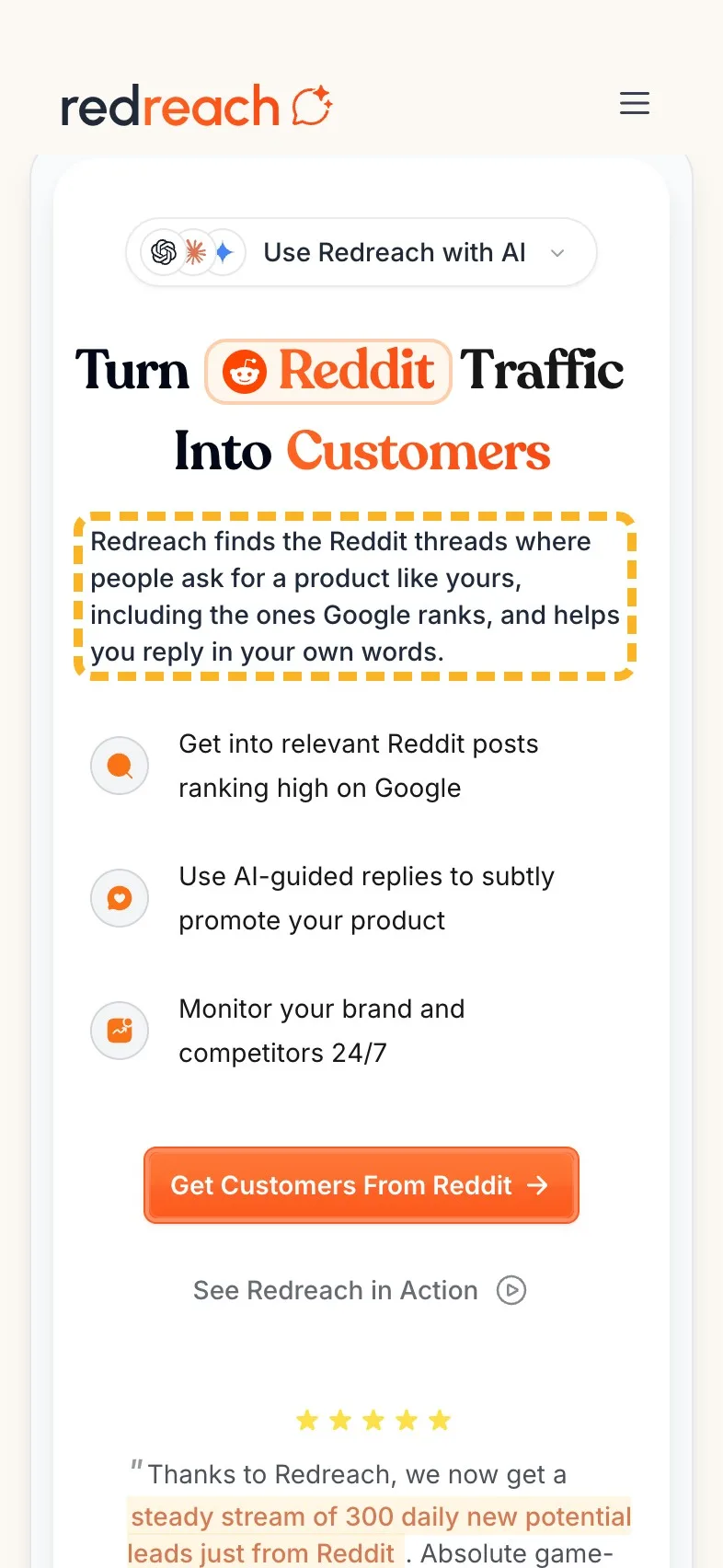
Redreach finds the Reddit threads where people ask for a product like yours, including the ones Google ranks, and helps you reply in your own words.
Why it works. It names the threads worth finding and ends on the worry buyers have.
On a phone the new line runs to four lines where the old one took three, and everything under it moves down a little. That's the cost. I think it's worth paying for a line that does real work.
Call to action#
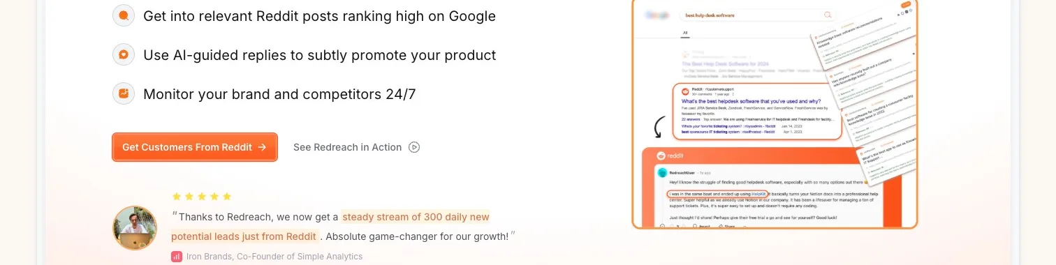
"Get Customers From Reddit" is a good label: it says what the click gets you rather than just asking you to sign up. It's a comfortable size for a thumb, and it repeats down the page. The weak spot is its colour. White words on that bright orange are harder to read than they look, especially outdoors on a phone.
Magpie measured
- 3.1:1 contrast, 4.5:1 needed
- 40px tall on mobile
- Filled, so it reads as the main action
- No second action beside it
- Up to 6 screens between buttons
- Needs work
White on orange measures 3.1:1, under the 4.5:1 text needs.
Darken the orange a shade, just until the label reaches 4.5:1.
- Works
The label names what you get, not just a sign-up.
Words that name the outcome tell a visitor what the click is for.
Where eyes go first#
On a laptop the headline does its job: the strongest attention sits on it. The main button is another story. It's predicted to be seen by about 1 in 10 visitors in their first five seconds, and both the logo and the chip above the headline that reads "Use Redreach with AI" draw more of the eyes than it does.
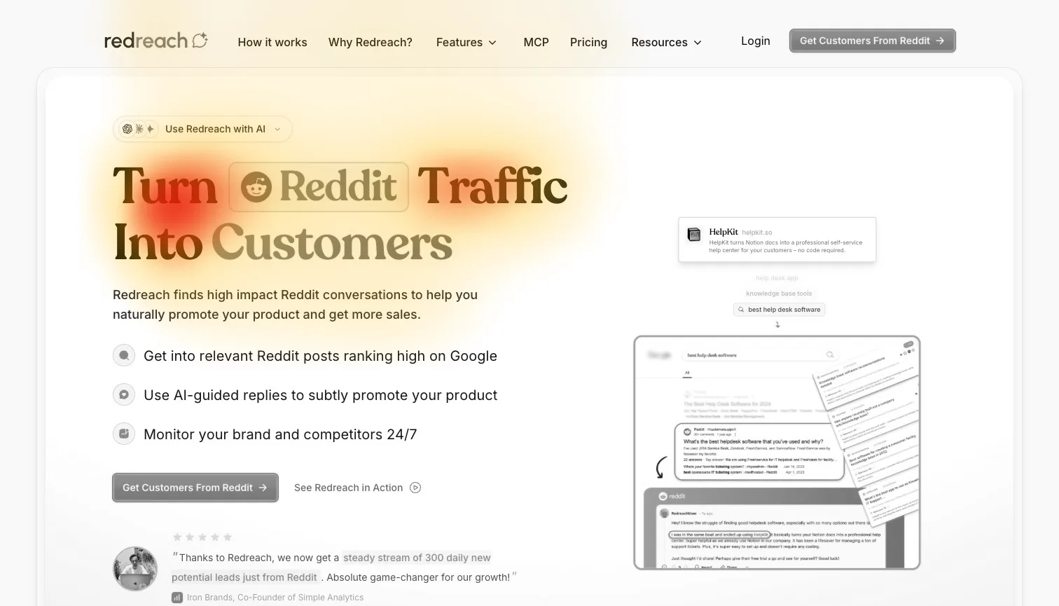
100% of the strongest attention lands on the headline and main button
- Could be better
The chip above the headline draws more eyes than the button.
Move it under the button, or make it smaller and quieter.
- Could be better
About 1 in 10 are predicted to see the button in 5 seconds.
Make it bigger, so less above it competes for the first look.
A magpie is drawn to shiny things, and so are visitors. A chip with three little logos in it is shiny. It's a nice detail, and it is in the button's way. There's more on where visitors look first and why the order things are seen in on a first screen matters.
Big numbers need their working shown#
Further down, a return on investment section claims "10x Lower Customer Acquisition Cost" and "5x Better Lead Quality" with no source for either. To its credit, the worked example above them says "Conservative estimate. You might get different results but you get the idea." That honesty is easy to miss when the bold figures beside it don't carry the same caveat.
- Could be better
The 10x and 5x figures stand alone, with no source.
Say whose results they are, or use the worked example's own numbers.
How the brand comes across#
Most of the page sounds like a team that respects Reddit, and that's its best asset. Two lines pull the other way, and both sit in sections a careful buyer reads closely.
- Builds it
“We believe in AI-guided responses, not fully automated ones with bought bots.”
It takes a clear stand against spam, the worry every buyer here brings.
- Builds it
“The internet doesn't need more spam, right?”
It sounds like a person who cares how Reddit feels about the product.
- Costs it
“AI SEO & Parasite SEO Tool”
Parasite SEO names a spam tactic, the thing the page promises to avoid.
- Costs it
“Secretly sneak into competitors search results”
Secretly and sneak read as underhand beside the page's honest tone.
I'd keep the first two as they are and rewrite the last two, which put off a buyer who fears bans.
Three steps that say what goes in#
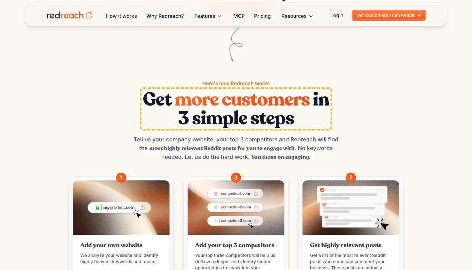
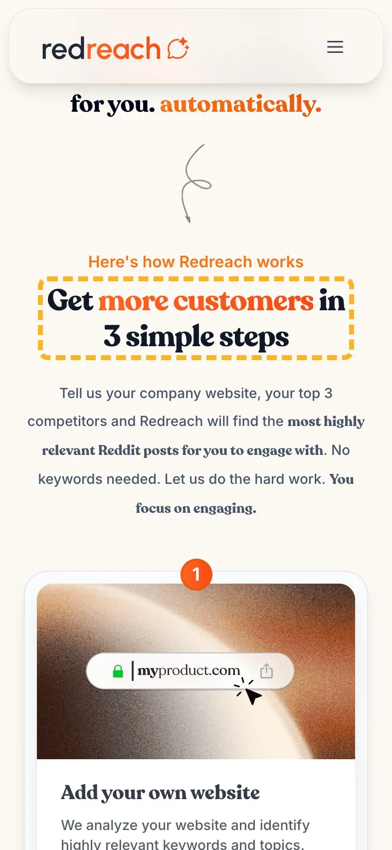
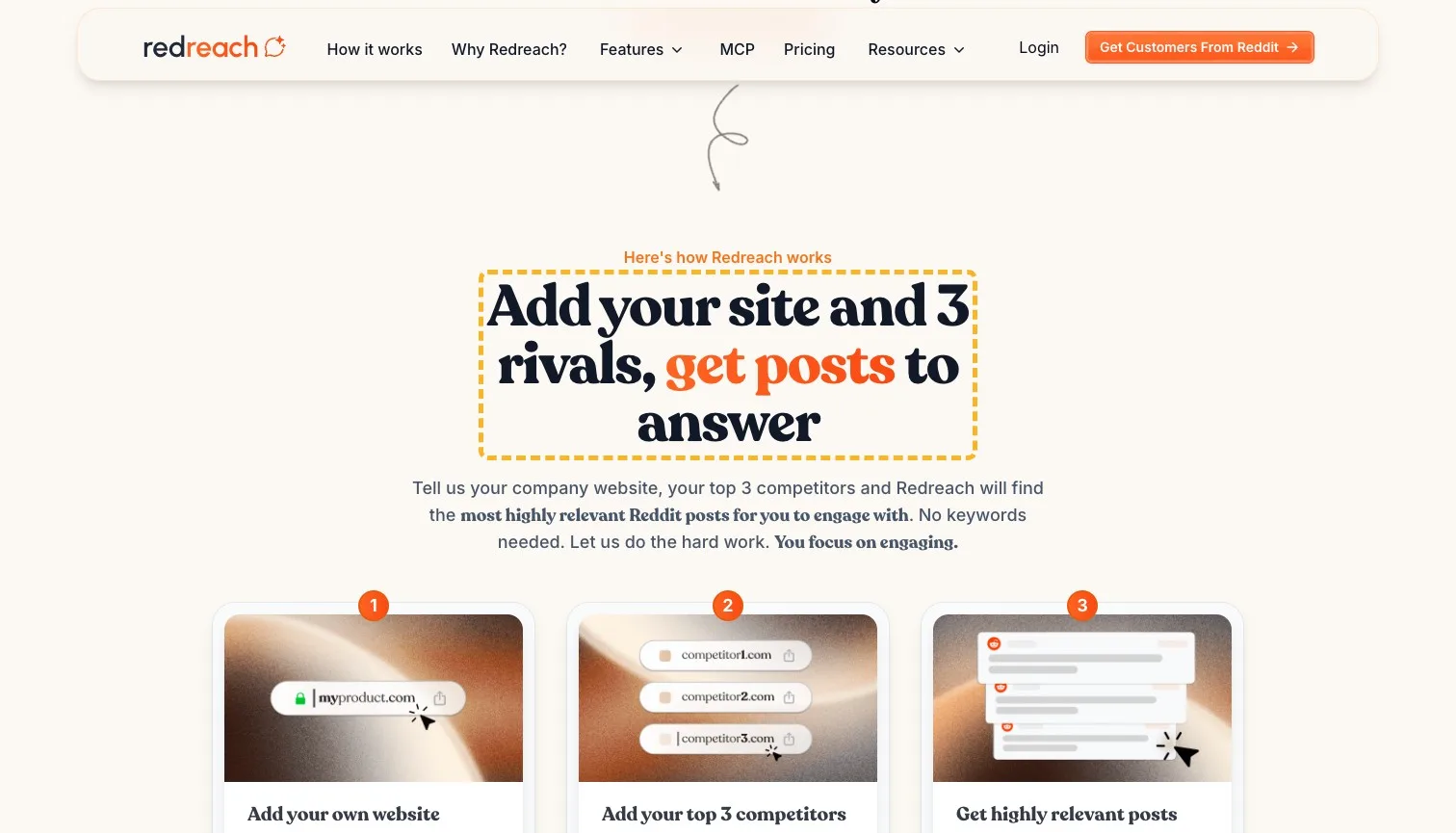
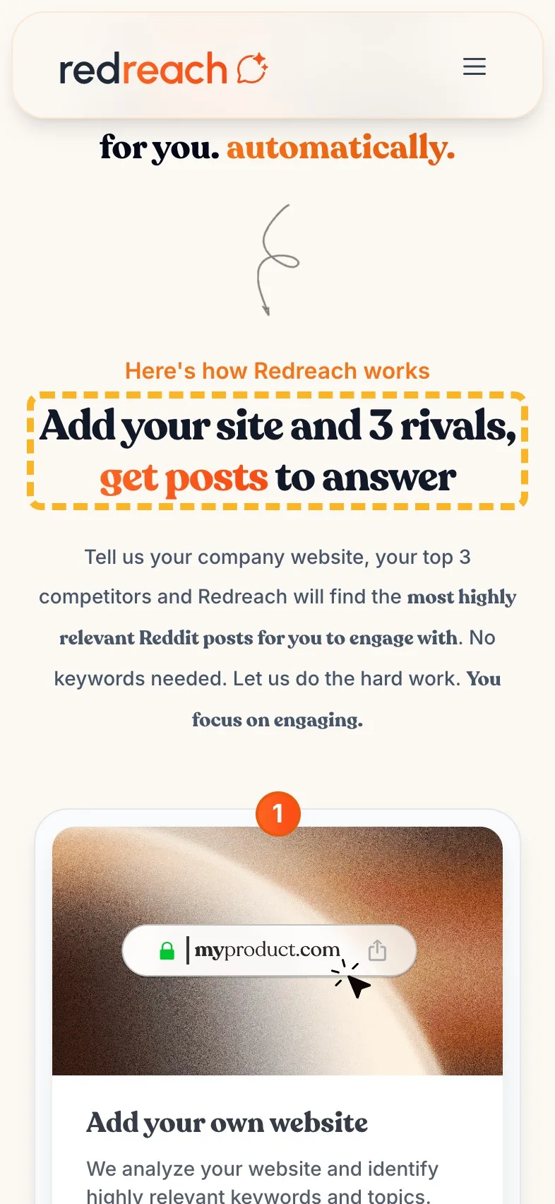
The how-it-works section is clear once you read the cards: add your website, add three competitors, get a list of posts. Its heading, "Get more customers in 3 simple steps", says none of that. Simple steps is a promise every product makes, and the cards underneath already prove it here.
- Current
Get more customers in 3 simple steps
Magpie recommends
Add your site and 3 rivals, get posts to answer
Why it works. It says what you give it and what you get back, before the cards do.
Features worth naming in the heading#
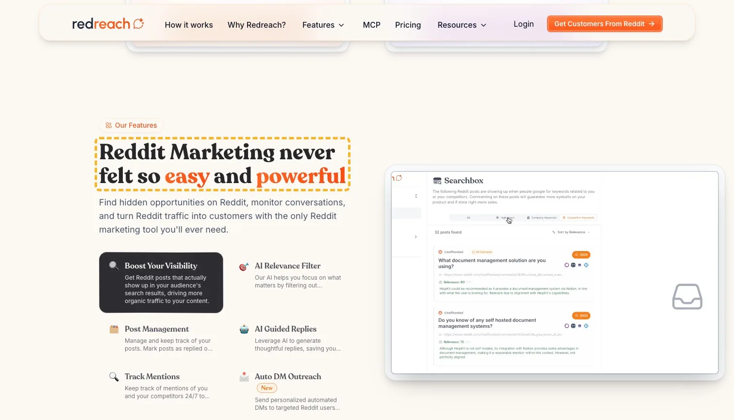
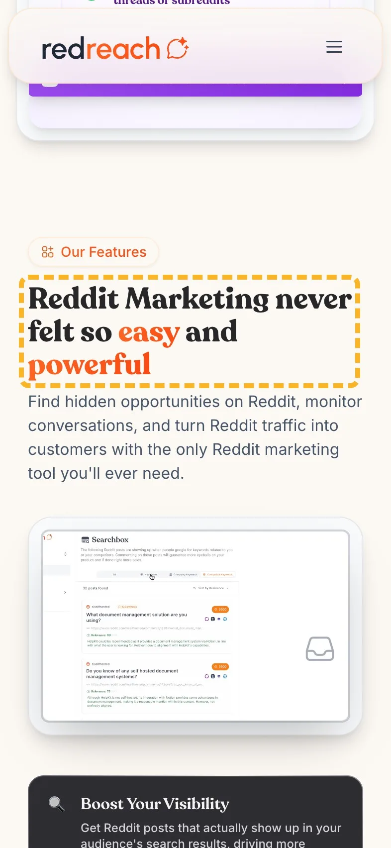
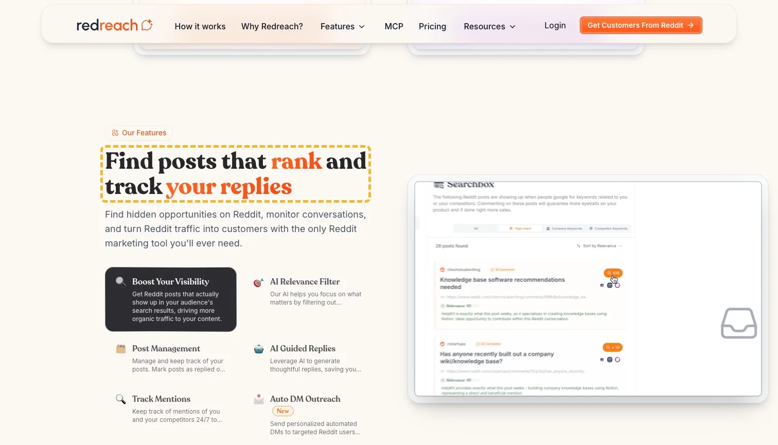
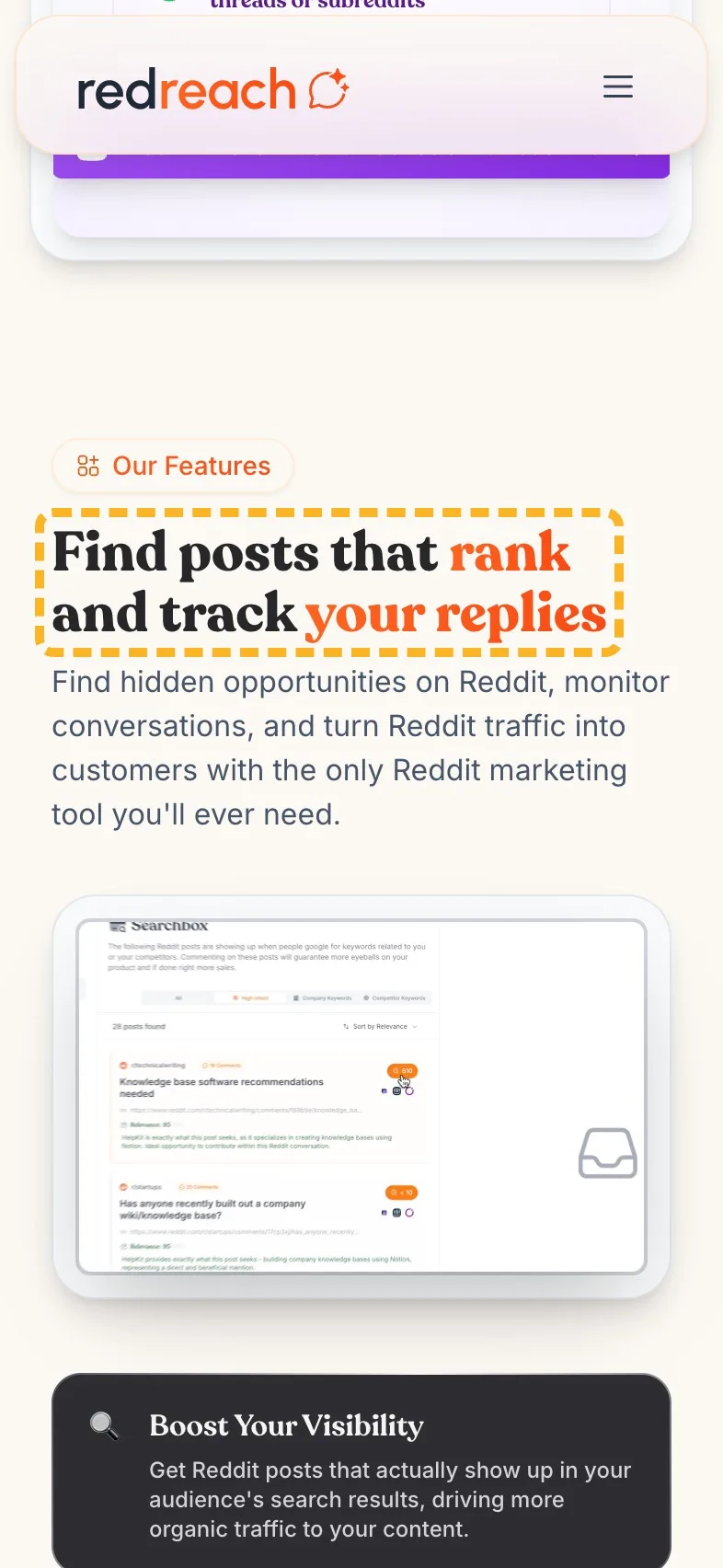
"Reddit Marketing never felt so easy and powerful" heads a list of features that are specific and useful: posts that show up in search, a filter for the irrelevant ones, a way to track what you've replied to. Easy and powerful are words a visitor skims past. The three jobs underneath are what they came to read.
- Current
Reddit Marketing never felt so easy and powerful
Magpie recommends
Find posts that rank and track your replies
Why it works. It swaps two adjectives for the jobs the list below describes.
Lead with the time it saves#
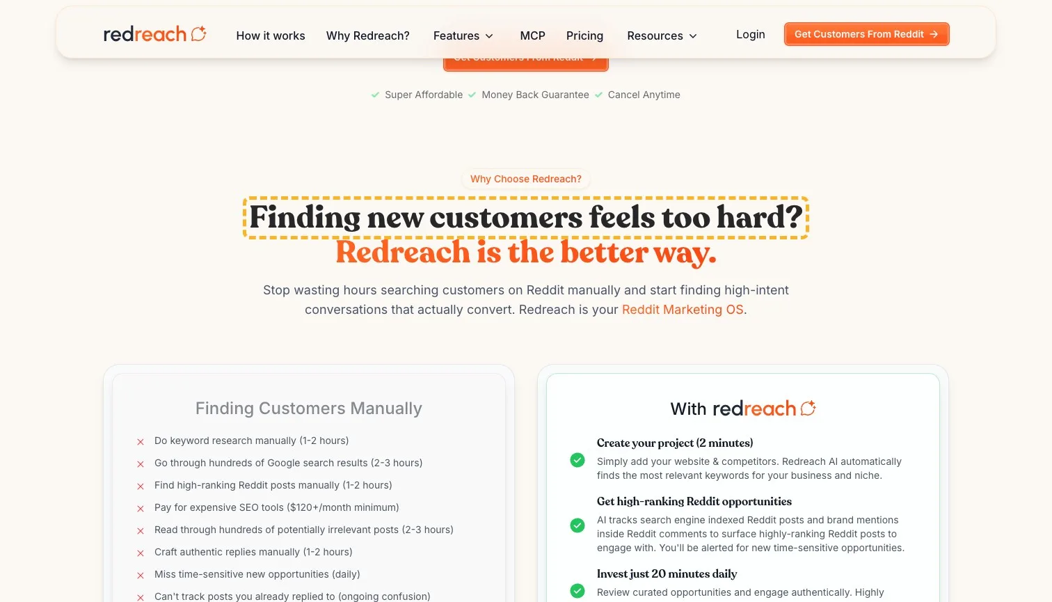
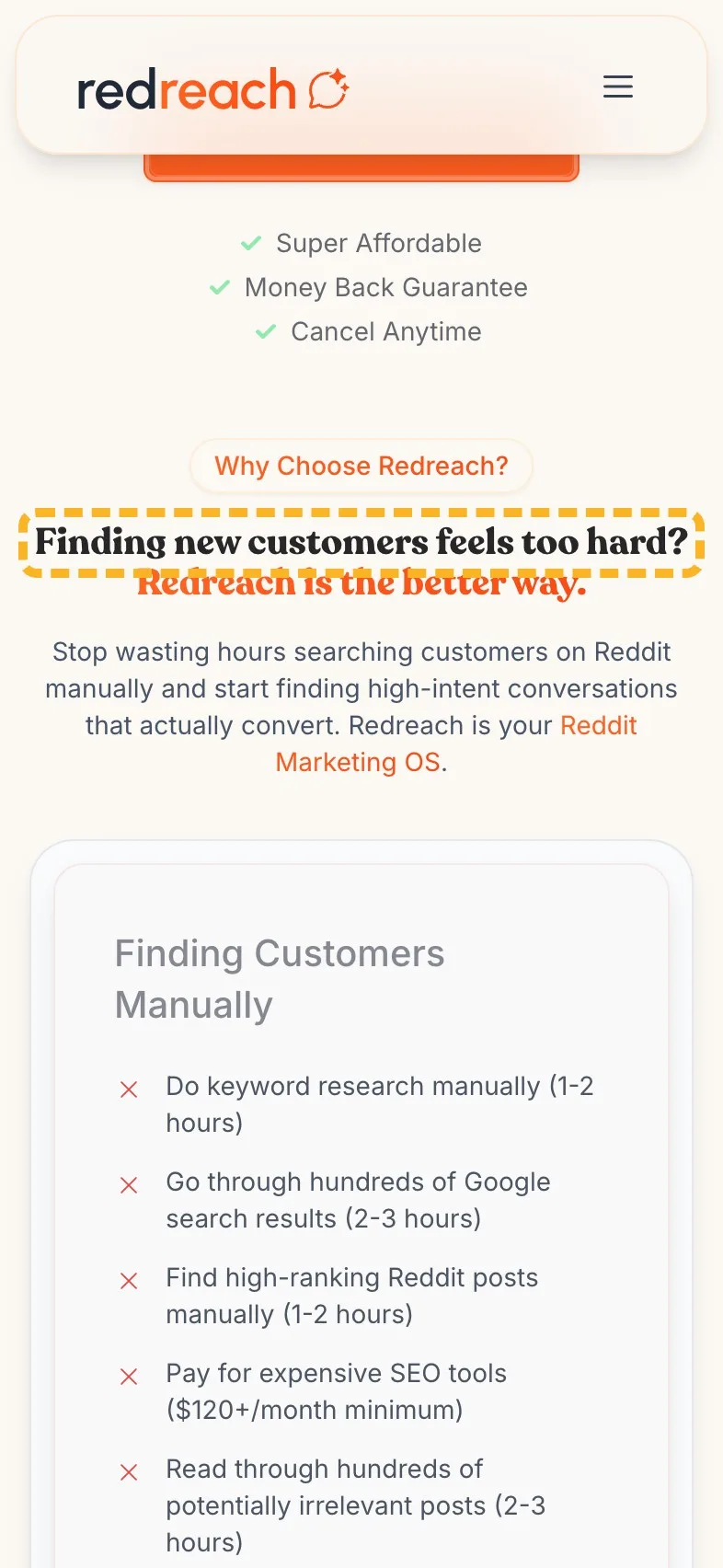
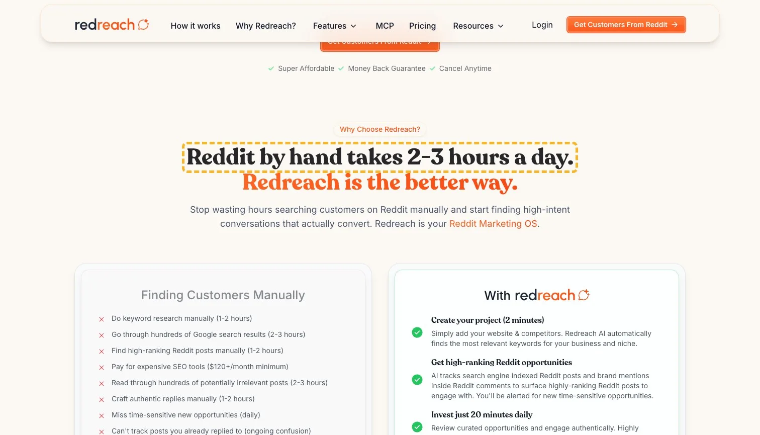
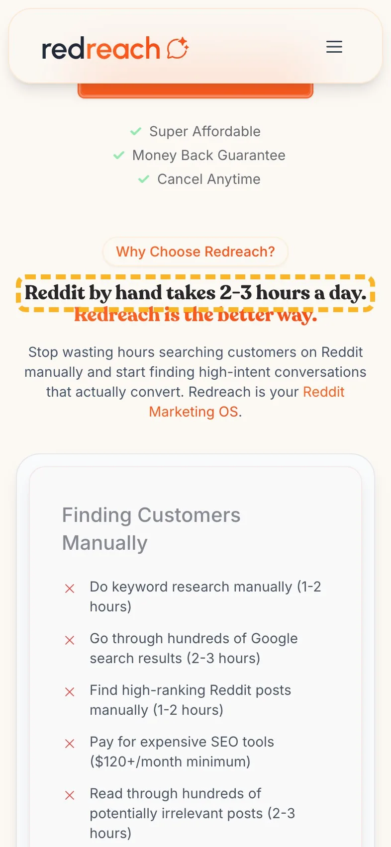
The comparison section is one of the strongest parts of the page. It adds up searching Reddit by hand, hour by hour, and lands on "2-3 hours daily + $120+/month tools". Its heading, above all that, opens on a question that could sit on any page.
- Current
Finding new customers feels too hard?
Magpie recommends
Reddit by hand takes 2-3 hours a day.
Why it works. It leads with the section's best fact, and the list below proves it.
The search title says its name twice#
The page's title in search results is the site's name and tagline, then the same again after a bar. It runs past the width Google shows, so a searcher never sees the line whole. Google's own guidance asks for distinct text that describes the page, and says a long title is cut to fit (Google Search Central (opens in a new tab)).
- Needs work
The search title repeats itself, and Google cuts it.
Use one short line, such as Redreach, find buyers in Reddit threads.
- Could be better
The search description runs past what Google shows.
Lead with finding buyers on Reddit and drop the line about ads.
I've covered writing a Google title and description that show whole, if you'd like the long version.
What I can't judge from outside#
I can't see Redreach's traffic, sign-ups or tests, and a page that converts well can break a rule or two. If the team tested a headline like mine and it lost, their numbers win.
Sources
About the author
Alex · Founder of Magpie AI
Alex founded Magpie AI and writes about turning a site's visitors into customers