AdaptlyPost landing page teardown

Alex · Founder of Magpie AI
Published · 4 min read
A teardown of AdaptlyPost (opens in a new tab), as it was on 20th Nov 2026. I publish these to teach, never to knock the makers. Magpie AI isn't installed on their site, so its engine has only worked from public-facing data.
In short
AdaptlyPost's reviews and comparisons are strong. I'd name the AI agent in the headline, thin the icons round it on a phone and give three headings the facts under them.
Contents
What AdaptlyPost gets right#
AdaptlyPost schedules posts to 14 social networks, and you can drive it from an AI agent as well as its dashboard. The proof is the best part of the page. Six reviews sit under the first screen, each with a number a buyer can hold it to (11 accounts across 8 platforms, 30 days of posts in about 10 minutes), and every one links to the review site where it was posted. That link is a feather in its cap: people trust a quote they can check far more than one a company prints about itself, and linking out is how a site shows it has nothing to hide (Nielsen Norman Group, 2016 (opens in a new tab)). Further down, a row of side-by-side comparisons and a question about whether scheduled posts reach fewer people meet two doubts buyers really have.
- Works
Every review links to the site where it was posted.
Keep it. A quote a buyer can check is worth three they can't.
- Works
The quotes carry numbers, not just praise.
11 accounts and 10 minutes read as real use, so lead with them.
- Works
The questions ask if scheduled posts reach fewer people.
It's the doubt a buyer brings, asked the way they'd ask it.
Call to action#
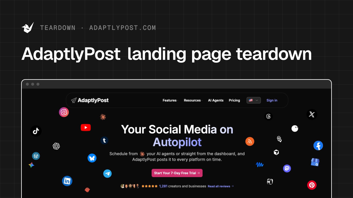
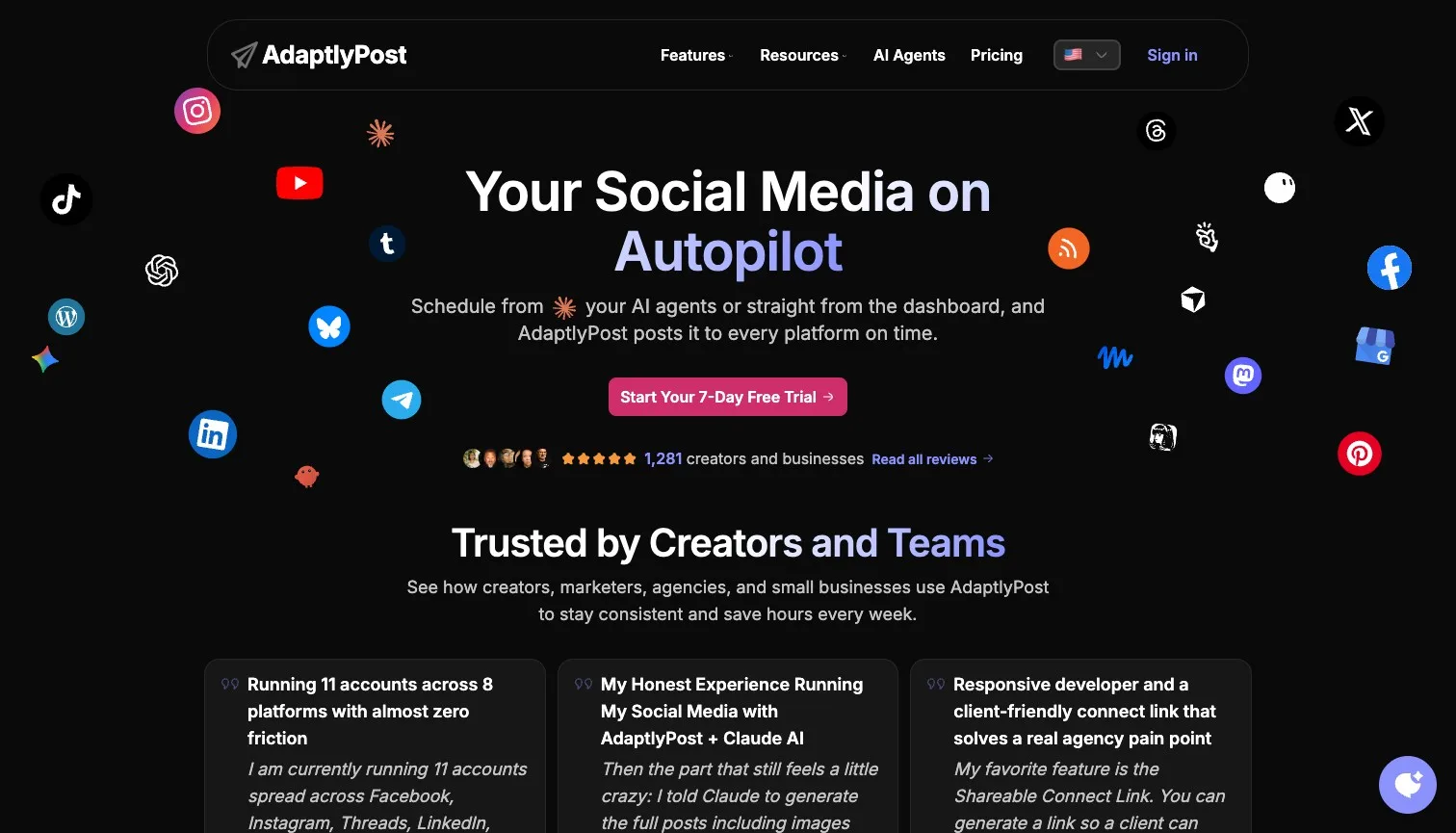
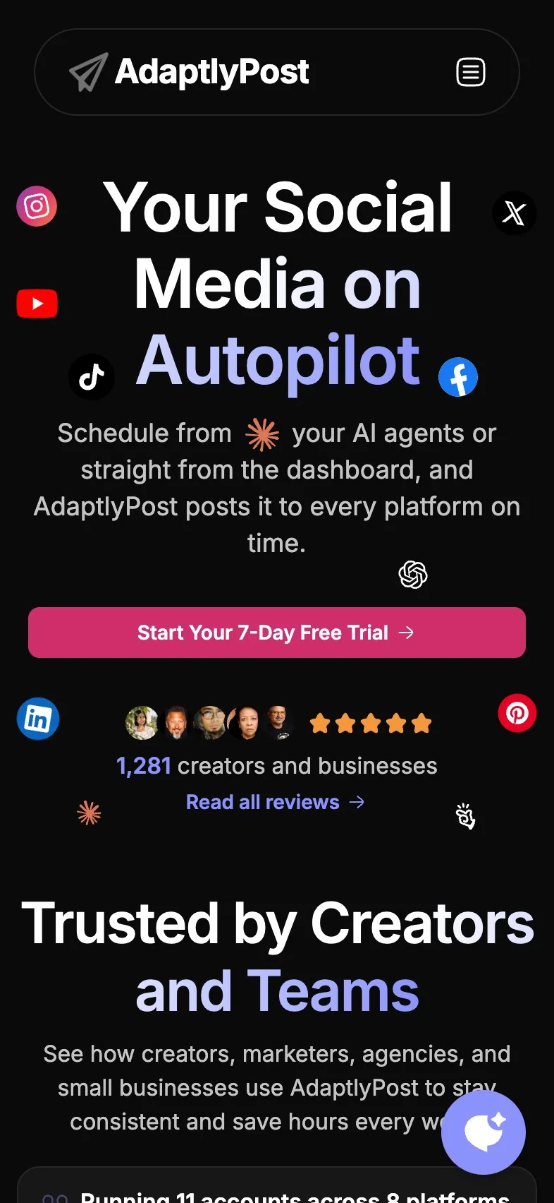
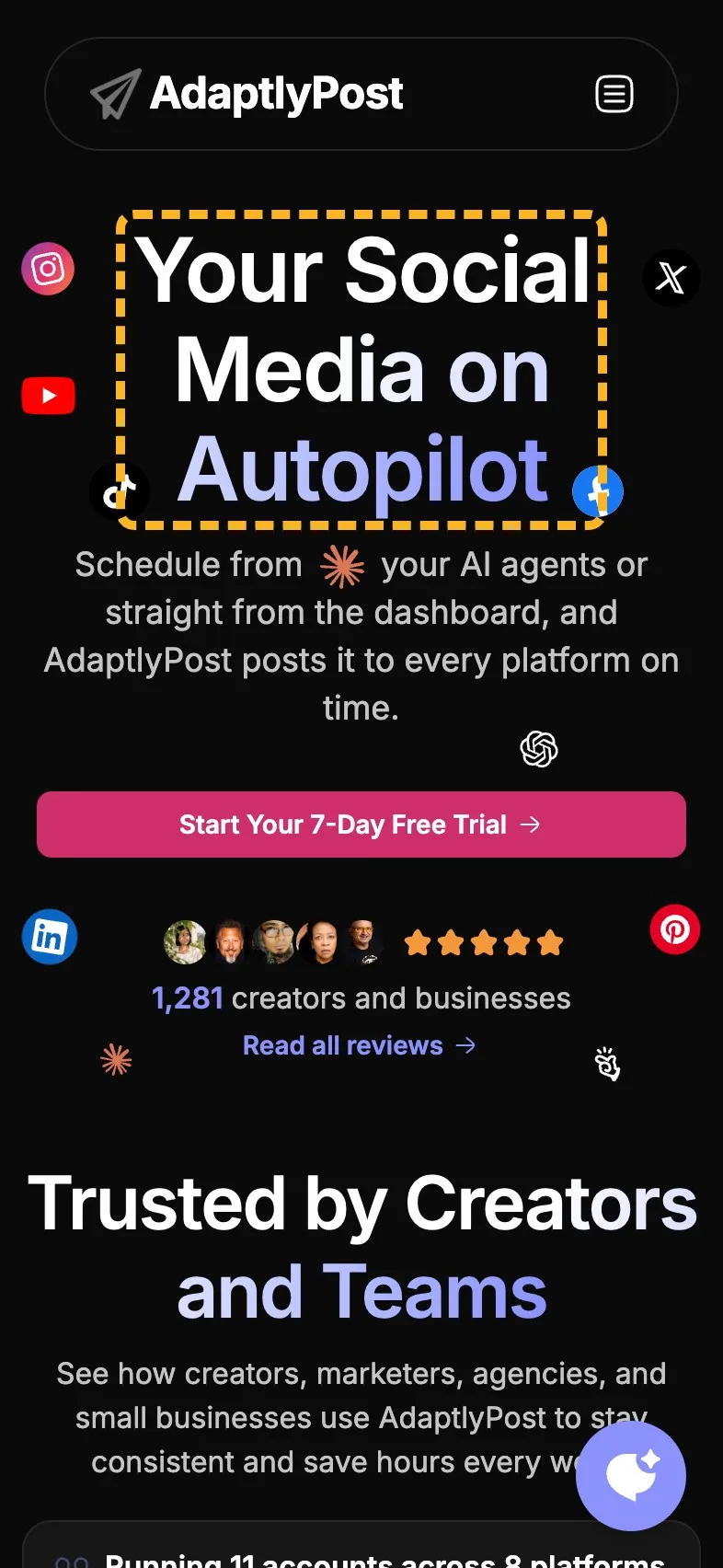
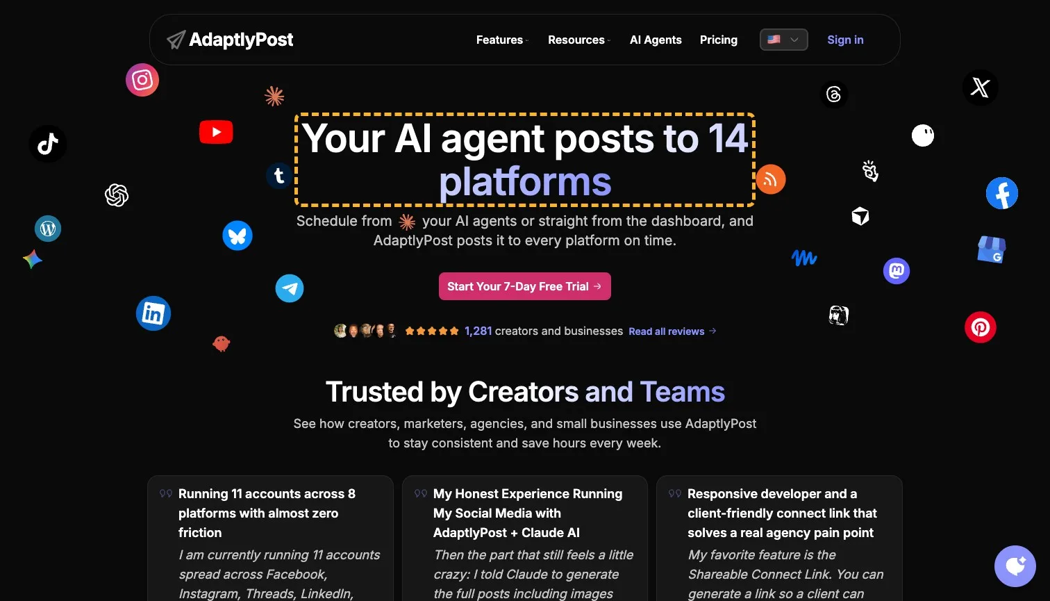
"Start Your 7-Day Free Trial" is filled in the brand's pink, reads at 4.96:1 against 4.5:1 needed, and a Get Started button stays in the header once you scroll, so it's never far away. On a laptop the first screen holds together: 60% of the strongest attention lands on the headline and the button. A phone is another story. A flock of platform icons circles the headline there, and only 44% of the strongest attention reaches the headline and button together. The button is also 36px tall on a phone, a touch under the 40px a thumb wants.
Magpie measured
- 5.0:1 contrast, 4.5:1 needed
- 36px tall on mobile
- Filled, so it reads as the main action
- No second action beside it
- One stays in view down the page

- Needs work
On a phone, 44% of the strongest attention is on the pitch.
Thin the icons round the headline on a phone and keep them on a laptop.
- Could be better
The trial button is 36px tall on a phone.
Give it 4px more height, so a thumb lands on it first time.
Even on a laptop the icons take their share. The YouTube logo by the headline draws one of the hottest spots on the screen.
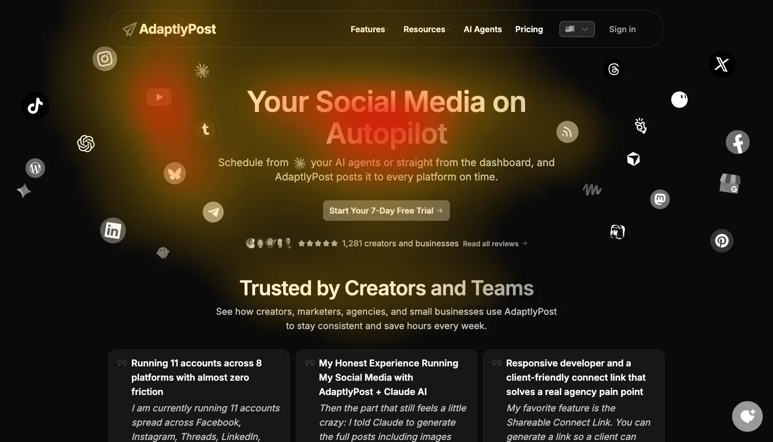
60% of the strongest attention lands on the headline and main button
Name the AI agent in the headline#
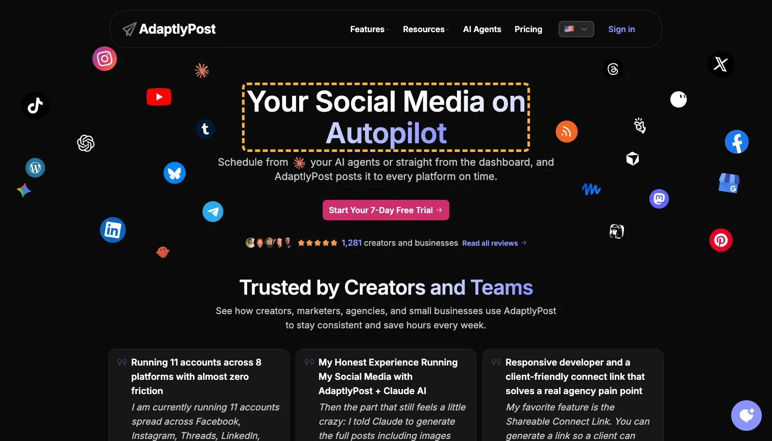
"Your Social Media on Autopilot" could head any scheduler's page. What sets AdaptlyPost apart is in the line underneath: you can schedule from your AI agent. A headline that names something only this product does tells a visitor in one glance whether they're in the right place, and the line under it can then add the dashboard route and the "on time" promise.
 Current
Your Social Media on Autopilot
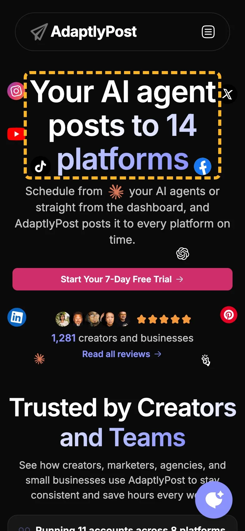
Magpie recommends
Your AI agent posts to 14 platforms
Why it works. It names what only this product does, and how many networks it covers.
Lead the reviews with a customer's result#
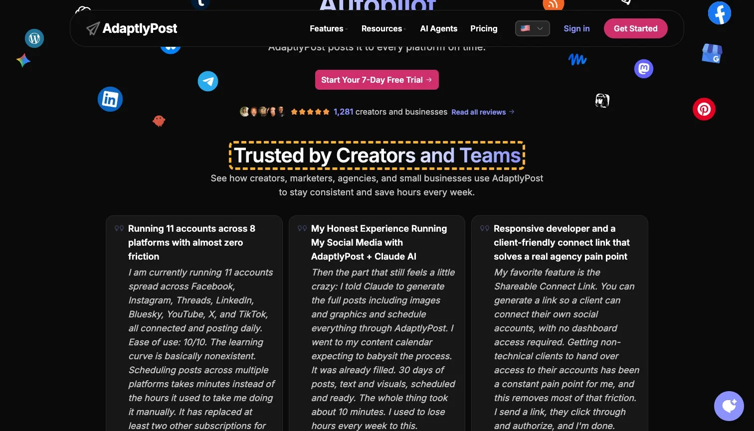
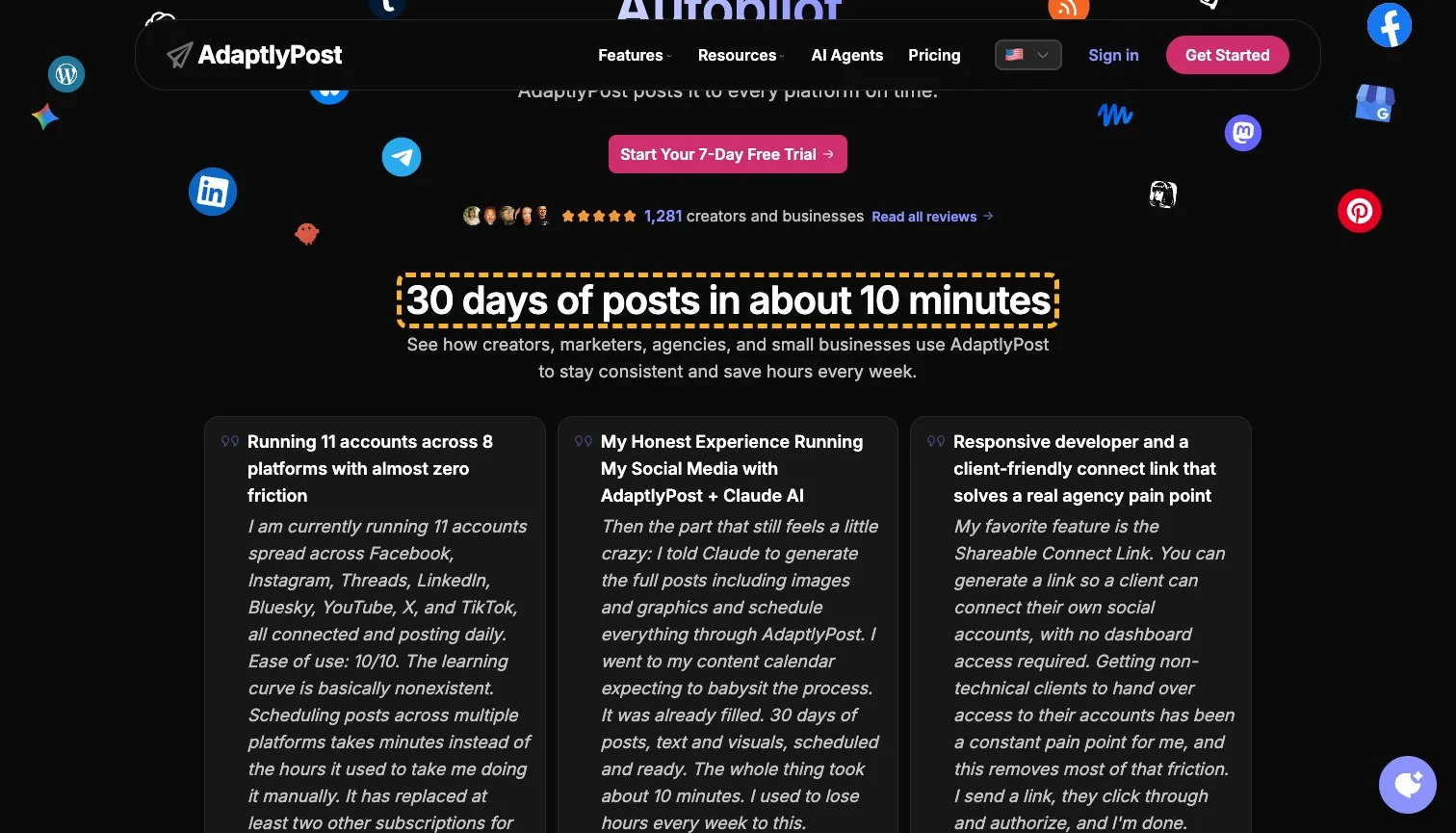
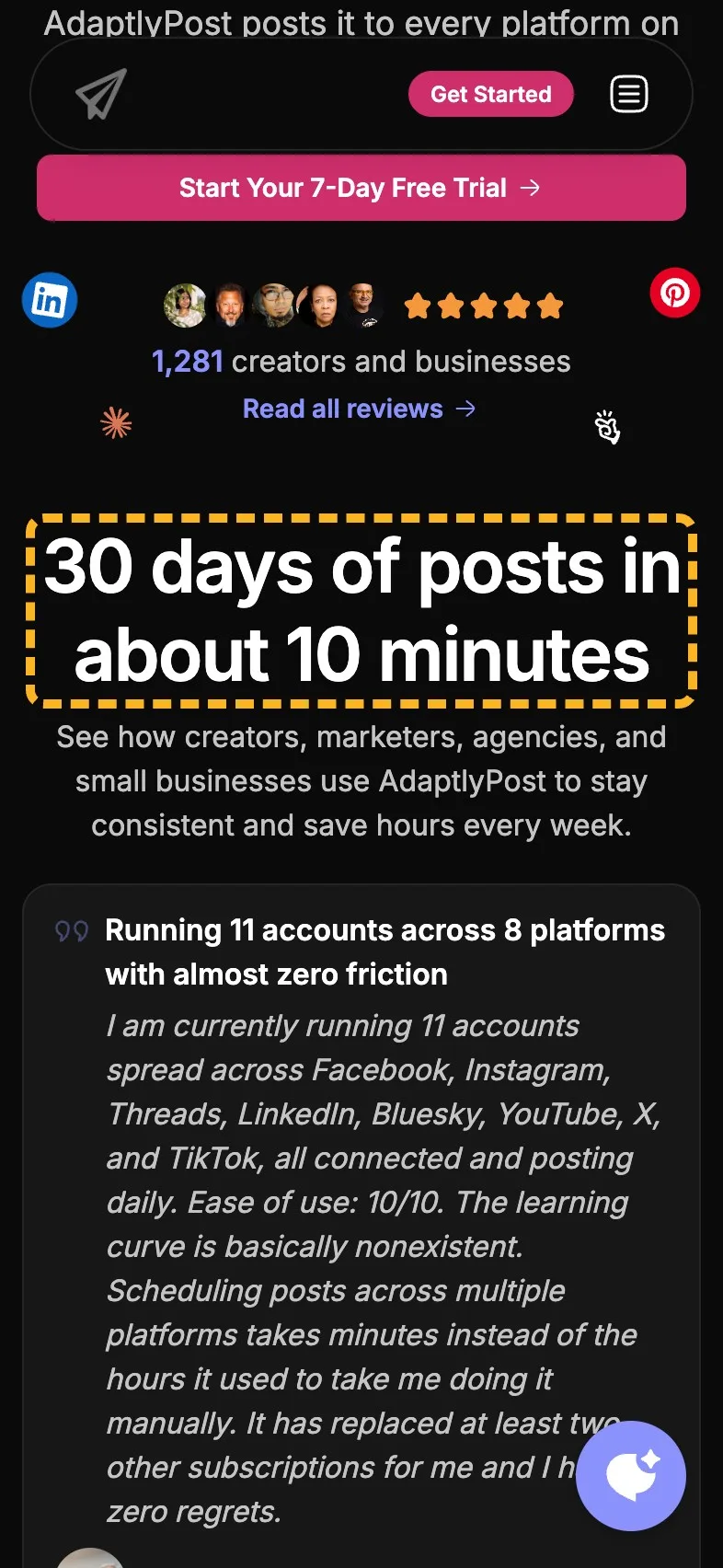
The review section opens with "Trusted by Creators and Teams", a heading that would fit any product with customers. The best line in the section is a reviewer's: a month of posts, text and pictures, scheduled in about 10 minutes. That's the claim a buyer remembers, and it's a customer saying it, which is why it belongs in the heading. I've written more on testimonials that name a result.
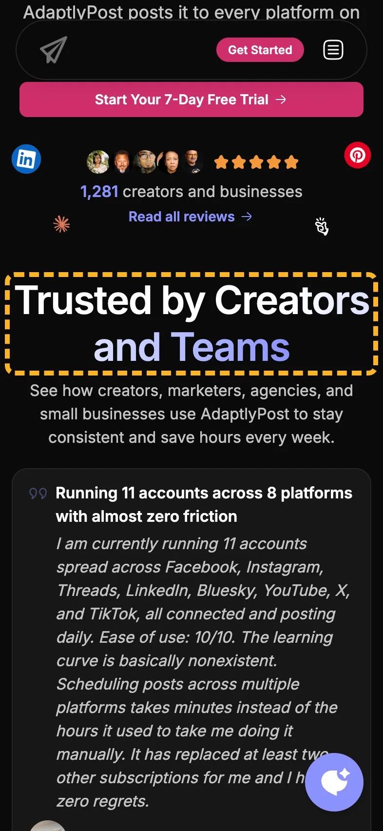
- Current
Trusted by Creators and Teams
Magpie recommends
30 days of posts in about 10 minutes
Why it works. It puts a customer's own result where a skimmer reads it first.
Say what the dashboard holds#
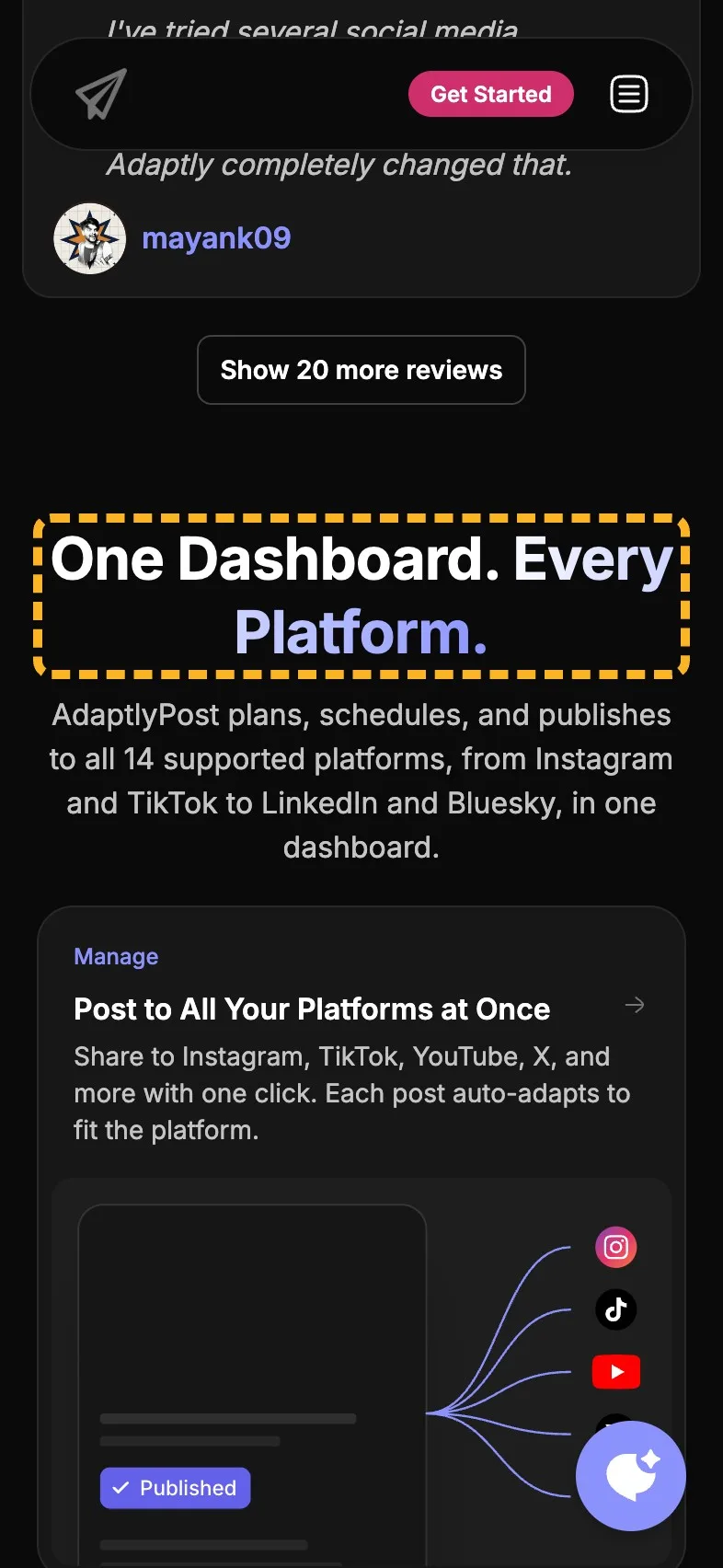
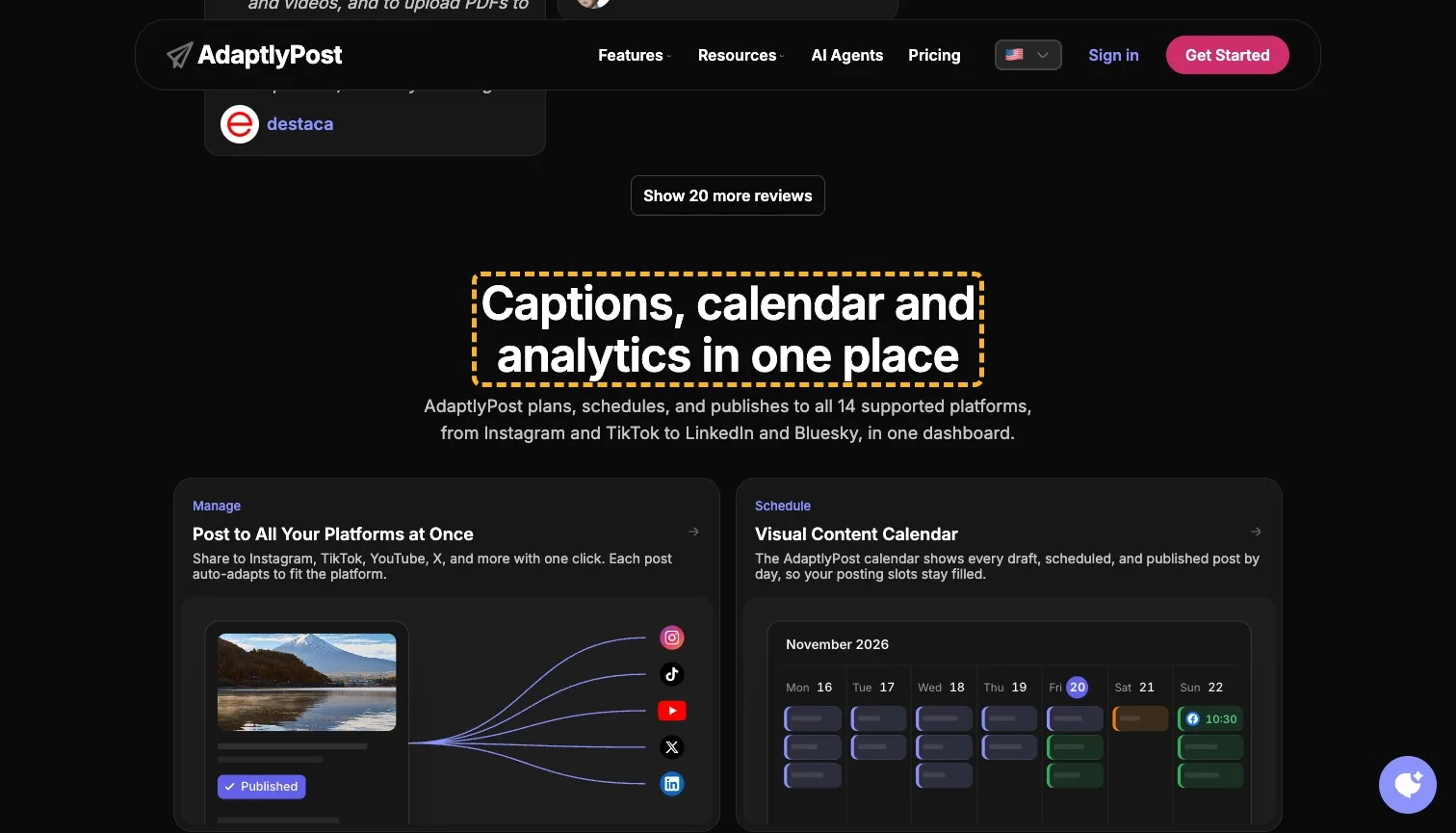
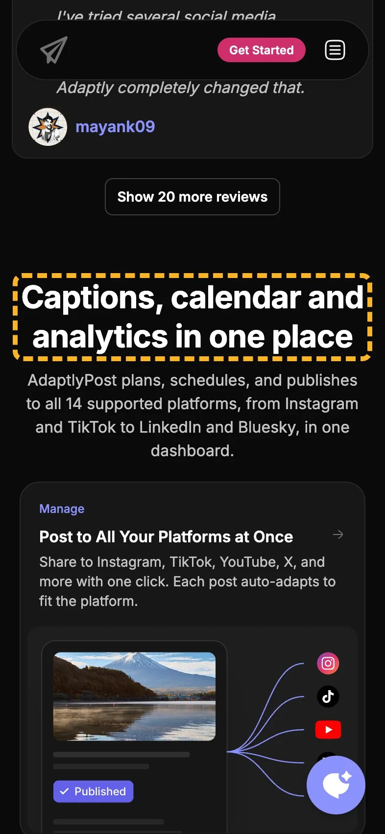
"One Dashboard. Every Platform." restates the first screen. Under it sit eight cards worth a heading of their own: AI captions rewritten per network, an image generator, a calendar, analytics across every account, an API and agent skill, and RSS posting. Nielsen found people read about 20% of a page's words on an average visit (Nielsen Norman Group, 2008 (opens in a new tab)), so a bird's-eye view of the page is mostly its headings. This one should carry the features.
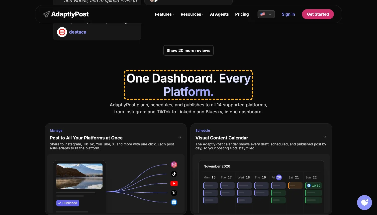
- Current
One Dashboard. Every Platform.
Magpie recommends
Captions, calendar and analytics in one place
Why it works. It names three things in the section, so a skimmer knows what's there.
Put a price in the pricing heading#
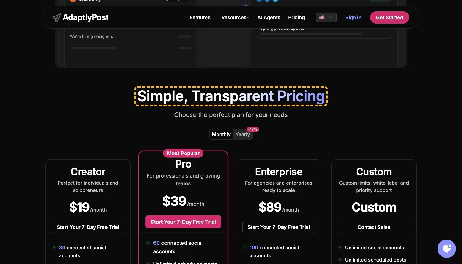
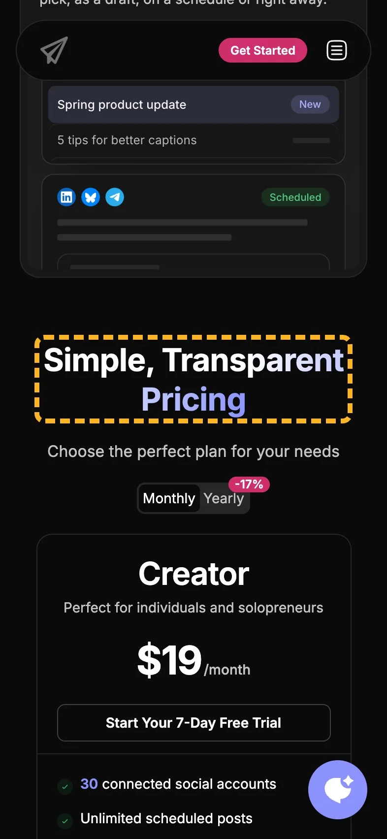
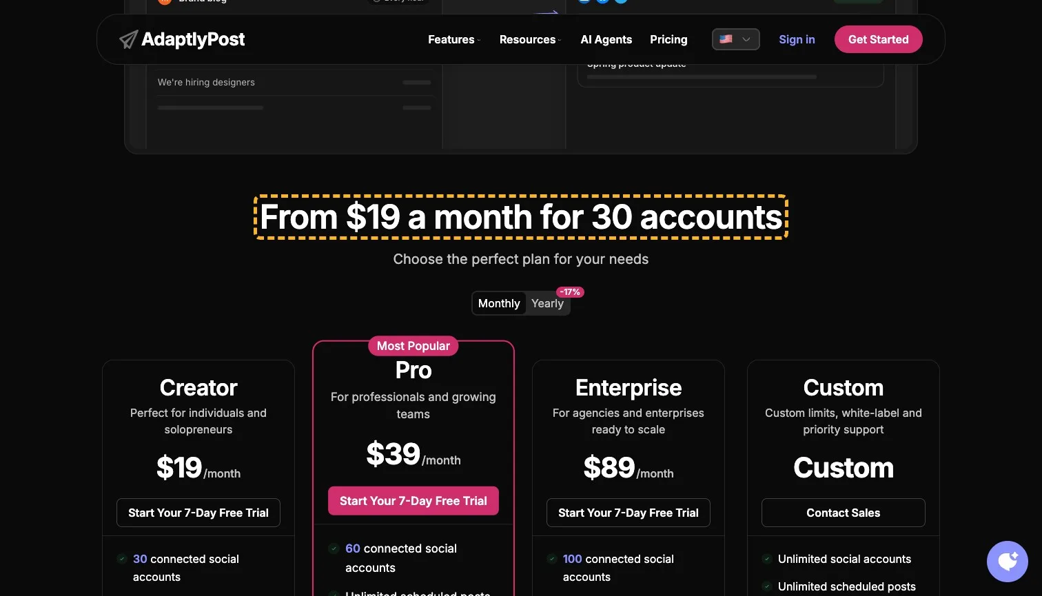
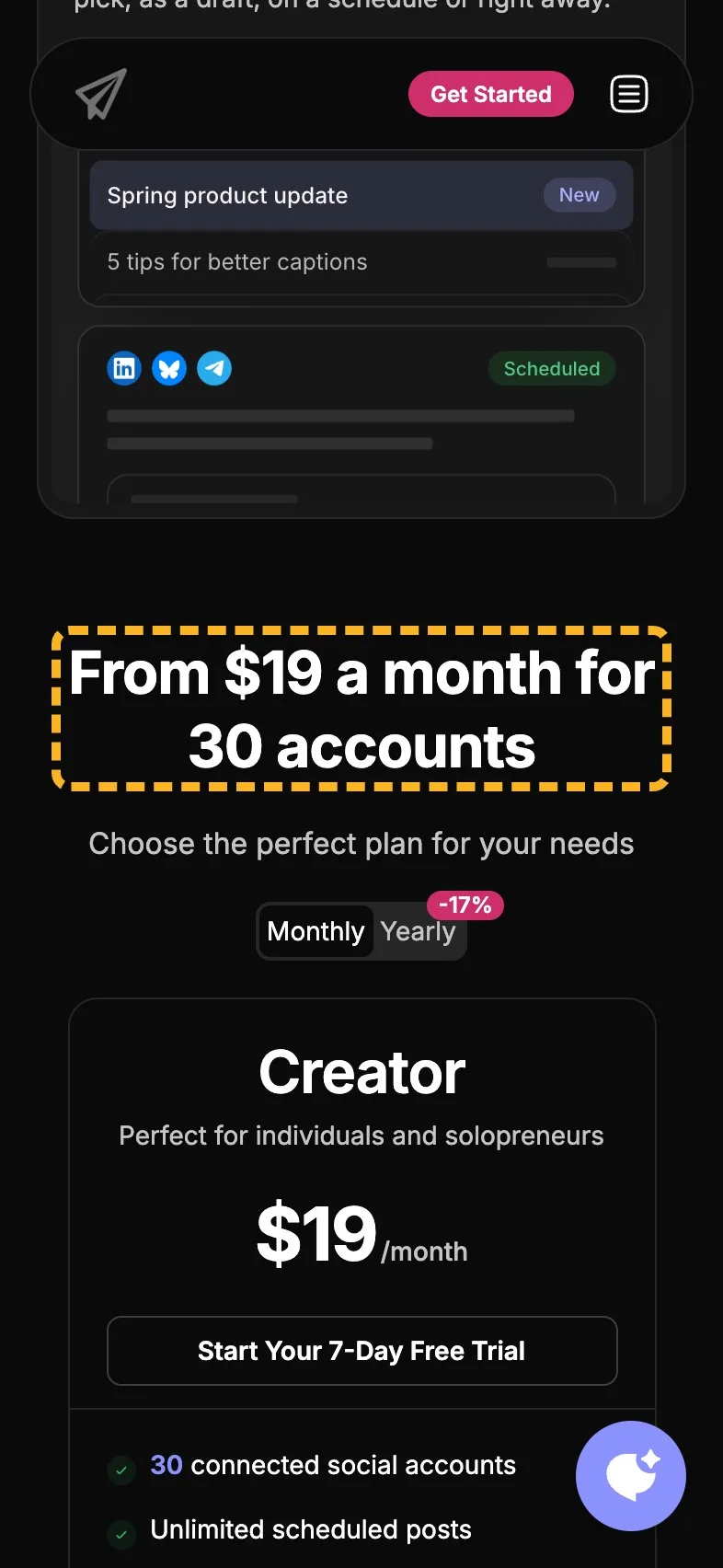
"Simple, Transparent Pricing" says the prices are easy to read without showing one. The plans are clear underneath: $19, $39 and $89 a month, a custom plan, and 17% off yearly. The page opens on monthly, so $19 a month is what a buyer sees first, and the Creator plan's 30 connected accounts is the fact that makes it look generous. Both fit in a heading (there's more in showing prices on a landing page).
- Current
Simple, Transparent Pricing
Magpie recommends
From $19 a month for 30 accounts
Why it works. It leads with the lowest price and what it buys, billed monthly.
How the brand comes across#
The product cards sound like someone who has run a posting calendar. Two lines read like any software page, and one of them counts the customers differently from the first screen.
- Builds it
“Connect your blog's RSS feed and AdaptlyPost posts every new article to the accounts you pick, as a draft, on a schedule or right away.”
Plain and exact, with all three ways it can post named.
- Builds it
“The AdaptlyPost calendar shows every draft, scheduled, and published post by day, so your posting slots stay filled.”
It names the worry, an empty slot, and how the calendar meets it.
- Costs it
“Generate scroll-stopping images in seconds.”
Scroll-stopping is a stock phrase any image tool could print.
- Costs it
“Join thousands of creators and businesses scheduling across 14 platforms with AdaptlyPost, and save hours every week.”
Thousands sits oddly beside the 1,281 the first screen counts.
What I can't judge from outside#
I can't see how many visitors start a trial, how many come from an agent rather than the dashboard, or what's been tested already. The reviews and comparisons already do the hard work, so I'd start on a phone, with the icons round the headline and the headline itself.
Sources
About the author
Alex · Founder of Magpie AI
Alex founded Magpie AI and writes about turning a site's visitors into customers