PostFast landing page teardown

Alex · Founder of Magpie AI
Published · 4 min read
A teardown of PostFast (opens in a new tab), as it was on 20th Nov 2026. I publish these to teach, never to knock the makers. Magpie AI isn't installed on their site, so its engine has only worked from public-facing data.
In short
PostFast's first screen and quotes are hard to beat. I'd give three headings the facts under them, put a price in the pricing heading and add a button lower down on a phone.
Contents
What PostFast gets right#
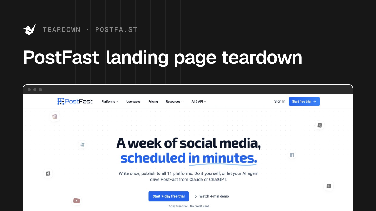
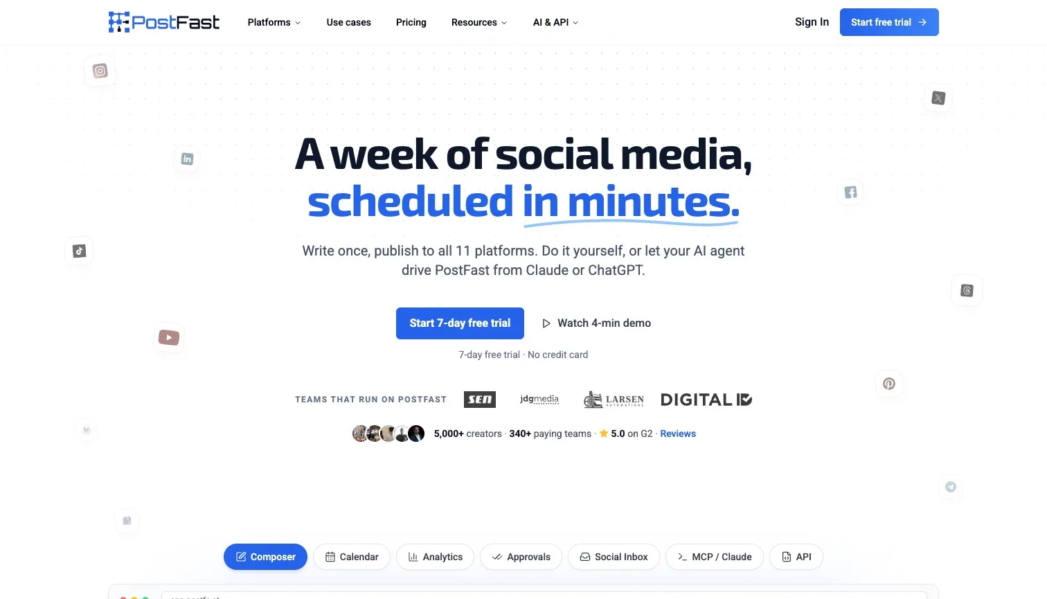
PostFast schedules posts to 11 social networks, and its first screen keeps a tidy pecking order. "A week of social media, scheduled in minutes." is a promise you can picture, the line under it says how (write once, publish to all 11), one filled button starts a trial, and "No credit card" sits right under it where the doubt lives. On a laptop, 86% of the strongest attention lands on the headline and the button. On a phone it's 84%. I'd leave every word of it alone.
- Works
The headline is a promise you can picture, in eight words.
Keep it. A week of posts in minutes is the whole pitch.
- Works
Quotes carry full names, roles, companies and logos.
Named proof from real teams is the hardest kind to fake.
- Works
The trial button has No credit card right under it.
It answers the one worry a trial button raises.
Call to action#
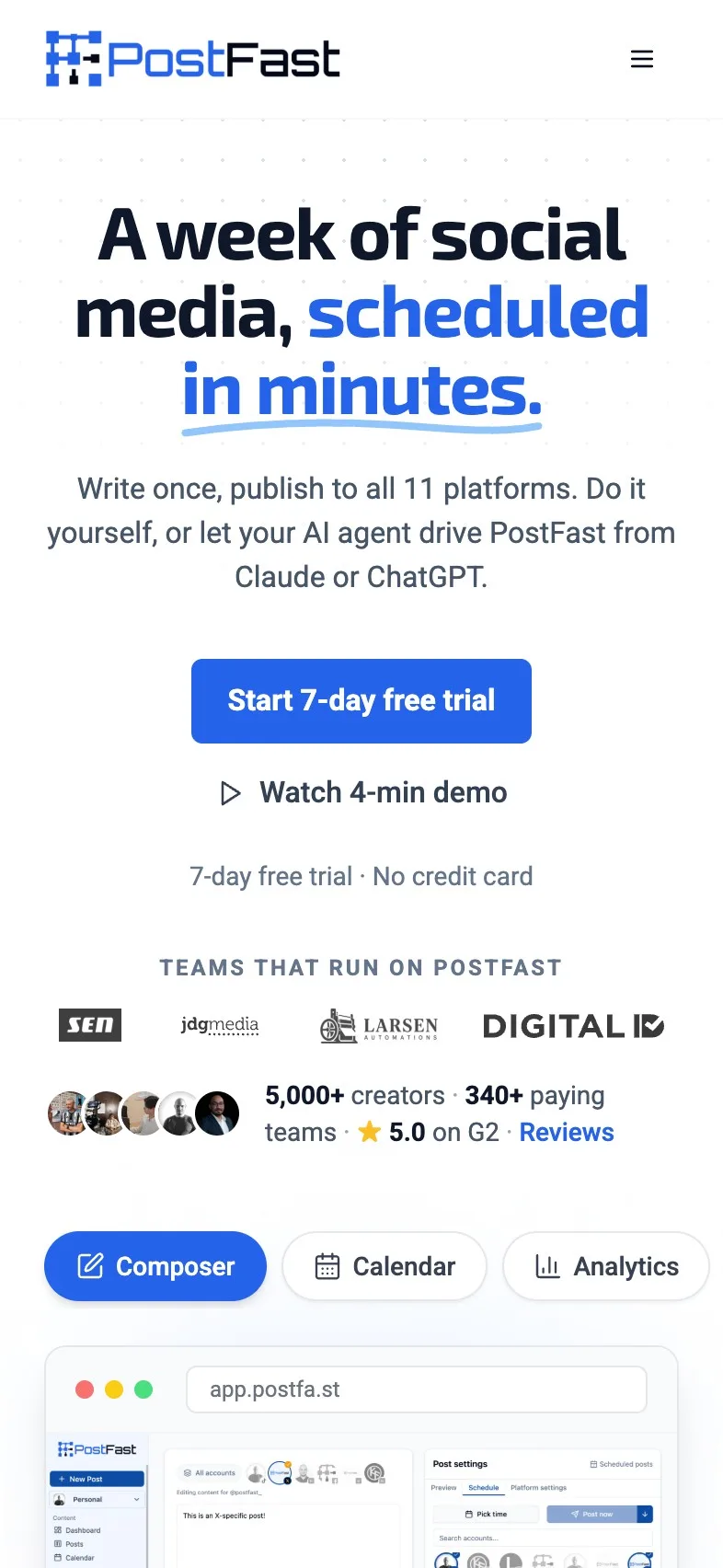
"Start 7-day free trial" is plain, filled in the brand's blue and readable at 5.17:1, comfortably past the 4.5:1 text needs. "Watch 4-min demo" sits beside it as a quieter link, which is how a second action should look. Two small things. The line under the button repeats "7-day free trial" straight after the button said it. And on a phone the longest run with no button in sight is 14.5 screens, most of it the platform list and the integrations.
Magpie measured
- 5.2:1 contrast, 4.5:1 needed
- 46px tall on mobile
- Filled, so it reads as the main action
- A quieter second button beside it
- Up to 15 screens between buttons

- Could be better
On a phone, 14.5 screens pass with no button in sight.
Add the trial button after the platform list, where a reader has seen it all.
- Could be better
The line under the button repeats the button's own words.
Cut it to the no-card promise alone, so the new fact stands out.
A composer heading that says what's new#
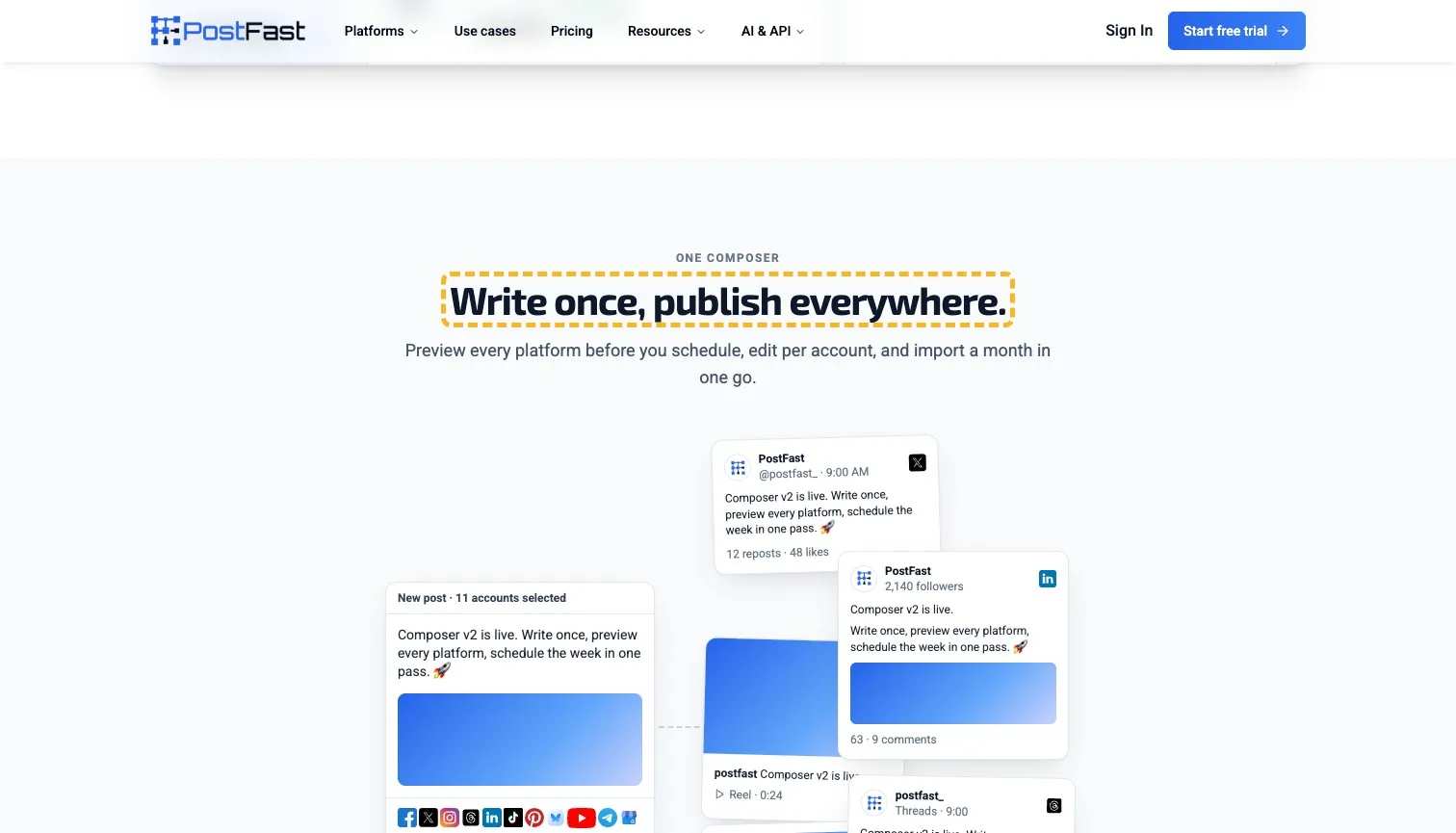
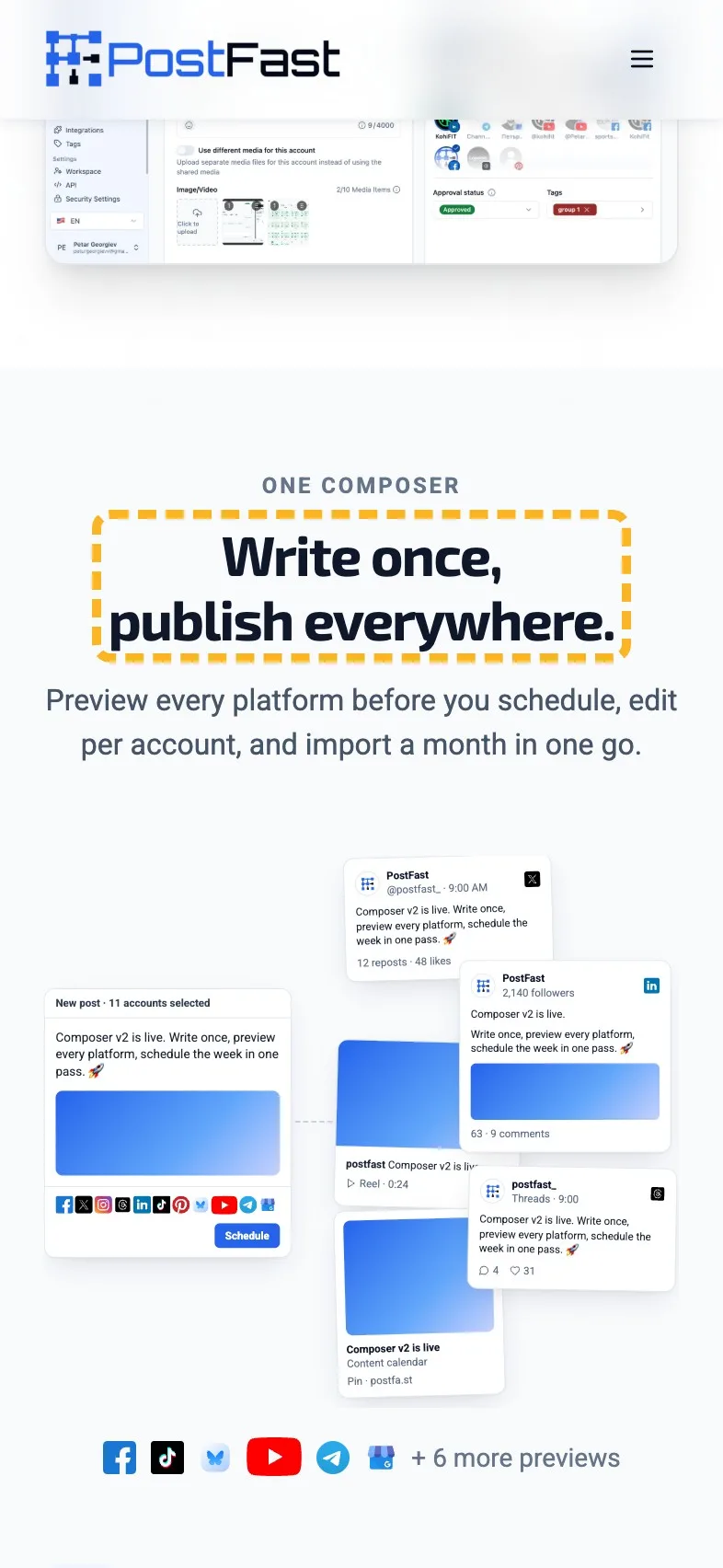
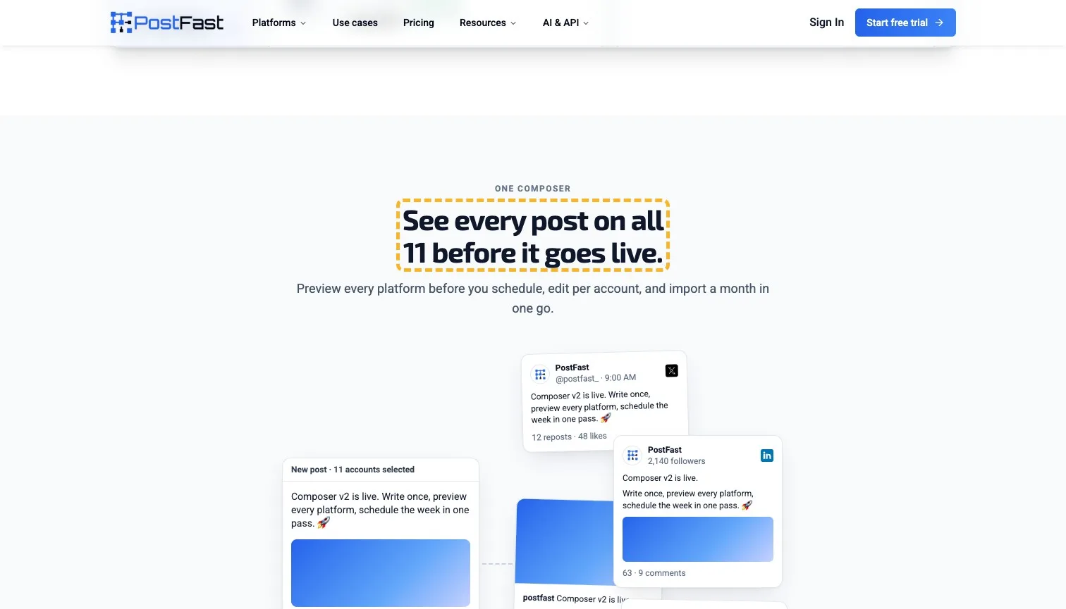
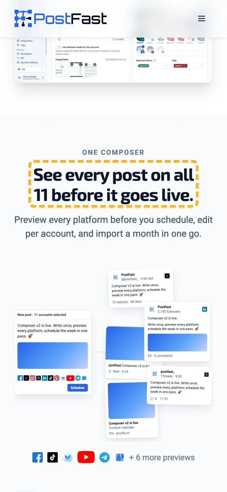
"Write once, publish everywhere." is the line every scheduler leads with, and PostFast has already said it on the first screen. The section underneath has something better. Every post is previewed as it'll look on each network before it goes out, which is the bit people worry about when one post goes to 11 places.
 Current
Write once, publish everywhere.
Magpie recommends
See every post on all 11 before it goes live.
Why it works. It names the one thing the section adds past the first screen.
Lead the customers with their biggest number#
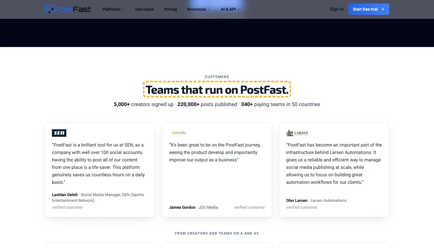
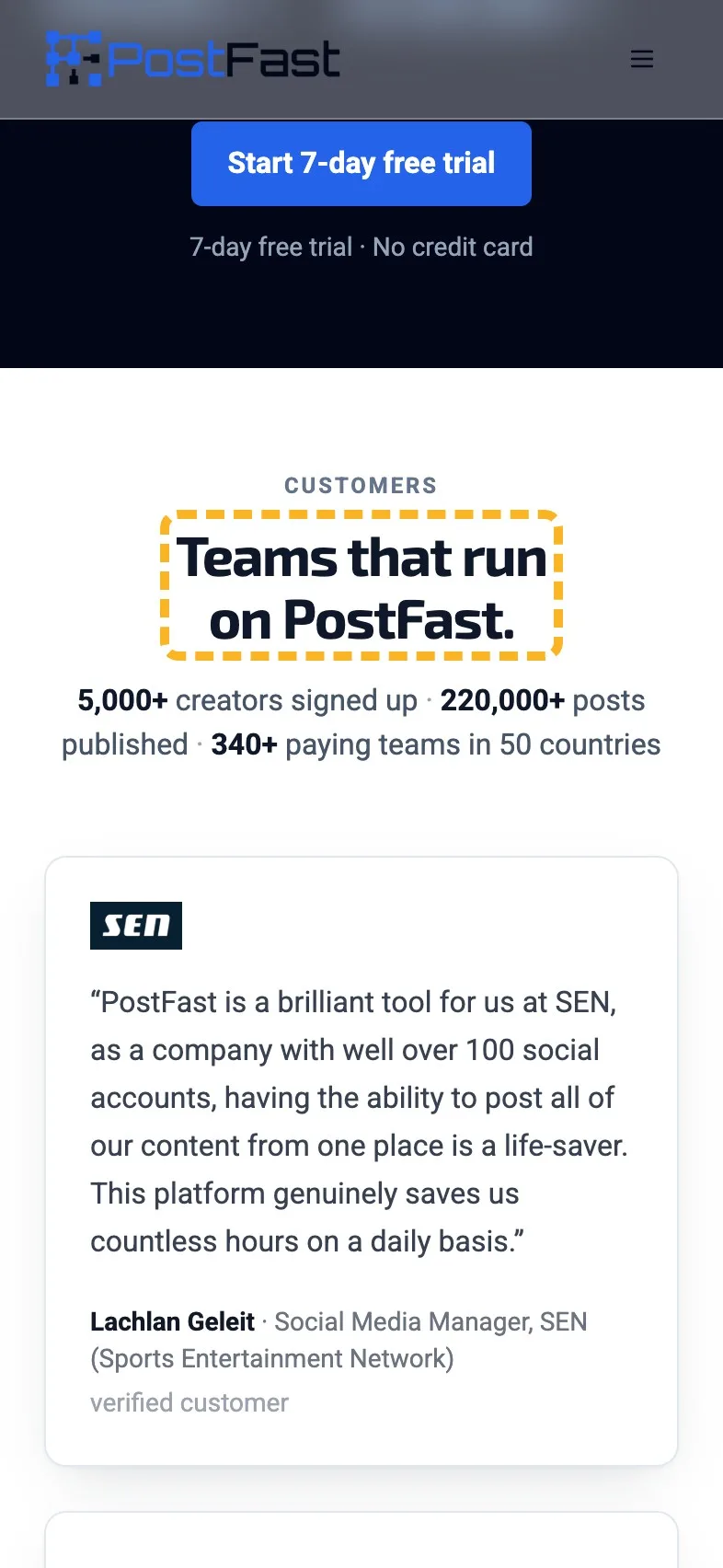
The customer section is the best proof on the page. Three quotes from named people at named companies, each marked as a verified customer, and one of them says something a buyer can measure: SEN posts from "well over 100 social accounts" in one place. The heading above them, "Teams that run on PostFast.", repeats the label from the logo strip on the first screen almost word for word.
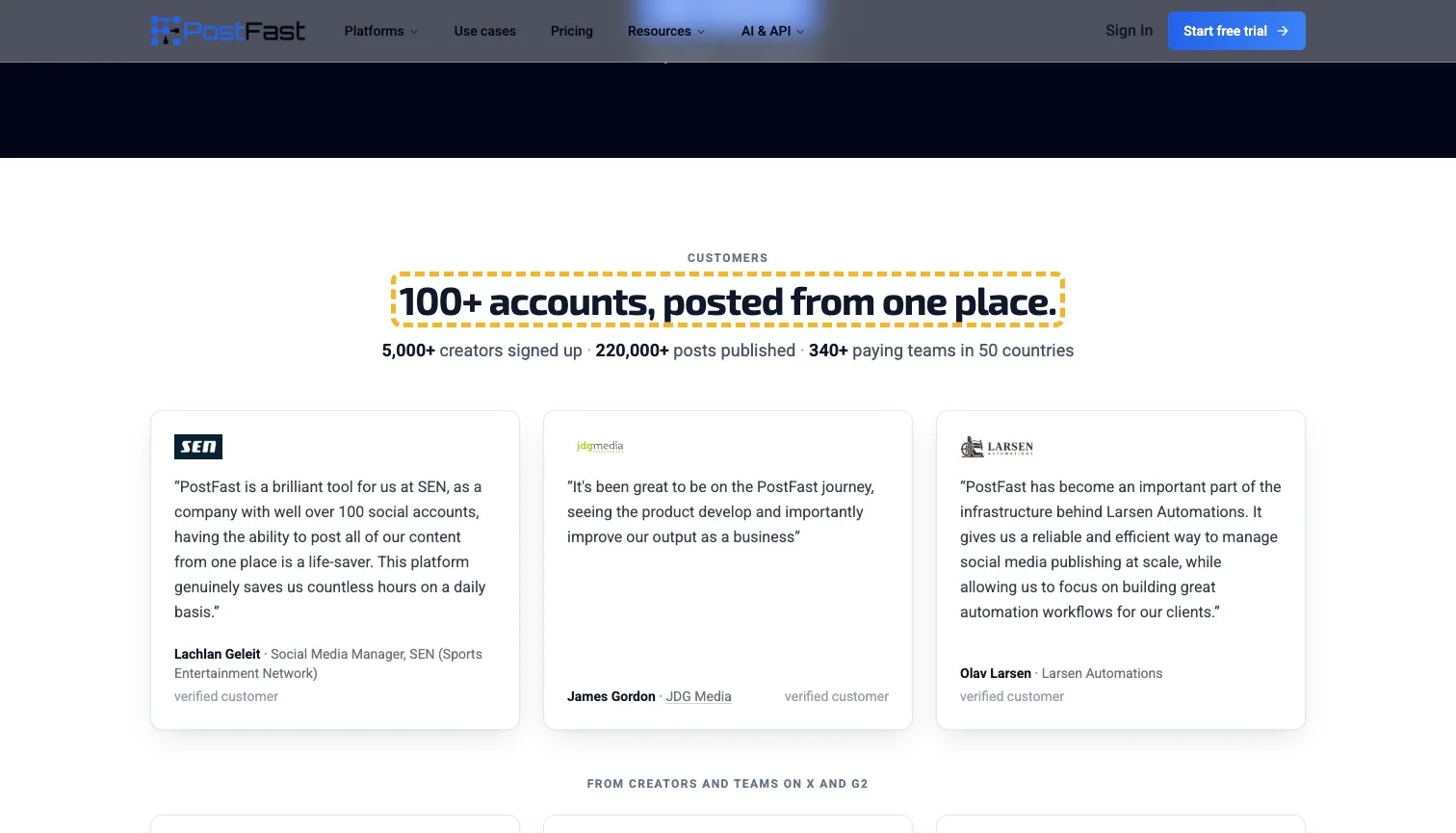
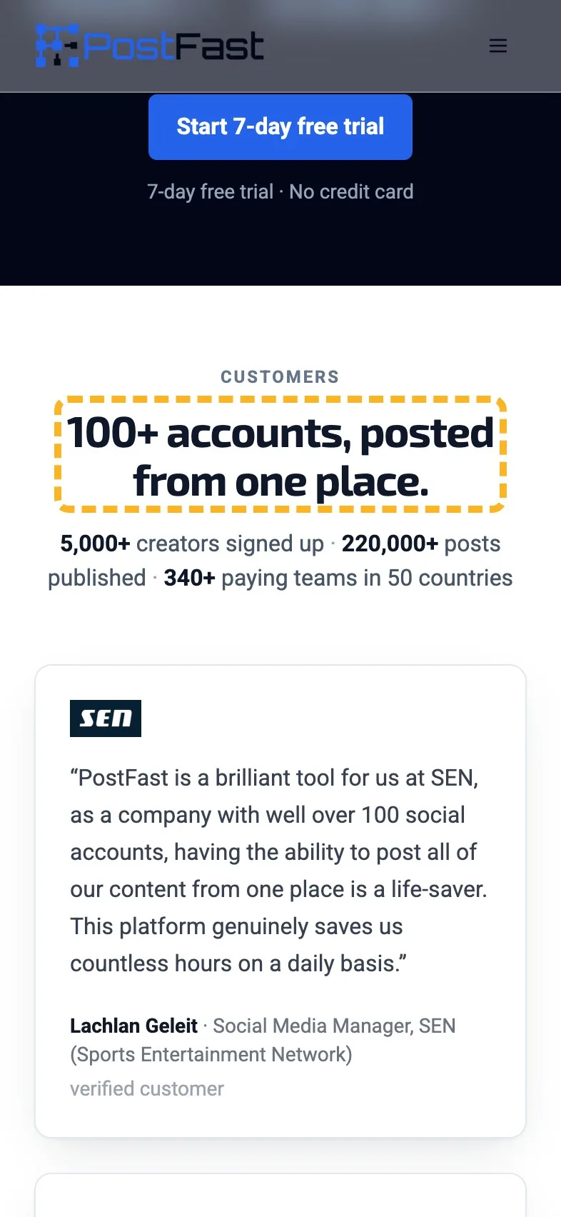
- Current
Teams that run on PostFast.
Magpie recommends
100+ accounts, posted from one place.
Why it works. It puts the most specific claim in the quotes where it's read first.
That's the eagle-eyed sort of detail testimonials that name a result are made of.
Name what "everything else" is#
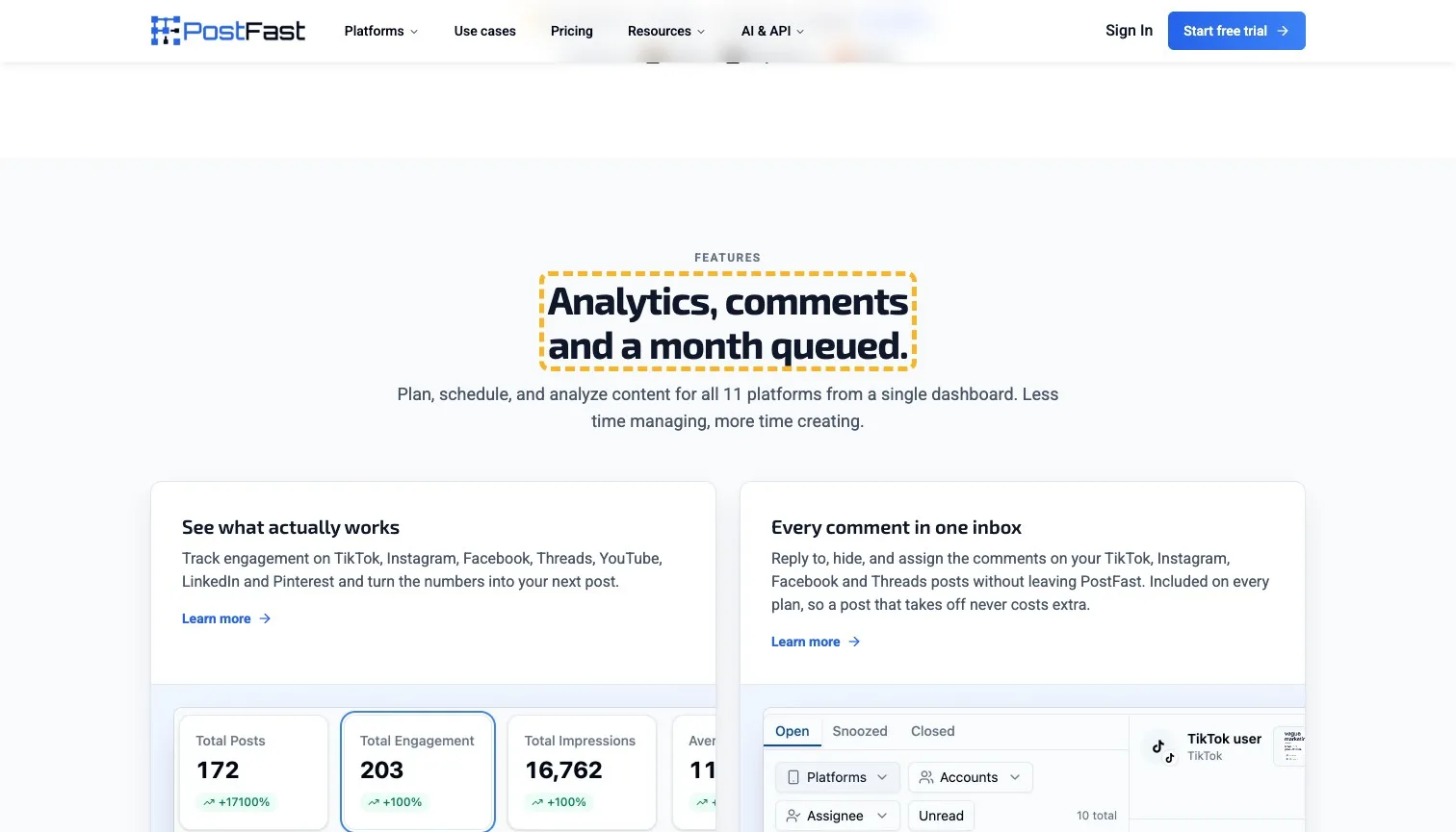
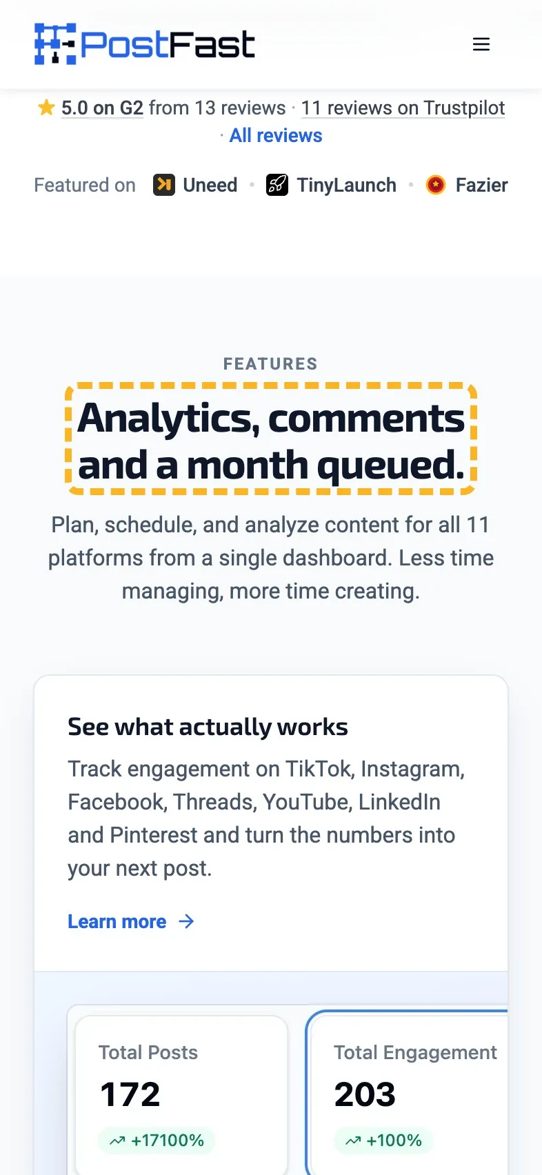
"Everything else you need." heads a features section packed with specifics: engagement tracking on 7 networks, every comment in one inbox, a month of posts queued, 200 imported from a CSV, your last 60 days pulled in so the analytics aren't empty on day one. The heading says none of it. A reader skimming headings (and most do) flies straight past the best list on the page.
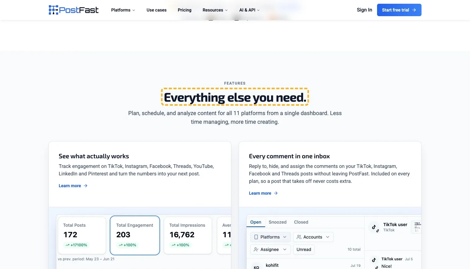
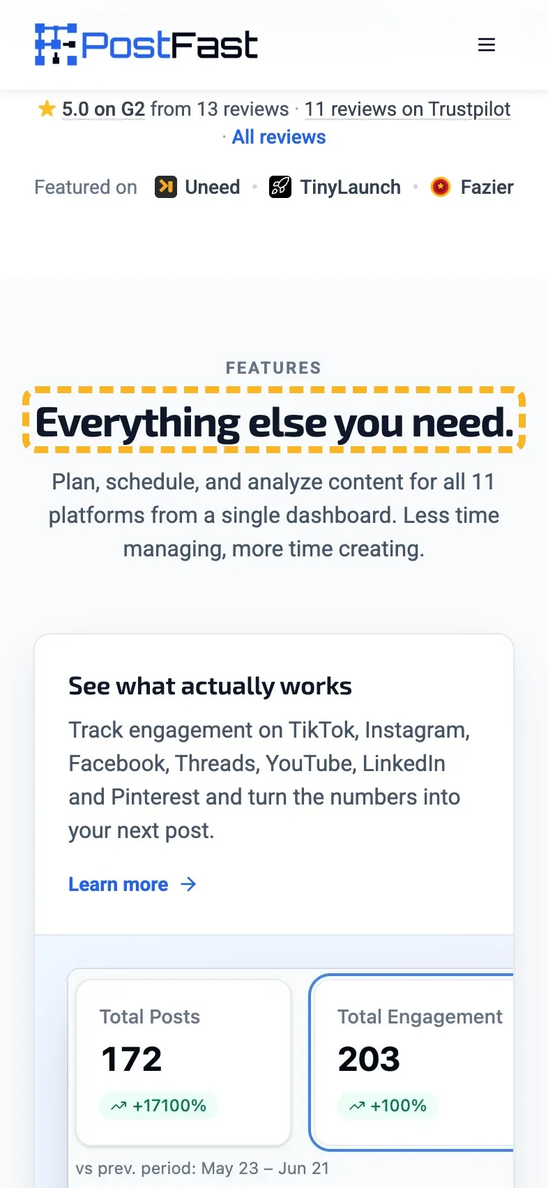
- Current
Everything else you need.
Magpie recommends
Analytics, comments and a month queued.
Why it works. It swaps "everything else" for the three features a skimmer wants.
Put a price in the pricing heading#
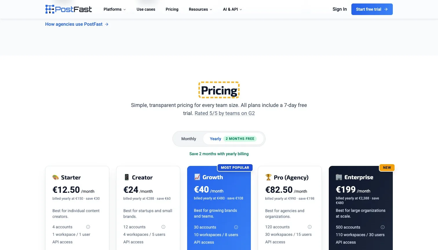
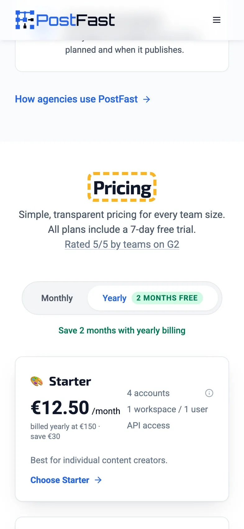
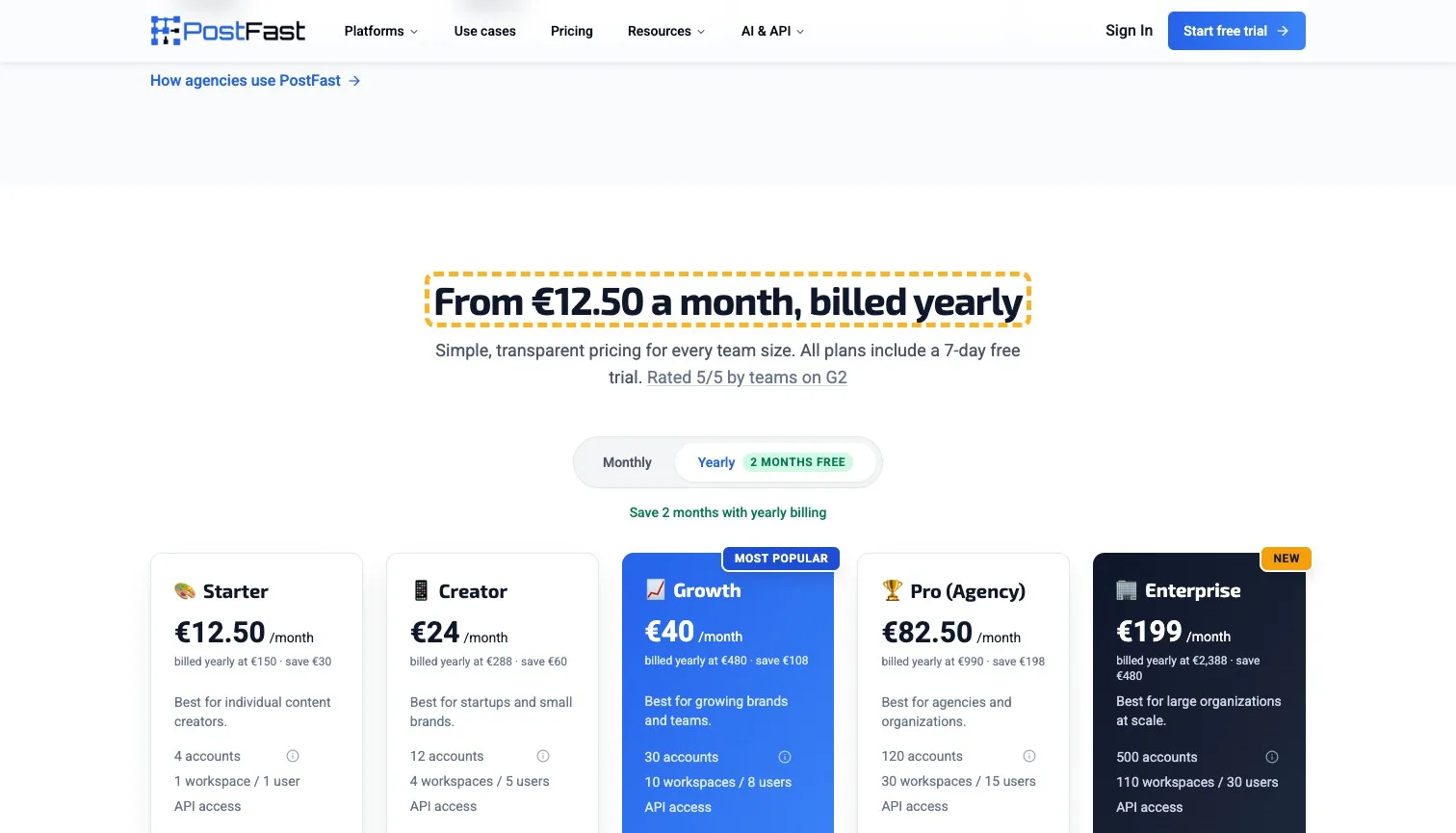
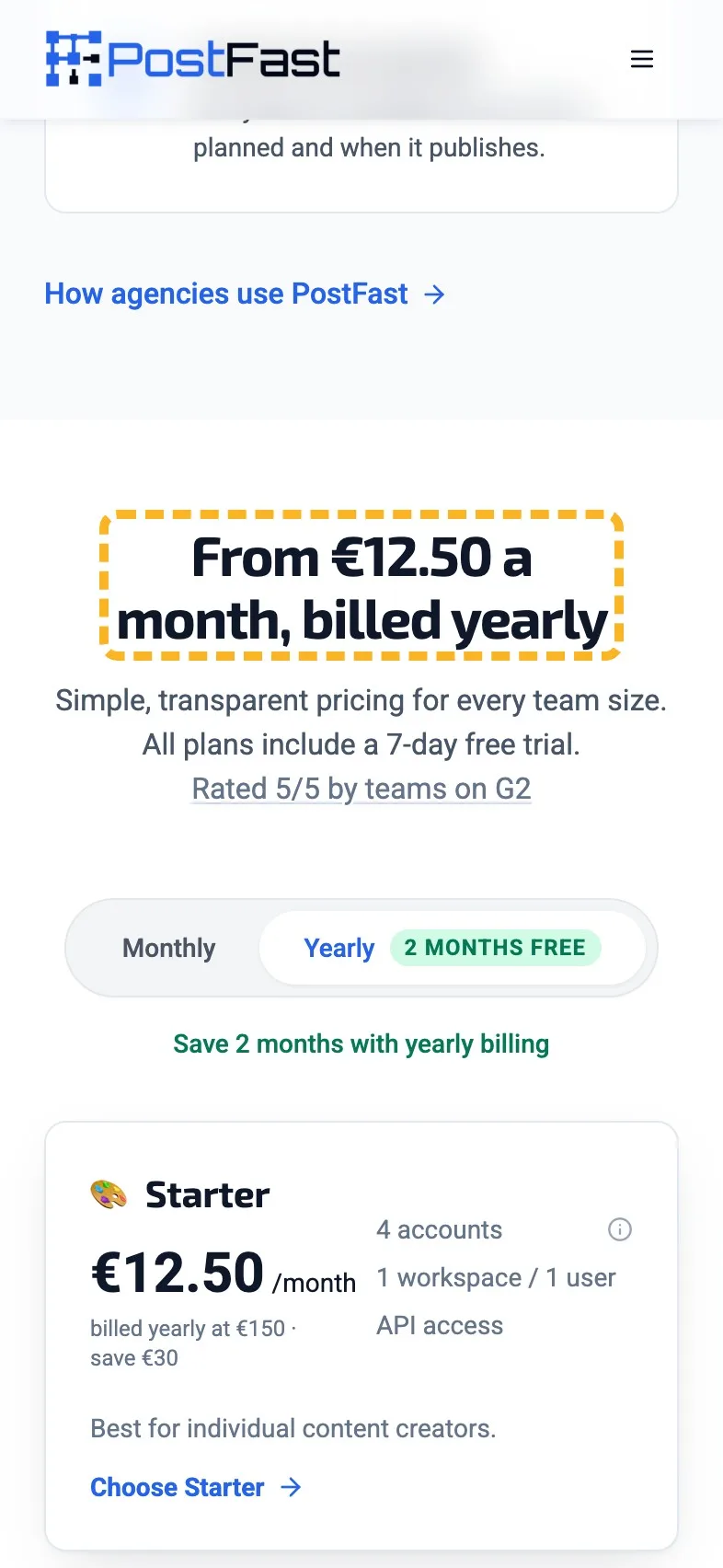
Pricing is clear once you're in it. Five plans, each with who it's best for, a yearly saving in euros as well as months and one marked most popular. I wouldn't cut a plan, because the "Best for" lines do the sorting a buyer would otherwise have to do (there's more on how many pricing plans to show). The heading is just "Pricing", though, and the lowest price, €12.50 a month billed yearly, is the number a careful buyer scrolls down for.
- Current
Pricing
Magpie recommends
From €12.50 a month, billed yearly
Why it works. It leads with the lowest price and says how it's billed.
How the brand comes across#
Most of the page sounds like a person who has run social accounts. A few lines lower down slip into stock phrases, and they stand out because the rest is so particular.
- Builds it
“Nothing publishes until you approve.”
Five words that answer the fear of a bot posting for you.
- Builds it
“Connect links, not passwords”
Plain and specific, it tells an agency exactly what it avoids.
- Costs it
“Learn how to schedule and manage all your social media content in minutes with our powerful yet simple platform.”
Powerful yet simple could sit on any software page at all.
- Costs it
“We pride ourselves on offering the most competitive and fair pricing in the market for the value provided.”
A claim with no number beside a pricing table that has plenty.
The search description runs long#
The search title fits Google's results whole, but the description runs past the width Google shows, so the list of networks gets cut mid-flow. Google writes its own snippet when it likes, though a description it can use whole gives it the best chance of showing yours (Google Search Central (opens in a new tab)). The title is fine as it is, and Google's guidance for those is to keep them distinct and descriptive (Google Search Central (opens in a new tab)).
- Could be better
The search description runs past Google's width.
Keep the hours saved, name four networks, then say how many more.
I've written up a Google title and description that show whole in more detail.
What I can't judge from outside#
I can't see how many visitors start a trial, which plan they pick, or what the team has already tested. With a first screen this strong, I'd start with the headings lower down, where the page's best facts are sitting a line too low.
Sources
About the author
Alex · Founder of Magpie AI
Alex founded Magpie AI and writes about turning a site's visitors into customers