Screen Charm landing page teardown

Alex · Founder of Magpie AI
Published · 4 min read
A teardown of Screen Charm (opens in a new tab), as it was on 20th Nov 2026. I publish these to teach, never to knock the makers. Magpie AI isn't installed on their site, so its engine has only worked from public-facing data.
In short
Screen Charm's headline and pricing are clear. I'd name who loves it, swap a generic heading for what the app does, and pick quotes that say what people made with it.
Contents
- What Screen Charm gets right
- Call to action
- Loved by founders needs a name or a number
- A heading that says what the app does
- An editor heading that names the saving
- Testimonials that say what people made
- Put the price in the pricing heading
- How the brand comes across
- The search title runs long
- What I can't judge from outside
What Screen Charm gets right#
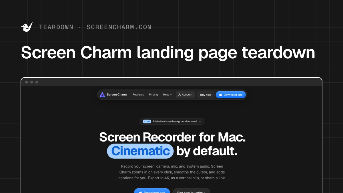
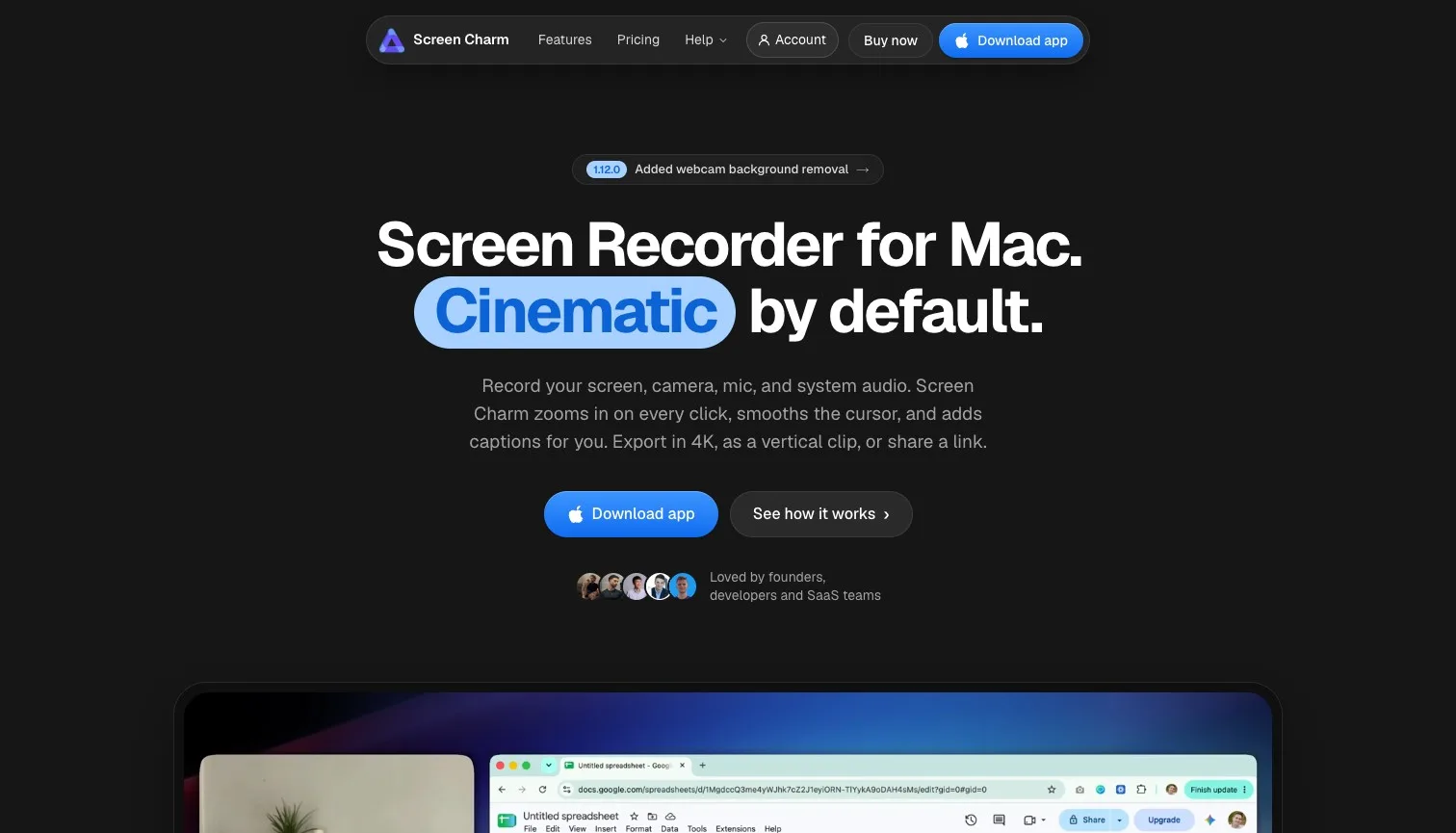
Screen Charm is a screen recorder for Macs, and its first screen says so before anything else: "Screen Recorder for Mac. Cinematic by default." names the product and its edge in seven words, the line under it lists exactly what the app does to a recording, and on a laptop almost all the strongest attention lands on the headline and the button. That's a first screen I'd struggle to improve, ducks in a row from the first word.
- Works
The headline names the product and its edge in seven words.
Keep it. A stranger knows what this is at a glance.
- Works
Pricing shows both plans, every feature and the yearly saving.
With every feature on every plan, the only choice left is how to pay.
- Works
The founder, Sergey, says why he built it.
A named maker with a reason makes a small app feel safe to buy.
Call to action#
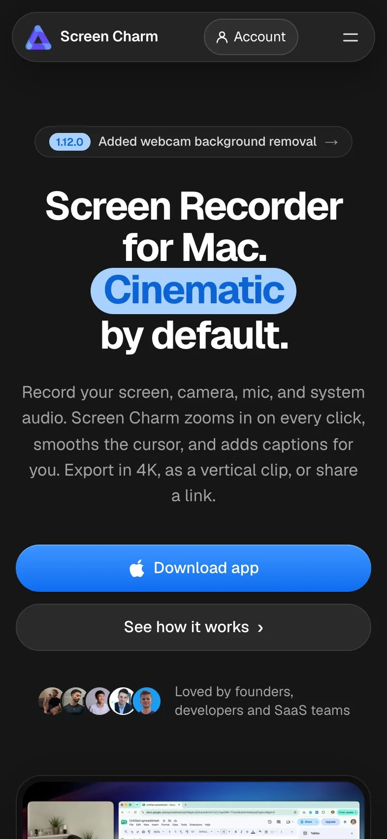
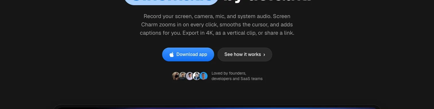
"Download app" is plain and right for a Mac app, and on a phone it does something thoughtful: instead of a download that can't work there, it scrolls to a form that emails you the link. Two things hold it back. Its white label on blue is harder to read than it looks, and on a phone there's a long stretch of features and examples with no button in sight.
Magpie measured
- 3.8:1 contrast, 4.5:1 needed
- 48px tall on mobile
- Filled, so it reads as the main action
- A second button as bold beside it
- Up to 14 screens between buttons
- Needs work
White on blue measures 3.8:1, under the 4.5:1 text needs.
Darken the blue a shade, just until the label reaches 4.5:1.
- Could be better
On a phone, 14 screens pass with no button in sight.
Add a download button after the features, where interest peaks.
- Works
On a phone it scrolls to a form that emails the link.
A phone visitor gets a step that works on a phone.
Loved by founders needs a name or a number#
Under the button sits a row of faces and "Loved by founders,developers and SaaS teams". It's the first proof a visitor meets, and it names nobody and counts nothing. I think it's the easiest win on the page, because the proof already exists further down: posts from named makers in the showcase and quotes with their handles.
- Could be better
The proof under the button names no one and gives no number.
Name two customers by their product, or give a count you can stand behind.
There's more on why customer logos and names do more than a general claim.
A heading that says what the app does#
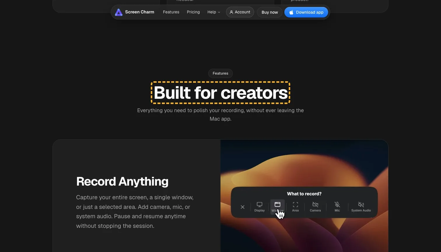
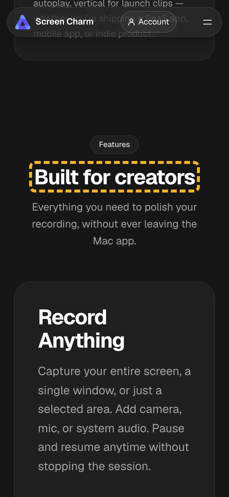
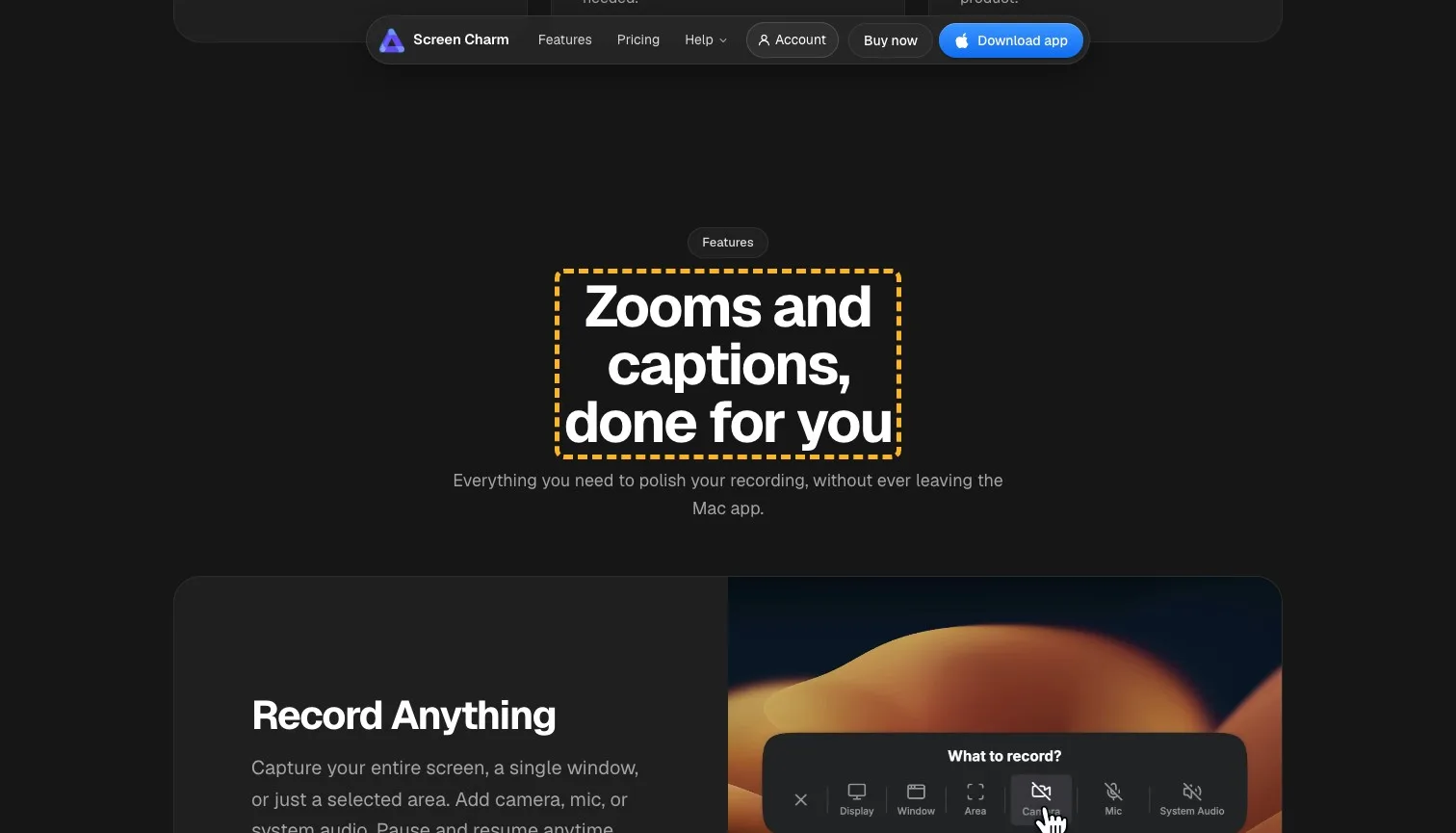
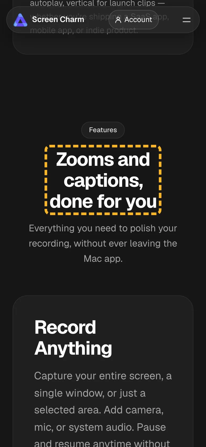
The features section opens on "Built for creators", a label that could head almost any app's features. The section underneath is specific and good: auto-zoom on every click, captions from your narration, a smoothed cursor. The heading can carry that.
 Current
Built for creators
Magpie recommends
Zooms and captions, done for you
Why it works. It swaps a label any app could use for two things this one does.
An editor heading that names the saving#
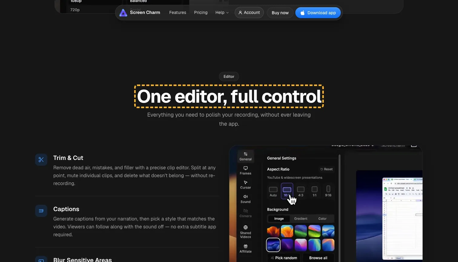
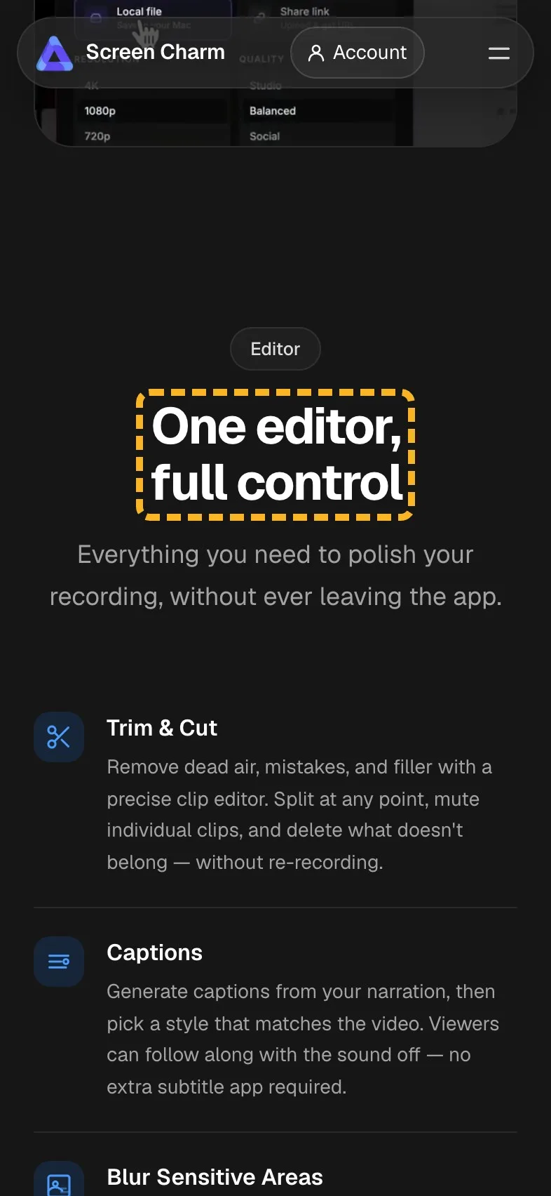
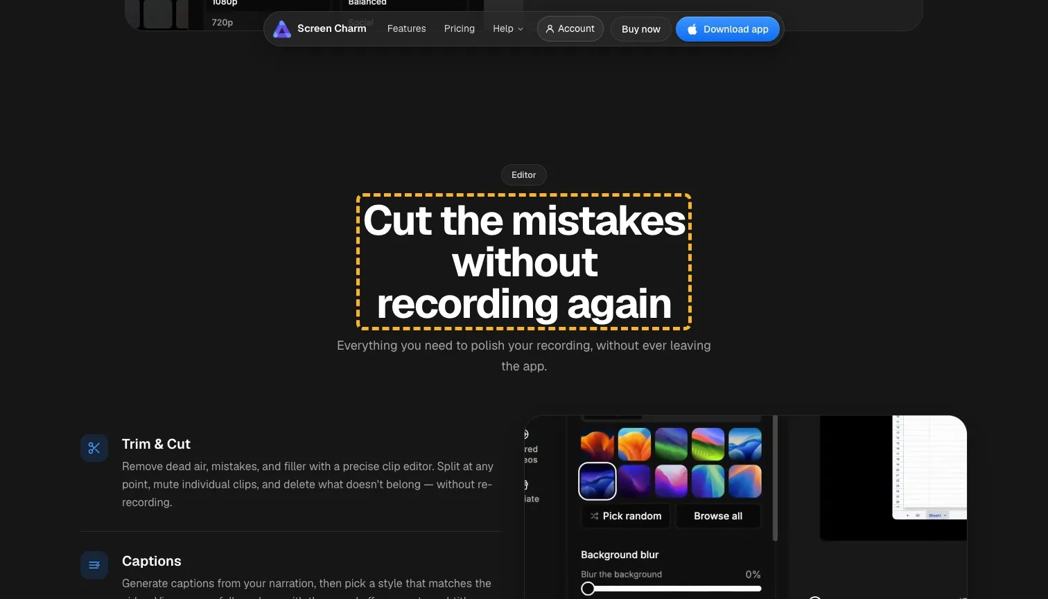
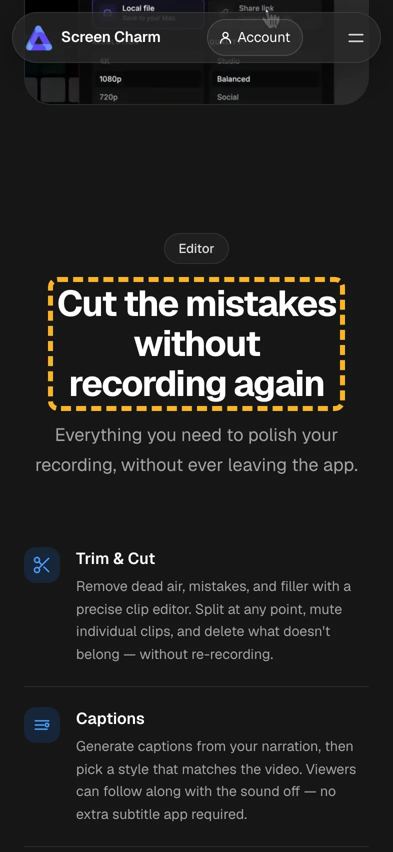
The editor section's first card says the thing a creator most wants to hear: remove dead air and mistakes "without re-recording". The heading above it, "One editor, full control", says far less. Full control is a phrase any editing app could use, and the card underneath has the better line.
- Current
One editor, full control
Magpie recommends
Cut the mistakes without recording again
Why it works. It lifts the editor's best promise from its first card into the heading.
Testimonials that say what people made#
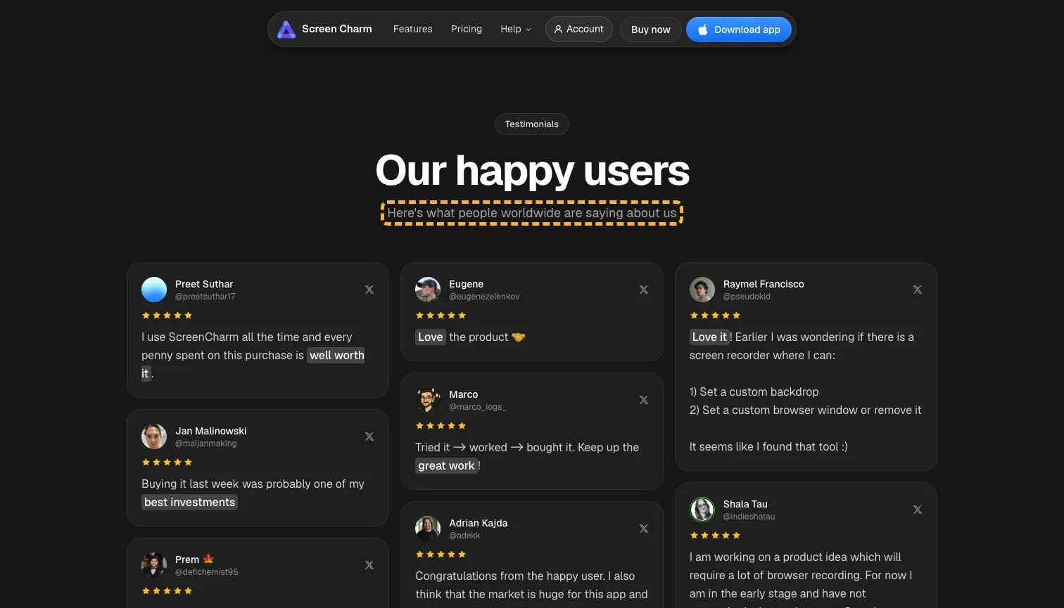
The quotes are warm, with names and handles. They praise the purchase rather than the result, though: "every penny spent on this purchase is well worth it" and "Buying it last week was probably one of my best investments". A buyer can't picture their own video from either. I'd ask for one line on what each person recorded, and the showcase section already holds exactly that kind of proof. Testimonials that name a result beat general praise.
- Could be better
The quotes praise the purchase, not what people made.
Ask each for one line on what they made, and link the post it came from.
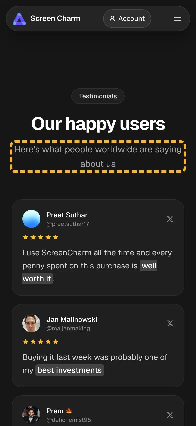
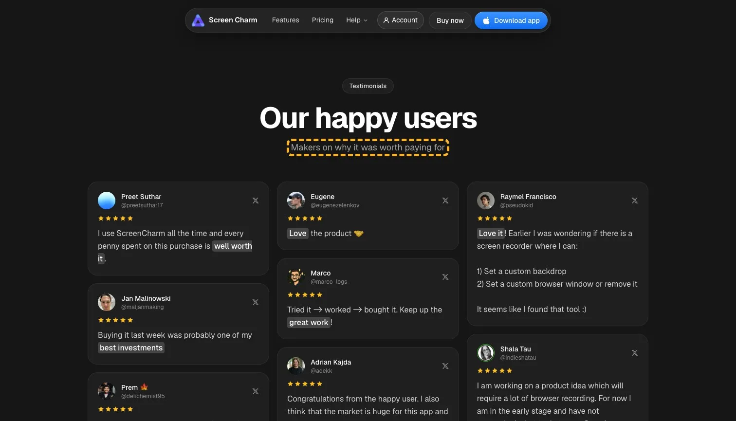
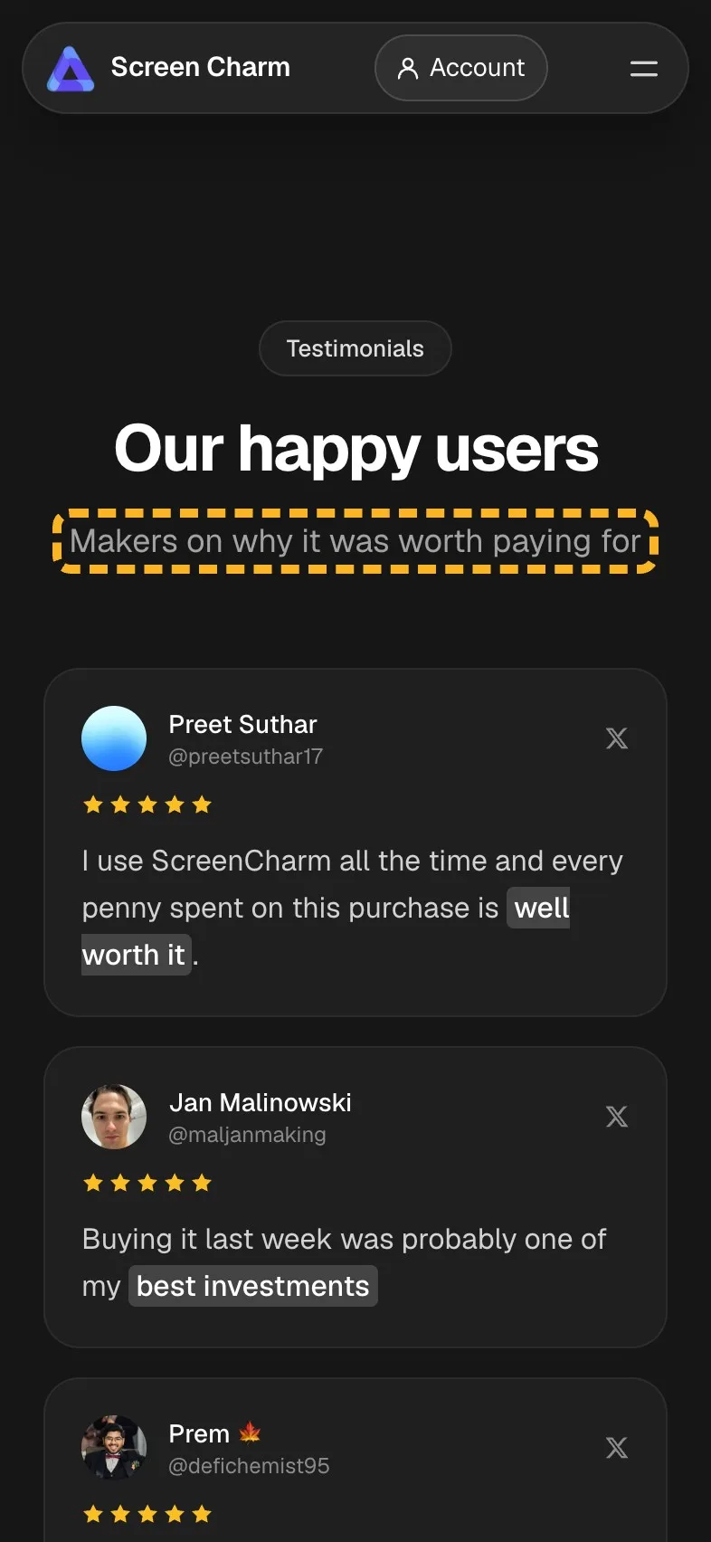
- Current
Here's what people worldwide are saying about us
Magpie recommends
Makers on why it was worth paying for
Why it works. It says what the quotes prove before anyone reads them.
Put the price in the pricing heading#
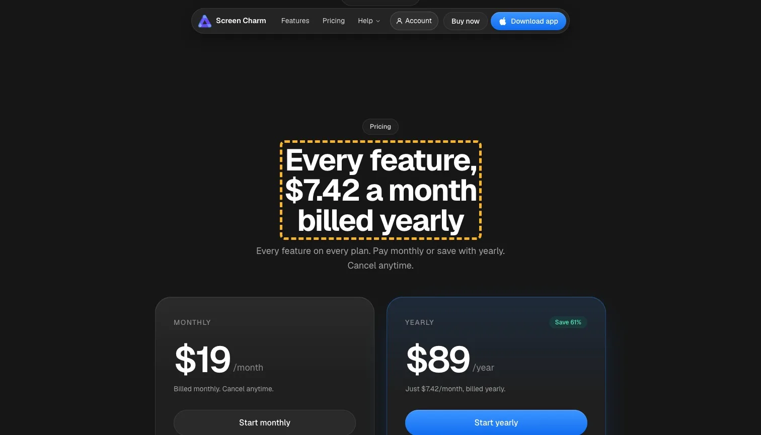
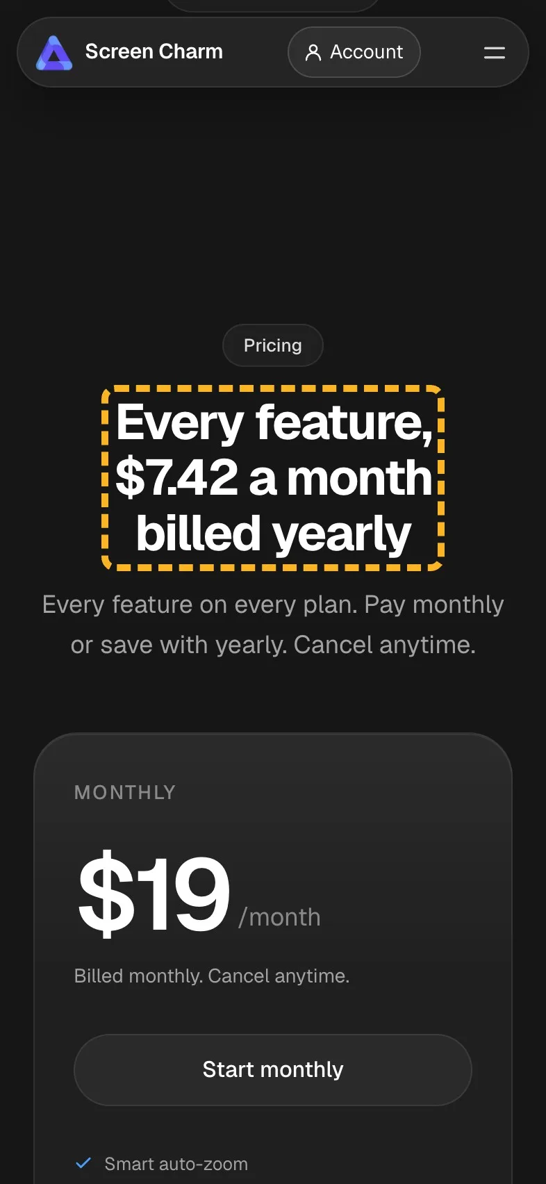
The pricing section is already one of the best parts of the page, as I said up top. Its heading, "Simple pricing", is the only part that says nothing. The yearly plan works out at $7.42 a month, which is the number a careful buyer is looking for, and it's sitting in small type under $89.
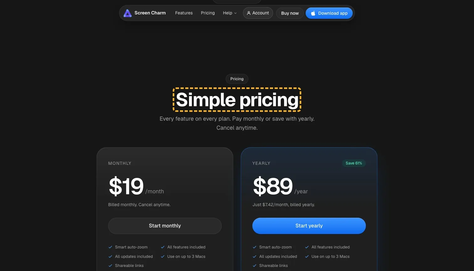
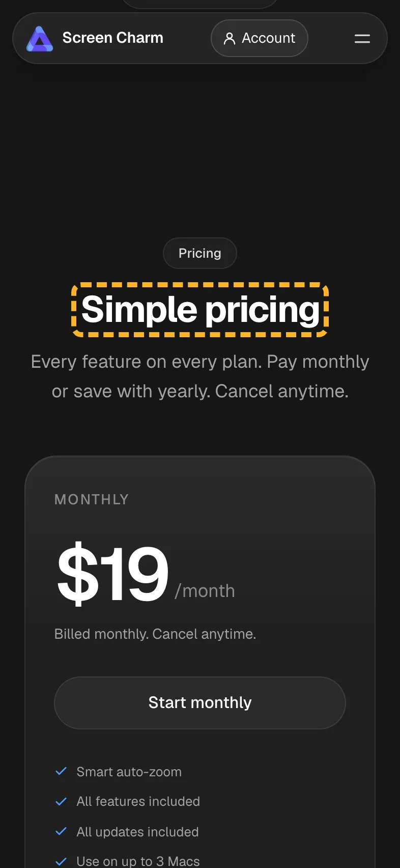
- Current
Simple pricing
Magpie recommends
Every feature, $7.42 a month billed yearly
Why it works. It leads with the lowest price and says how it's billed.
The line under it already starts with "Every feature on every plan", so in the real build I'd trim that to its last two sentences.
How the brand comes across#
The founder's note under the questions is the most human part of the page, and the share links section has the same plain confidence. One line in the testimonials sounds like any template.
- Builds it
“I'm creating Screen Charm to help makers pursue their dreams.”
A named founder with a reason reads as someone who'll answer your email.
- Builds it
“Your viewer gets a link. No account, no download, no friction.”
Short and plain, it sounds like the product it describes.
- Costs it
“Here's what people worldwide are saying about us”
Stock filler beside a founder who writes so personally.
The search title runs long#
Google cuts the page's title and description to fit its results, and both run past that width here, so a searcher sees neither whole. Google's own guidance is to keep a title distinct and descriptive (Google Search Central (opens in a new tab)).
- Could be better
The search title and description both run past Google's width.
Drop the captions from the title and cut the description to one sentence.
I've covered writing a Google title and description that show whole.
What I can't judge from outside#
I can't see how many visitors download, which plan they pick or any test the team has run. The first screen is strong enough that I'd start with the proof lower down.
Sources
About the author
Alex · Founder of Magpie AI
Alex founded Magpie AI and writes about turning a site's visitors into customers