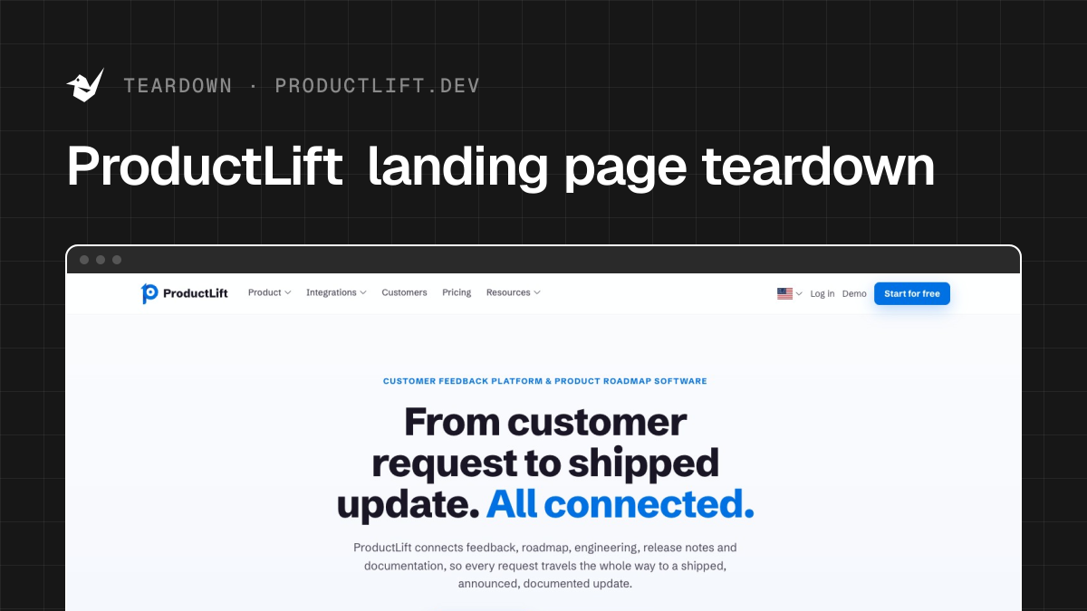
ProductLift landing page teardown

Alex · Founder of Magpie AI
Published · 4 min read
A teardown of ProductLift (opens in a new tab), as it was on 21st Nov 2026. I publish these to teach, never to knock the makers. Magpie AI isn't installed on their site, so its engine has only worked from public-facing data.
In short
ProductLift's first screen is one of the clearest I've checked. I'd shorten the line under the headline, keep the chat greeting off the phone's trial button and give three headings their facts.
Contents
What ProductLift gets right#
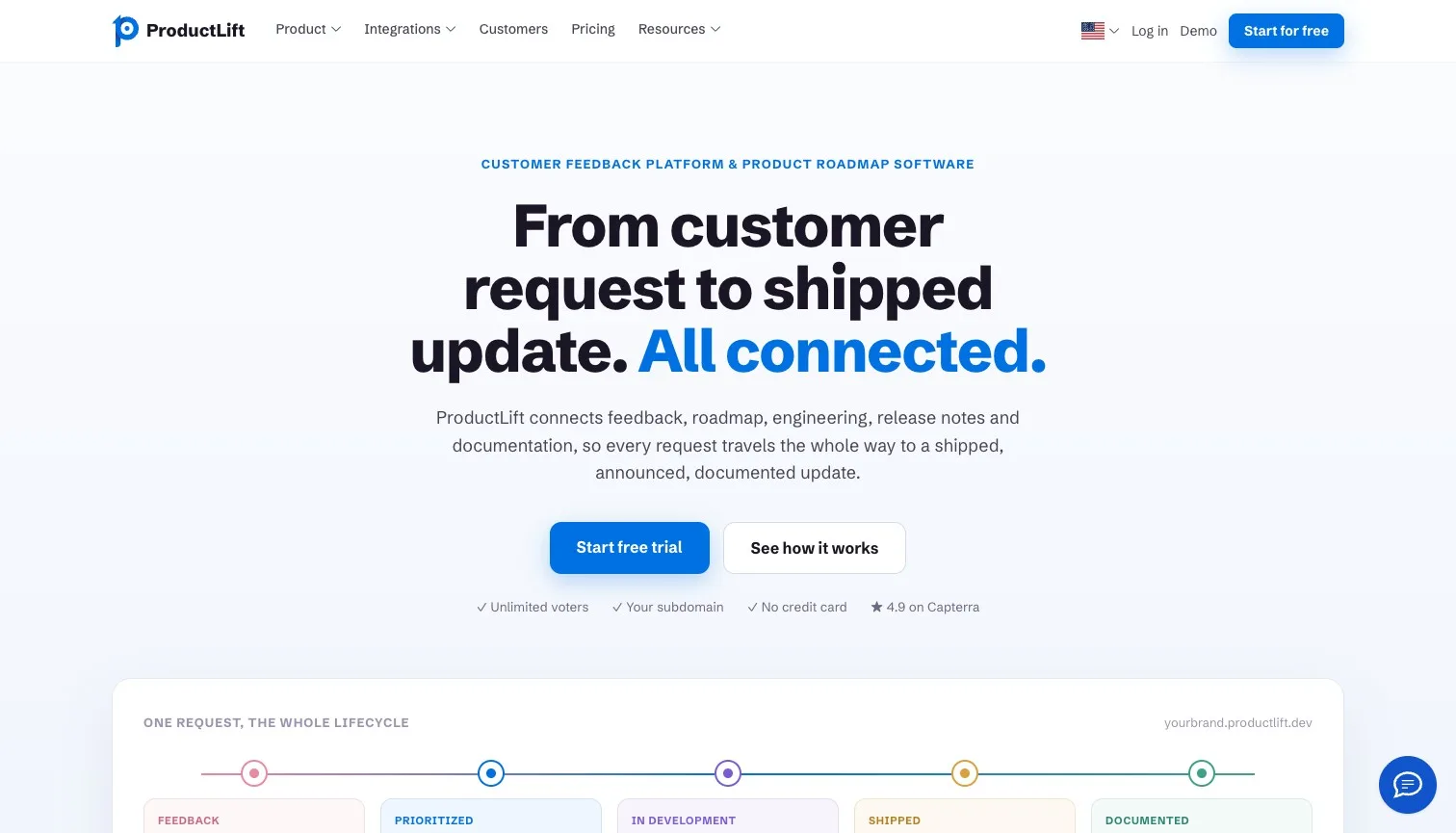
ProductLift collects customer feedback, turns it into a roadmap that syncs with Jira, and tells voters when their request ships. Its first screen is the tidiest I've looked at in a while. On a laptop, every bit of the strongest attention lands on the headline and the trial button, and nothing else on the screen competes. Under the button sit four short facts a buyer checks before trying anything: unlimited voters, your own subdomain, no credit card, and 4.9 on Capterra. Further down, the reviews name the tools people switched from, which is the doubt a buyer in this market really has. That's a feather in its cap.
- Works
The laptop's strongest attention all falls on the pitch.
Keep the first screen this bare. It's doing its job.
- Works
Four facts under the button answer the first doubts.
No credit card and unlimited voters are the ones a buyer checks first.
- Works
Two reviews name the tool the customer switched from.
A switcher's word reads as a real comparison, so keep them near the top.
Call to action#
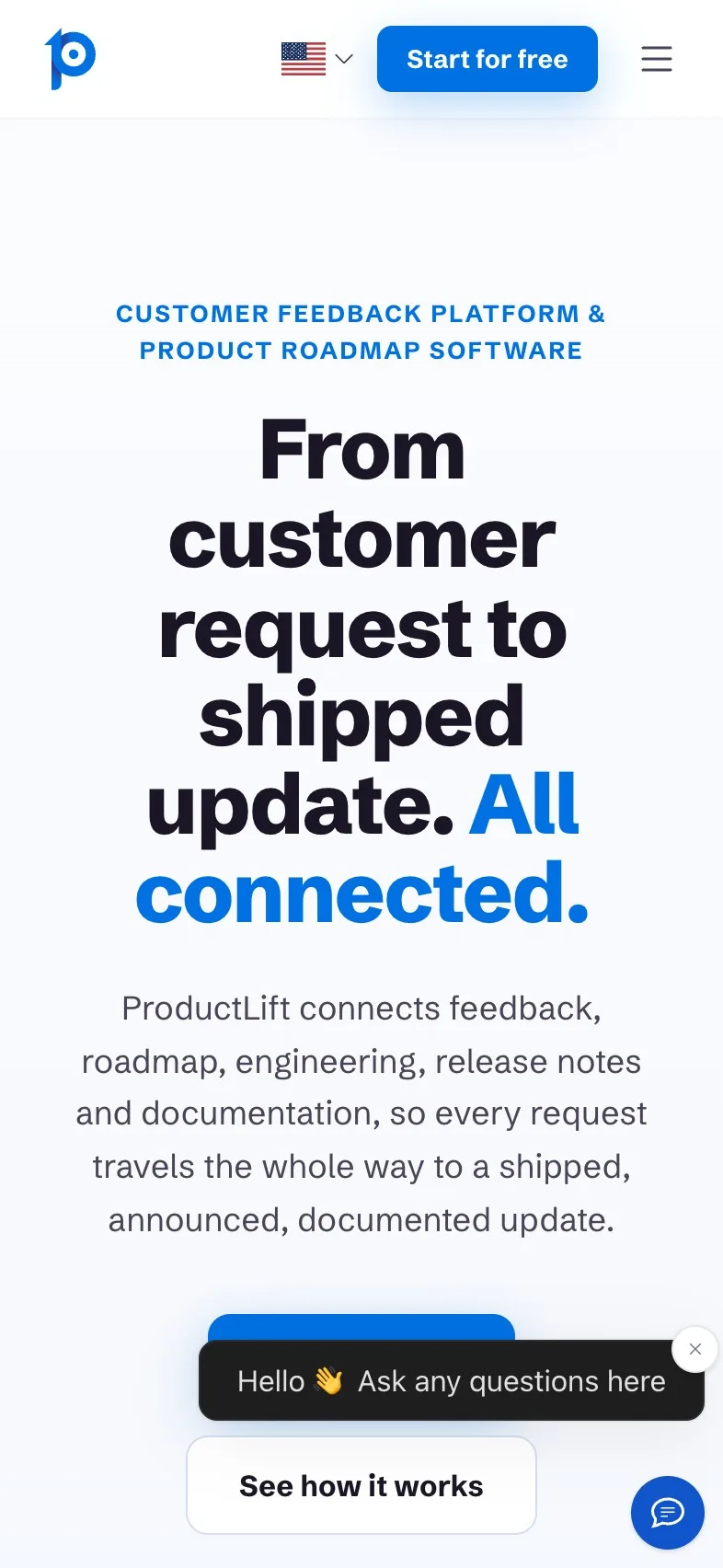
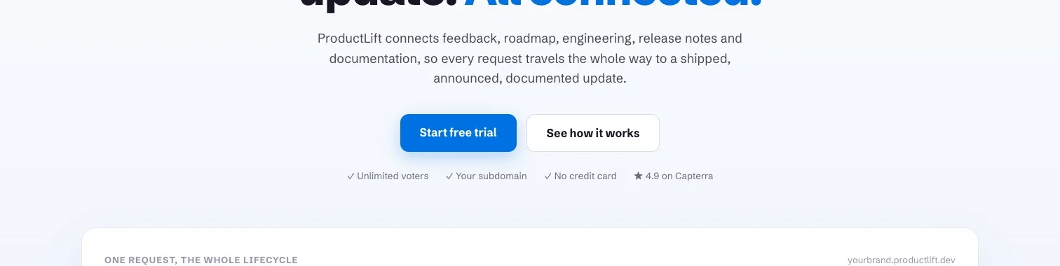
"Start free trial" is filled in the brand's blue, 52px tall on a phone and 4.70:1 against 4.5:1 needed, with "See how it works" beside it for anyone not ready. A button stays in the header as you scroll, so the longest stretch without one in the page itself, almost ten screens, never leaves a visitor stranded. Two small things. The header's button words differ from "Start free trial" on the main one, two names for one step. And on a phone, in my capture, the chat's greeting popped up right over the trial button at the foot of the first screen, so the one thing the screen builds up to was hidden behind a hello.
Magpie measured
- 4.7:1 contrast, 4.5:1 needed
- 52px tall on mobile
- Filled, so it reads as the main action
- A second button as bold beside it
- One stays in view down the page
- Needs work
On a phone, the chat greeting covers the trial button.
Hold the greeting back a few seconds, or open it from the corner bubble alone.
- Could be better
The header and main button name the same step two ways.
Use "Start free trial" in both, so a visitor knows it's one action.
The heatmap shows how little else pulls at the eye on a laptop. The small line above the headline takes some of it, more than the button does.
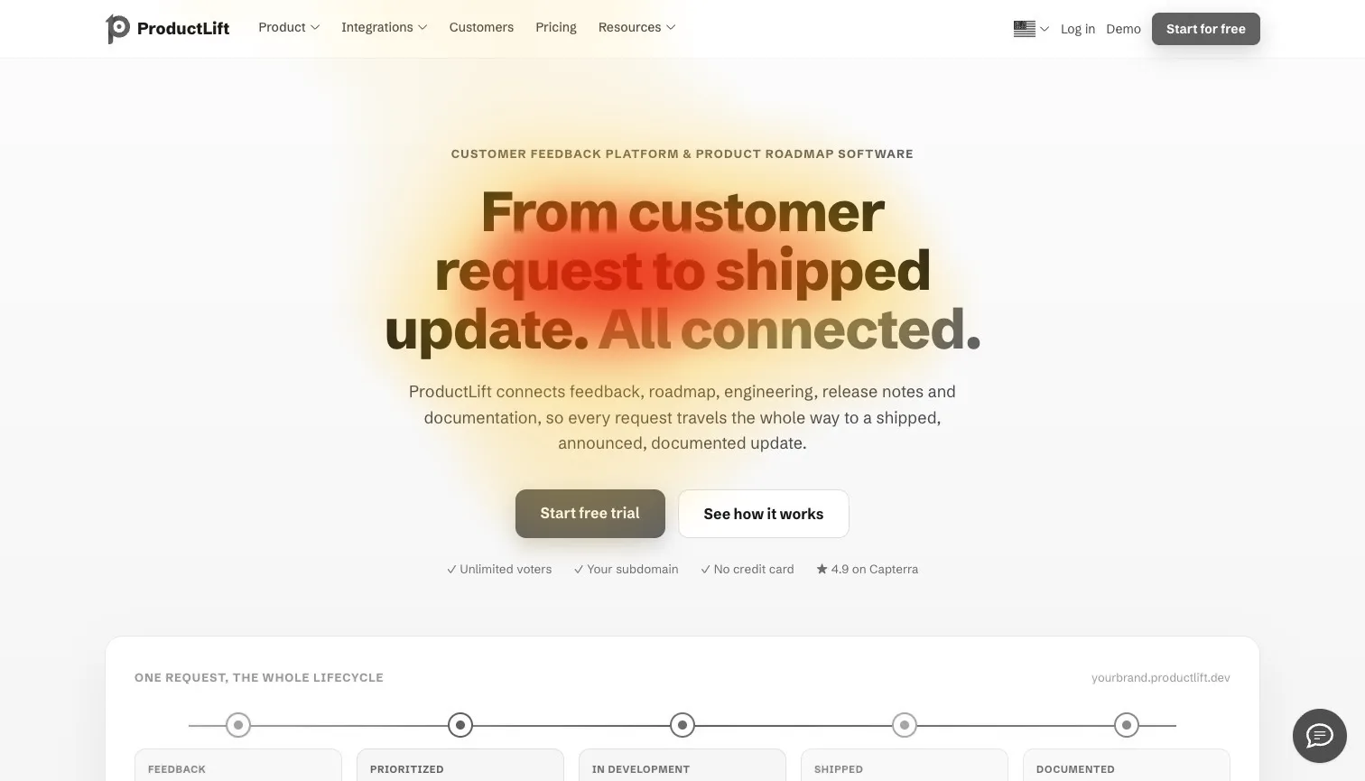
100% of the strongest attention lands on the headline and main button
Shorten the line under the headline#
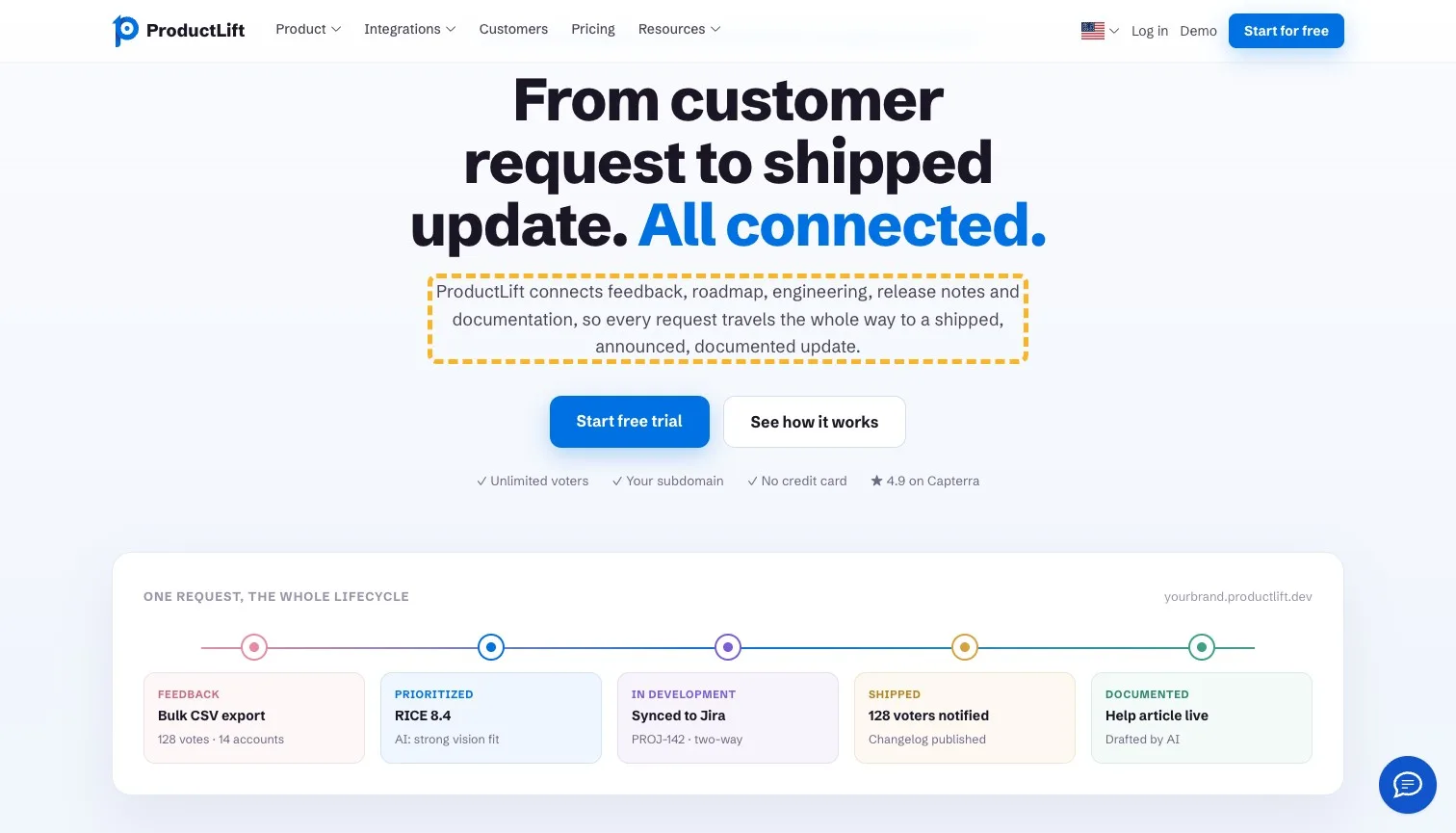
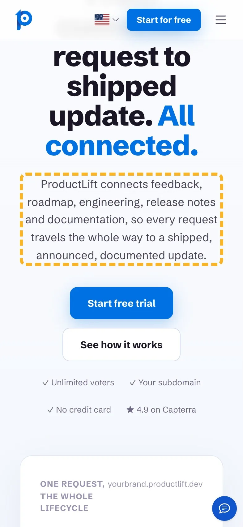
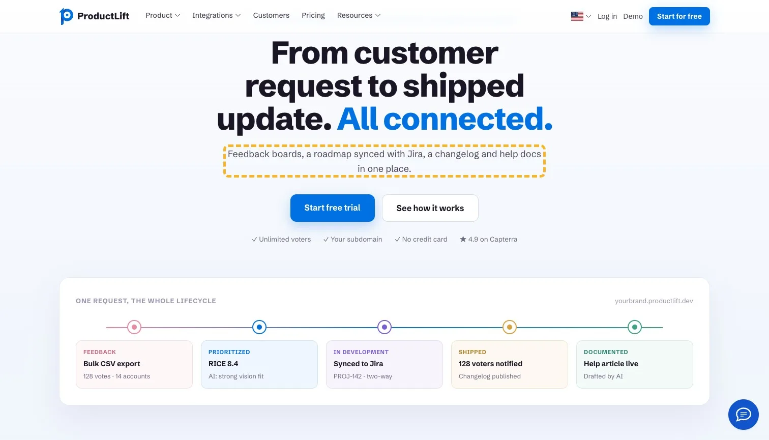
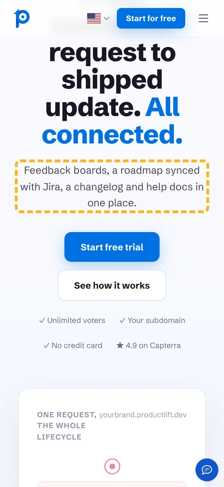
The line under the headline lists five modules and three past participles: "shipped, announced, documented". On a laptop it runs to three lines. On a phone it's five, and it pushes the trial button down to the screen's edge. Nielsen found people read about 20% of a page's words on an average visit (Nielsen Norman Group, 2008 (opens in a new tab)), so this line gets one glance. A shorter one keeps the facts a buyer looks for, the Jira sync above all, and gives the button its room back.
 Current
ProductLift connects feedback, roadmap, engineering, release notes and documentation, so every request travels the whole way to a shipped, announced, documented update.
Magpie recommends
Feedback boards, a roadmap synced with Jira, a changelog and help docs in one place.
Why it works. It keeps the four modules and Jira, in half the words.
Put the revenue in the feedback heading#
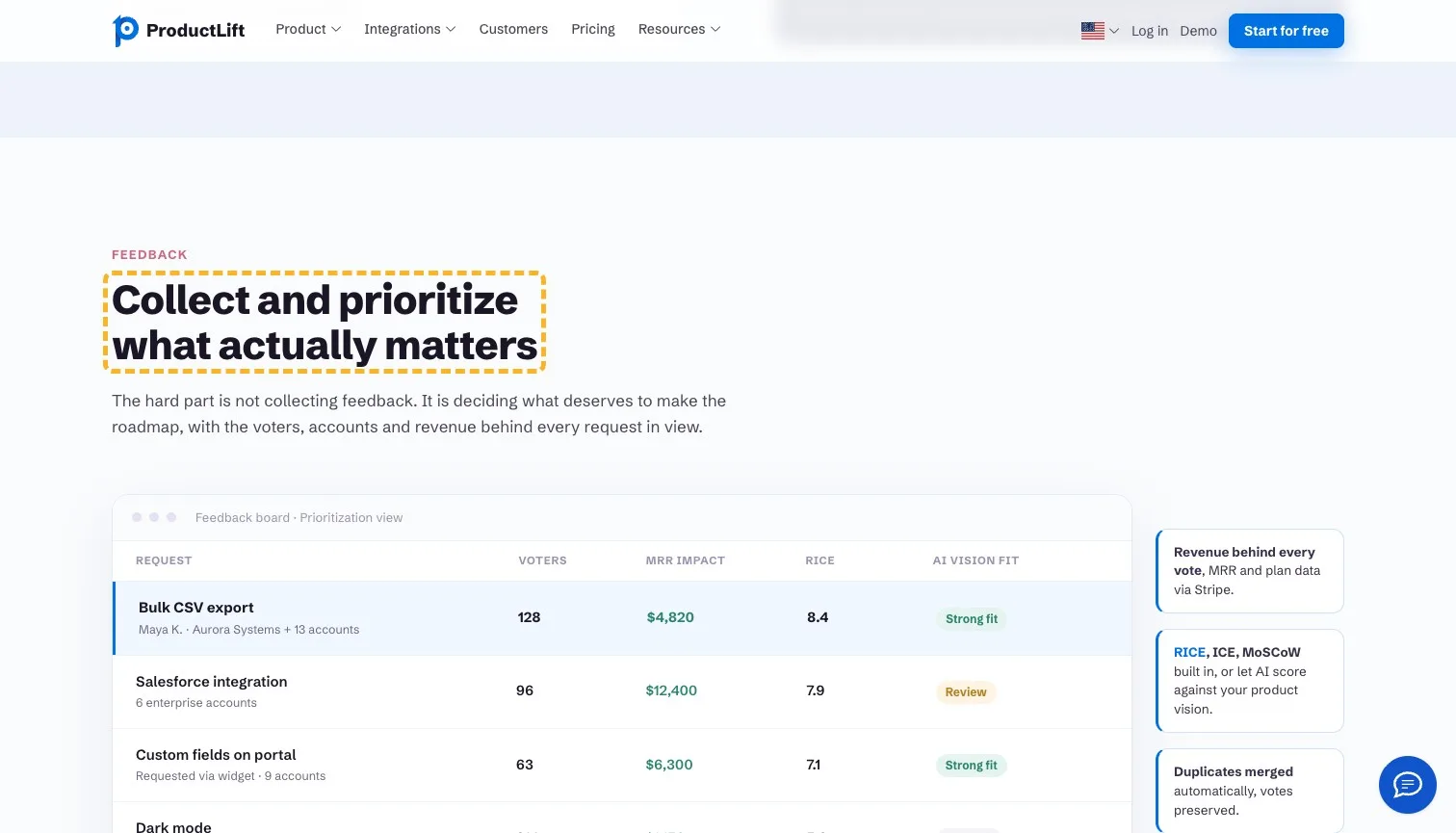
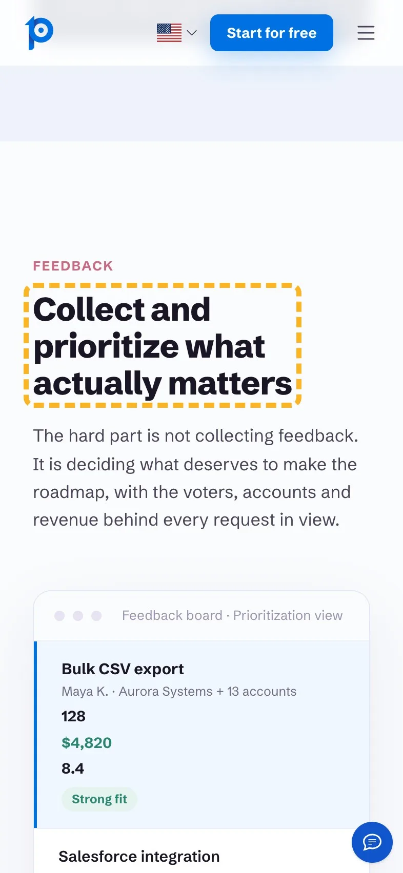
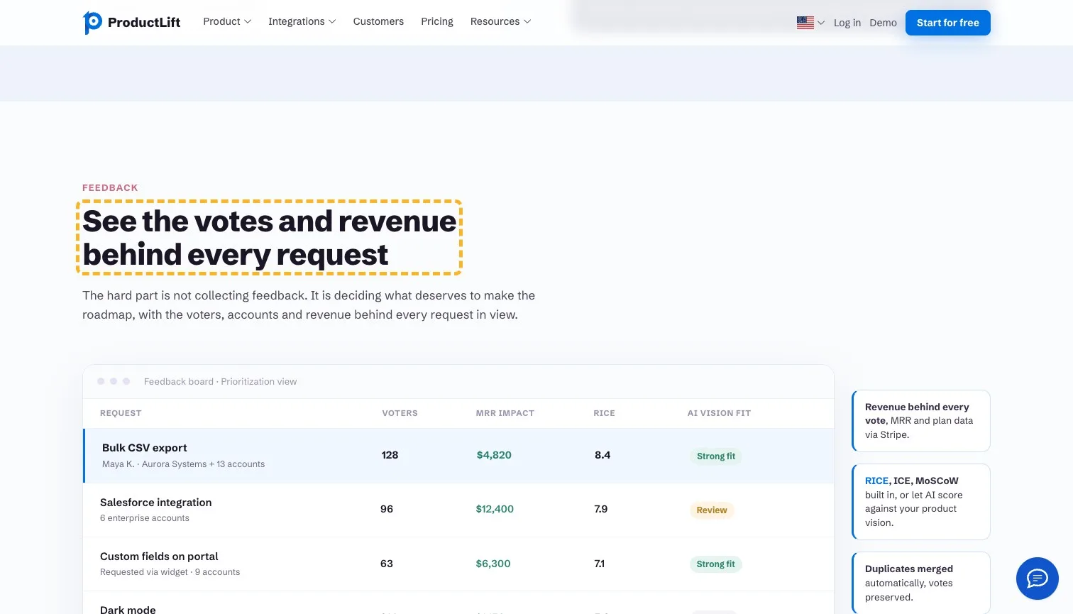
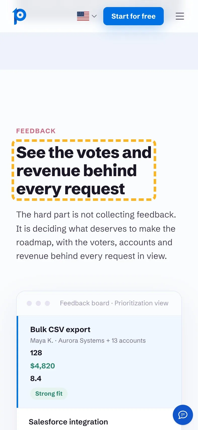
The feedback heading asks you to collect what matters, which any feedback tool could say. The table under it is the interesting part: every request with its voters, the revenue behind it from Stripe, and a score. That revenue column is what sets ProductLift apart from a plain voting board, so the heading should say it.
- Current
Collect and prioritize what actually matters
Magpie recommends
See the votes and revenue behind every request
Why it works. It names the revenue column, the thing a voting board can't show.
Name Jira in the roadmap heading#
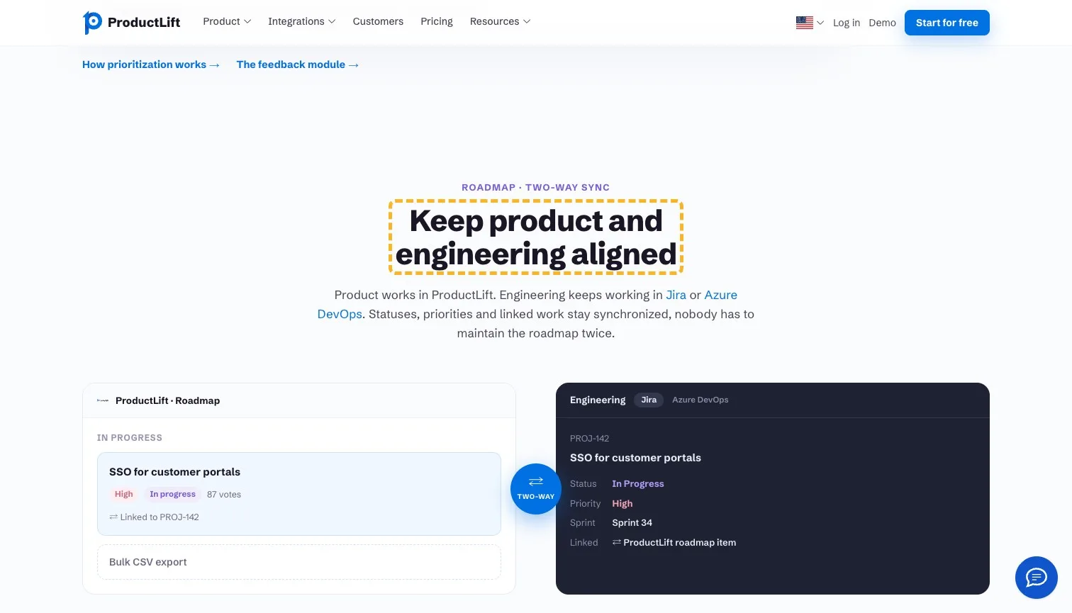
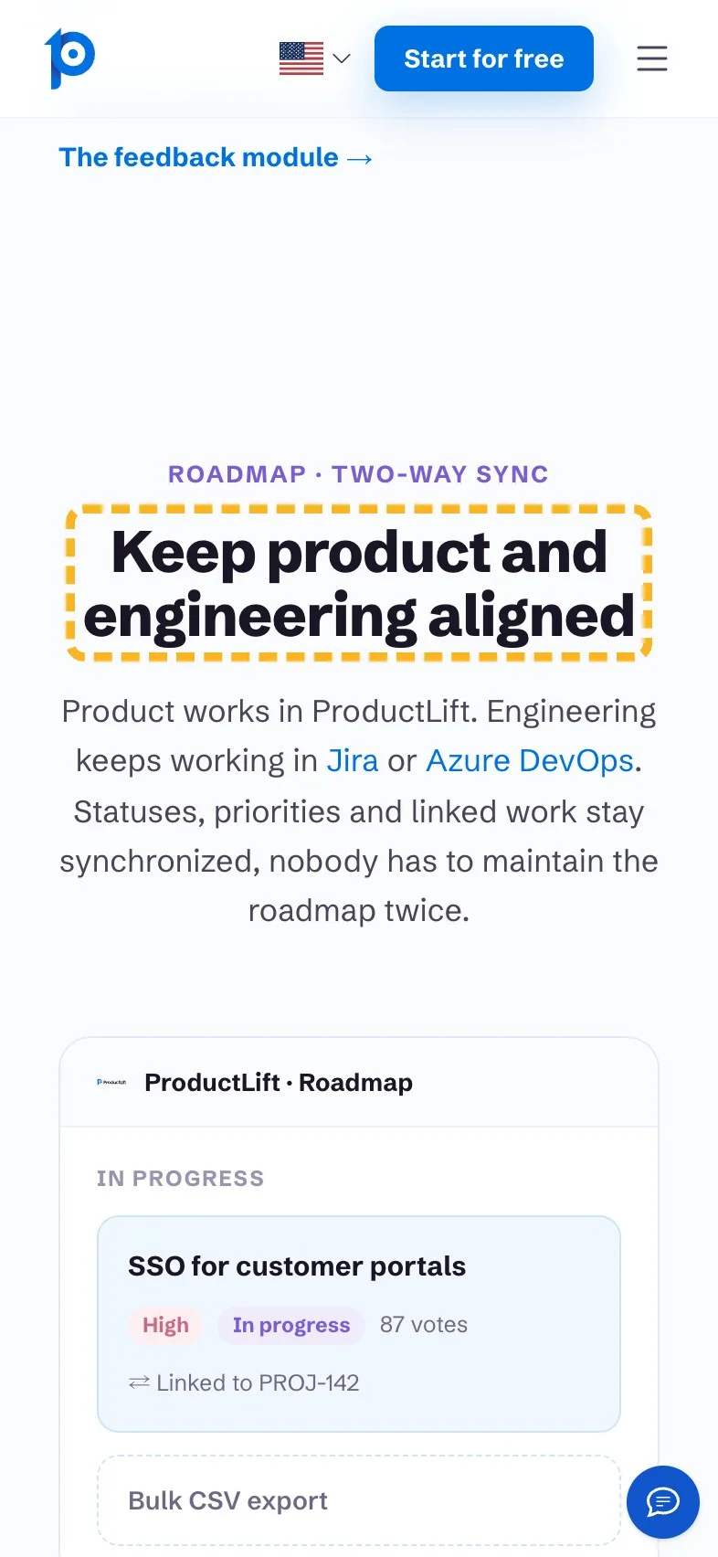
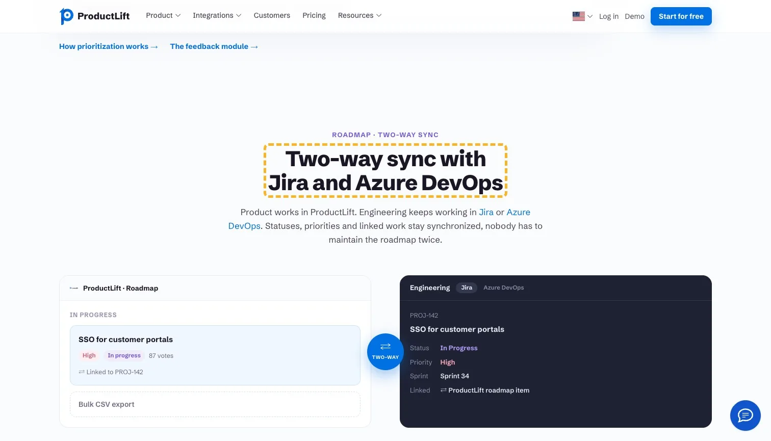
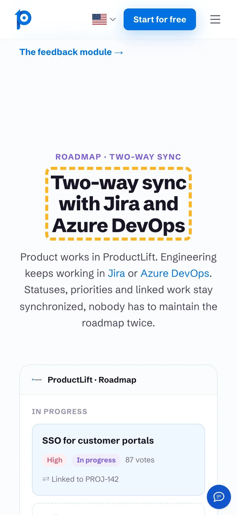
"Keep product and engineering aligned" is a goal every product team already has. The facts sit in the line under it: engineers keep working in Jira or Azure DevOps, and statuses and priorities sync both ways. A buyer whose team lives in Jira is looking for exactly those two words, so I'd lift them into the heading where a skimmer will spot them.
- Current
Keep product and engineering aligned
Magpie recommends
Two-way sync with Jira and Azure DevOps
Why it works. A Jira team finds the one fact they need without reading on.
Say who hears when it ships#
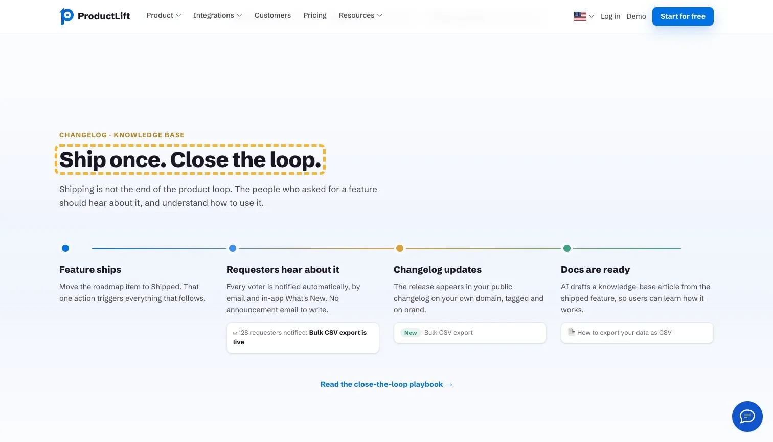
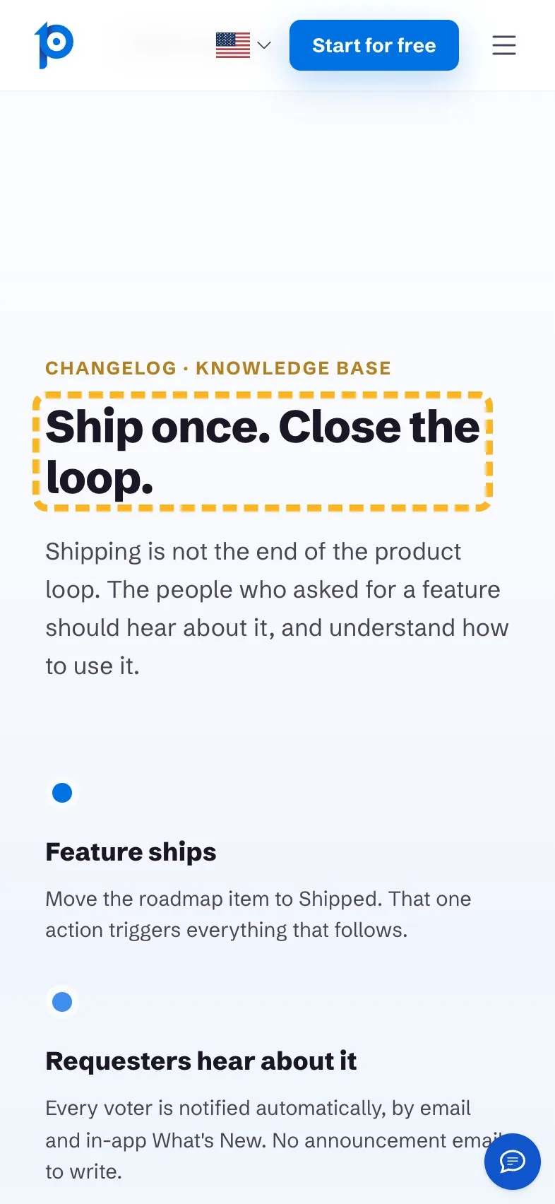
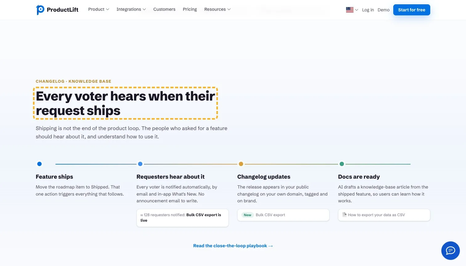
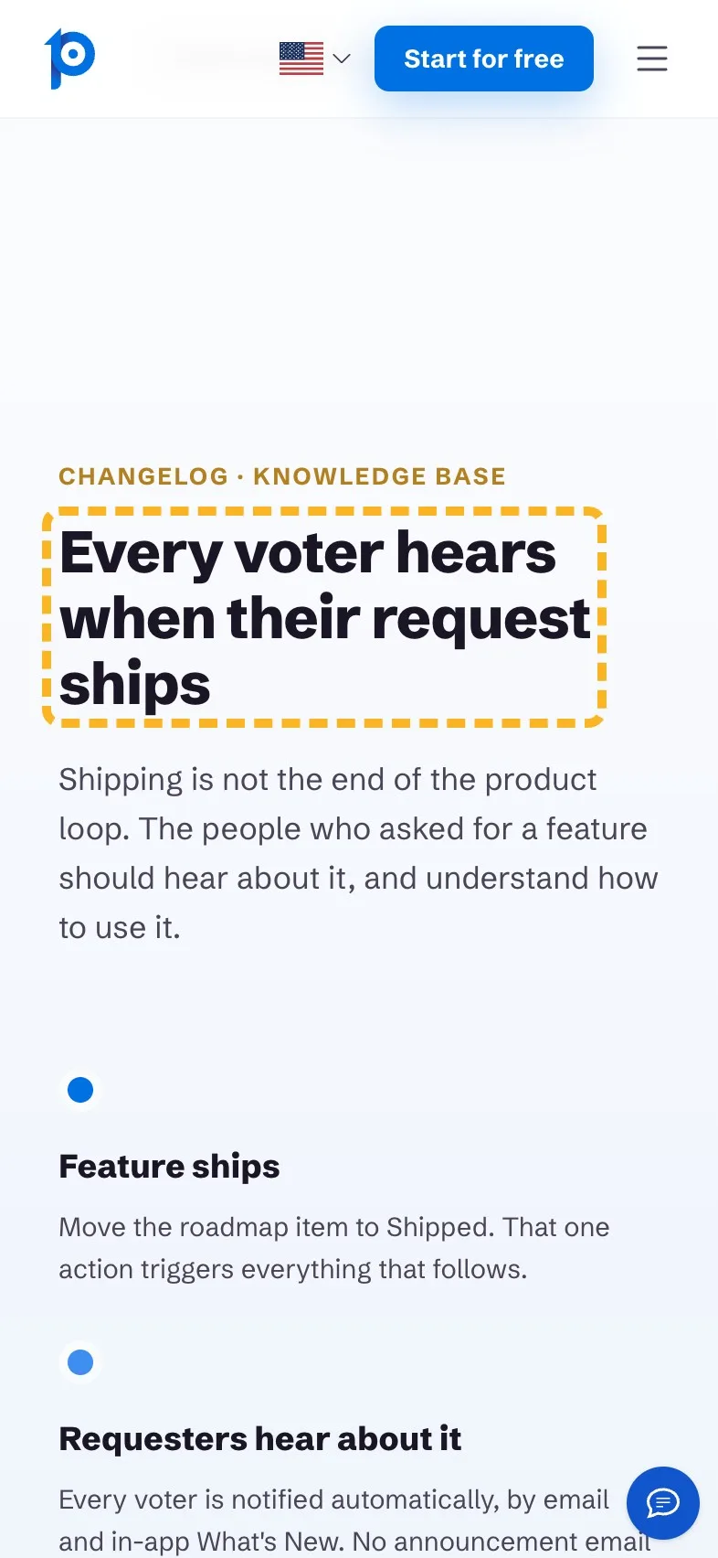
"Ship once. Close the loop." is neat, but "close the loop" is product-team shorthand. What happens is plainer and better: everyone who voted for a request is emailed when it ships, with no announcement to write. People trust what they can picture (Nielsen Norman Group, 2016 (opens in a new tab)), and a voter getting the email is easy to picture.
- Current
Ship once. Close the loop.
Magpie recommends
Every voter hears when their request ships
Why it works. It says what happens and to whom, in the voter's own terms.
How the brand comes across#
ProductLift writes like someone who has sat in a backlog meeting. Most lines are specific and plain; one reads like any roadmap tool's.
- Builds it
“Your customer base can grow without turning product communication into a per-user tax.”
It names a real fear about pricing and answers it in one go.
- Builds it
“Move the roadmap item to Shipped. That one action triggers everything that follows.”
Short and exact, and it shows how little work the loop takes.
- Costs it
“6,035+ product teams gather feedback and ship features customers actually want.”
Features customers actually want is a phrase any rival could print.
What I can't judge from outside#
I can't see how many visitors start a trial, how often the chat greeting covers the button on a real phone, or what the team has already tested. The first screen is the hard part and it's done. I'd start with the phone: the greeting, then the line under the headline.
Sources
About the author
Alex · Founder of Magpie AI
Alex founded Magpie AI and writes about turning a site's visitors into customers