Juicy landing page teardown

Alex · Founder of Magpie AI
Published · 4 min read
A teardown of Juicy (opens in a new tab), as it was on 20th Nov 2026. I publish these to teach, never to knock the makers. Magpie AI isn't installed on their site, so its engine has only worked from public-facing data.
In short
Juicy's page is one of the best I've looked at. I'd change three things: a headline that says what you get, one fewer beautiful, and a step to take on a phone's first screen.
Contents
What Juicy gets right#
Juicy is a battery app for Macs, sold by one developer, and the page does more right than most I've looked at: an Apps We Love badge from Apple, a 4.9 from 200+ ratings and 10,000+ downloads all sit by the button, and one-off pricing with a 14-day money-back guarantee takes most of the risk out of trying it. Ratings and review badges work best when they link to their source, so I'd point the 4.9 at the store page it comes from.
- Works
A 4.9 rating, 10,000+ downloads and Apple's pick by the button.
Proof sits right where a visitor decides, so keep it by the button.
- Works
Pricing is pay once, with a 14-day money-back guarantee.
Paying once takes away the worry of one more subscription.
- Works
Its search title and description fit Google's results.
Searchers read the whole promise before they click.
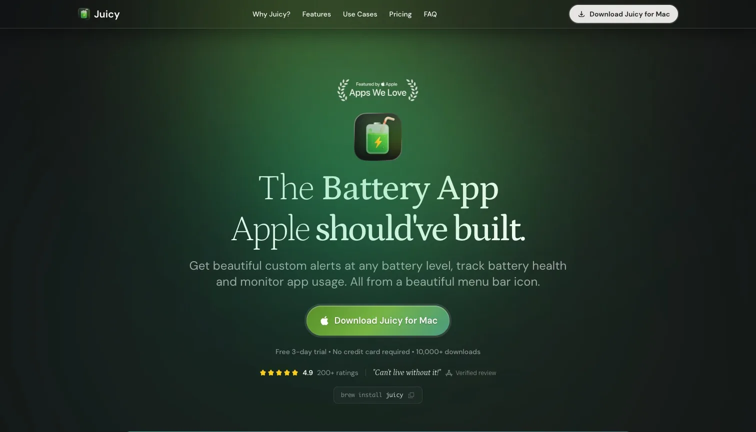
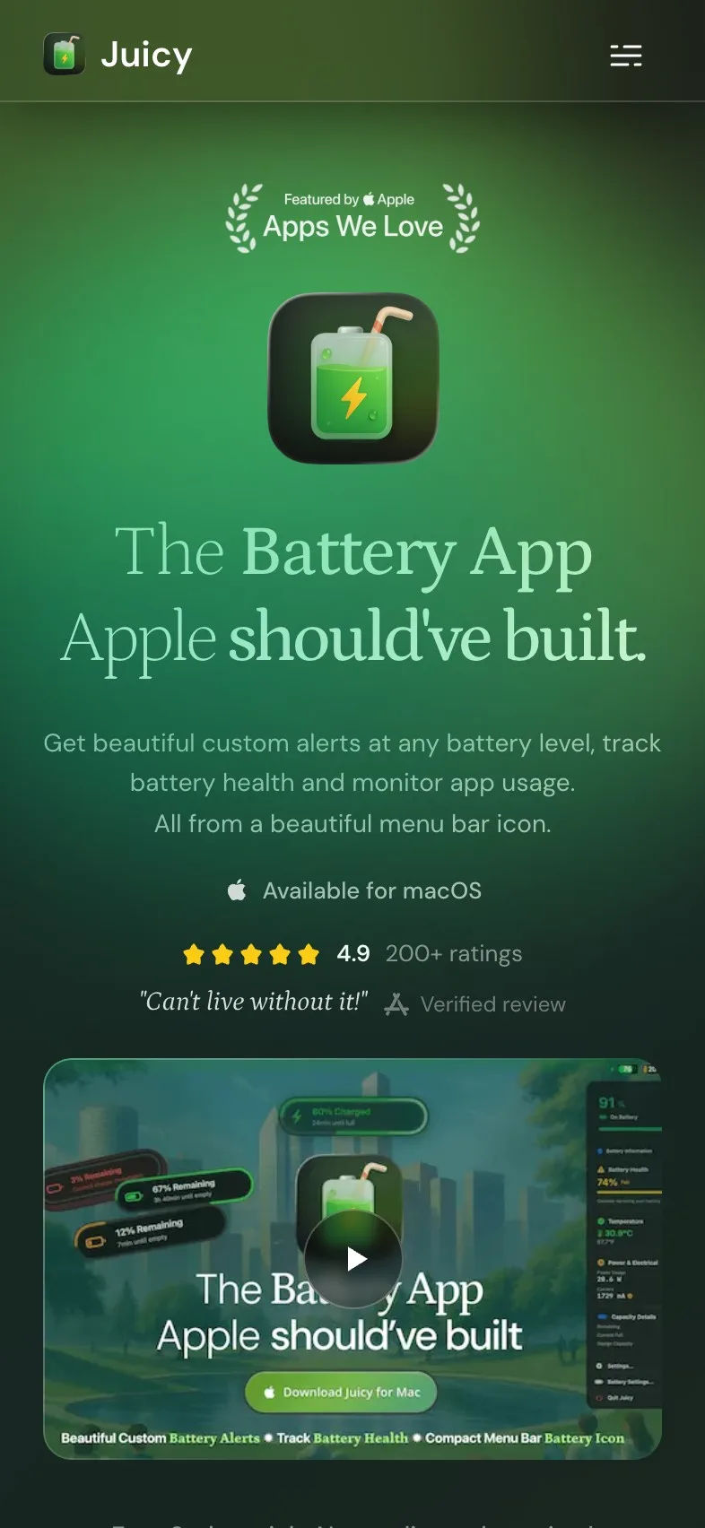
The headline is clever. The outcome is missing#
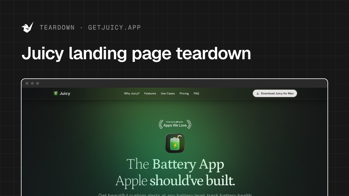
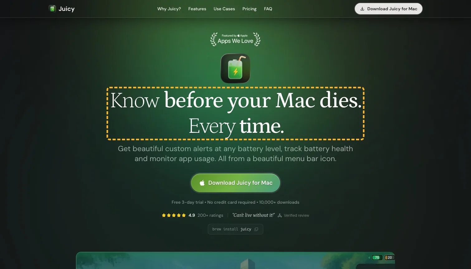
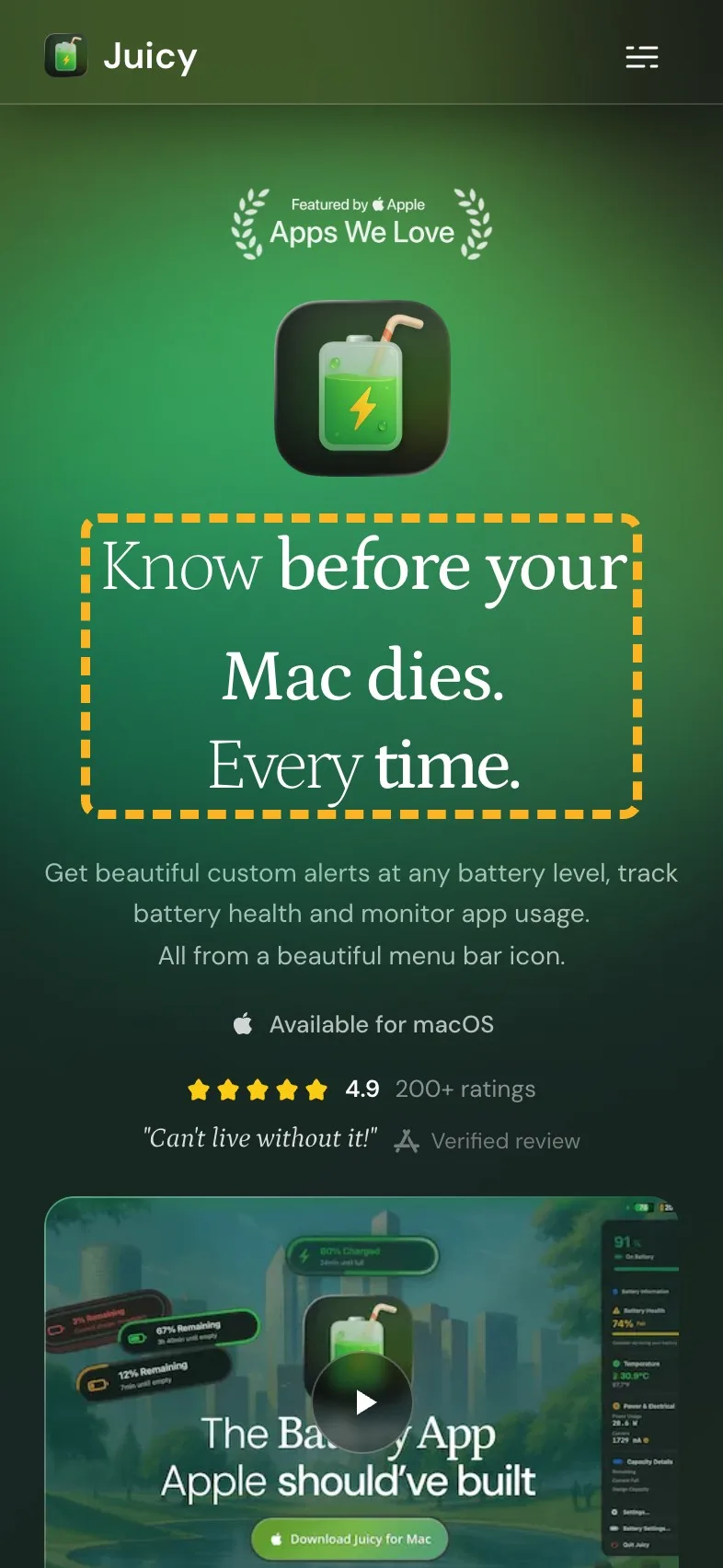
"The Battery App Apple should've built." is a confident line, and I like the swagger. What it doesn't say is what you get. A visitor has to read on to learn that Juicy warns you before your Mac dies, and Jakob Nielsen found people have time for 28% of a page's words at most (Nielsen Norman Group, 2008 (opens in a new tab)). On the first screen, the headline is the line most of them do get to.
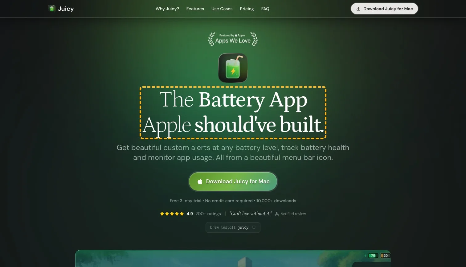
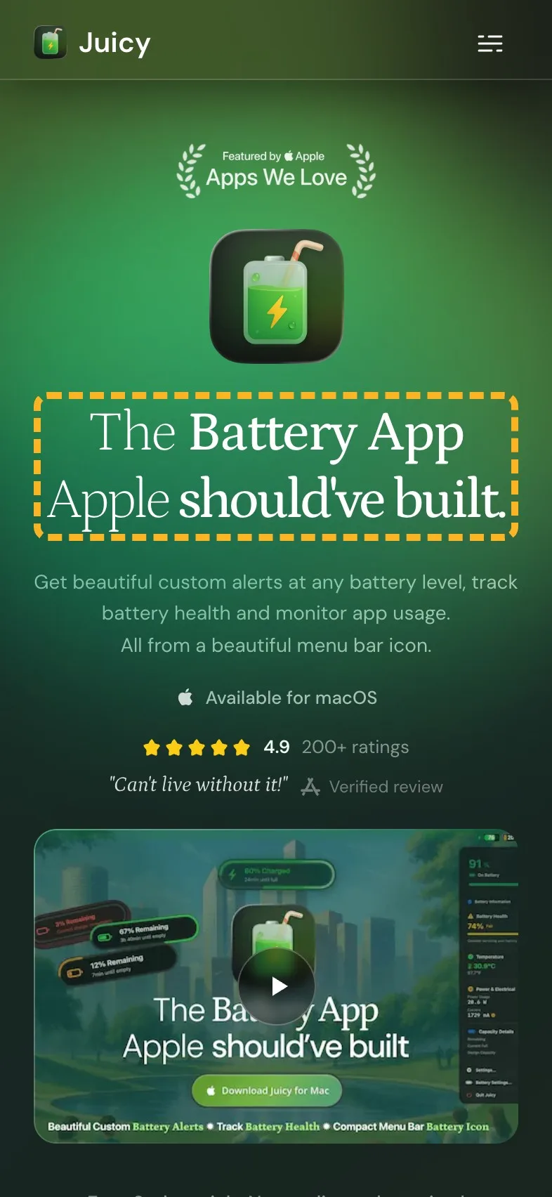
 Current
The Battery App Apple should've built.
Magpie recommends
Know before your Mac dies. Every time.
Why it works. It names the moment buyers fear before the comparison.
The new words keep the headline's mix of light and bold type. I'd still keep the Apple line close by, maybe as the line above it. It's too good to let fly the nest.
The line under it says beautiful twice#
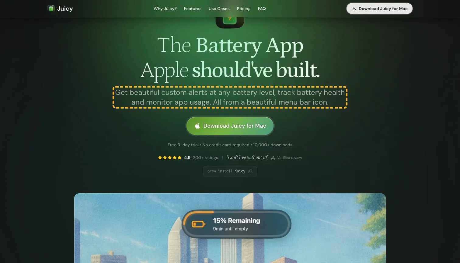
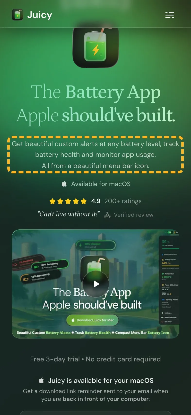
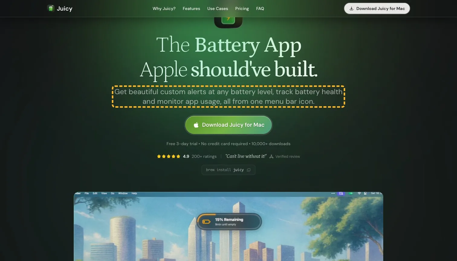
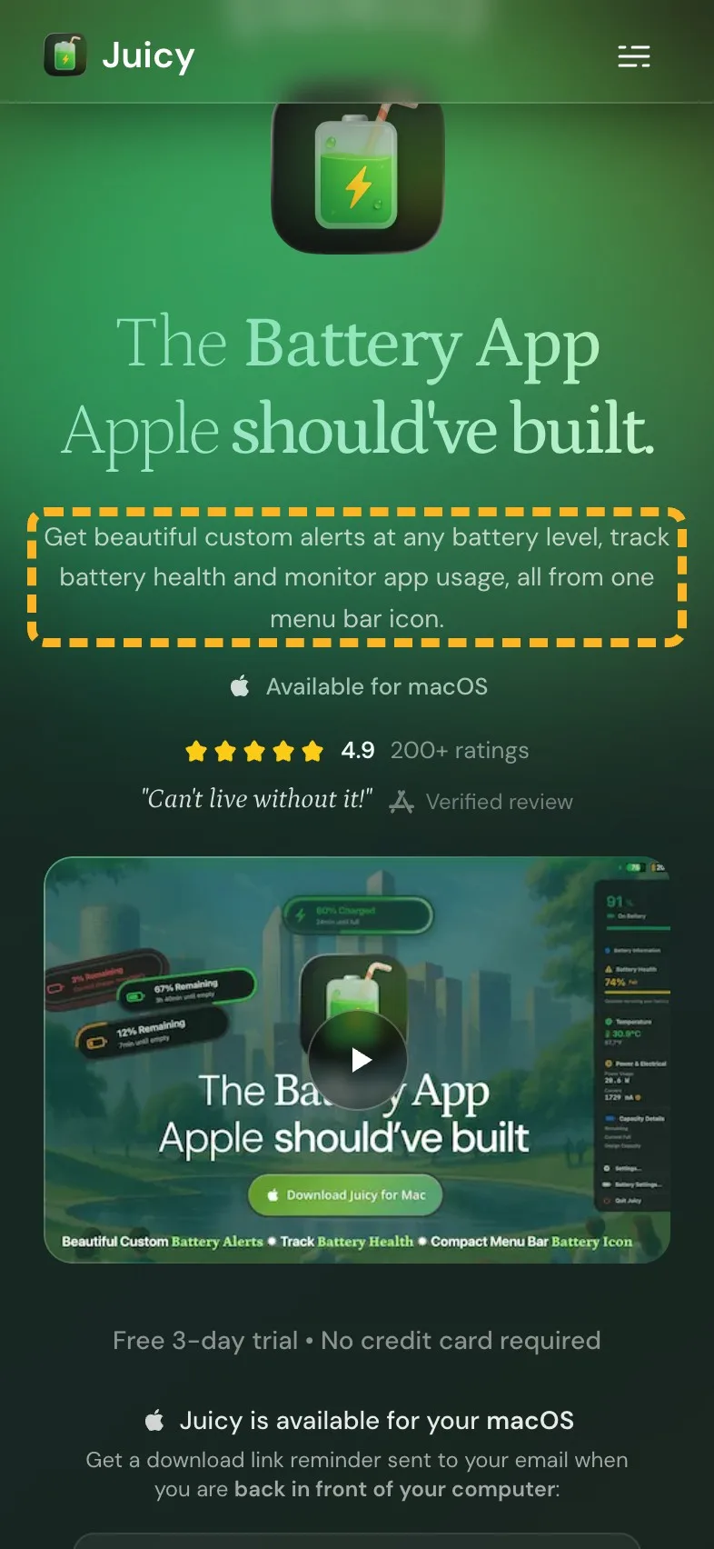
The line under the headline is specific, which is good: alerts at any level, battery health, app usage. It also calls the alerts beautiful and the icon beautiful in one breath. The second one weakens the first.
- Current
Get beautiful custom alerts at any battery level, track battery health and monitor app usage. All from a beautiful menu bar icon.
Magpie recommends
Get beautiful custom alerts at any battery level, track battery health and monitor app usage, all from one menu bar icon.
Why it works. It keeps every feature and one beautiful, so each word does a job.
Call to action#
"Get Free Download Link" is honest about what happens next. It doesn't pretend a phone can install a Mac app; it sends you the link instead, from a form on the page itself, so there's no new page to wait for. Its label sits in white on green, though, and that pair is harder to read than it looks.
Magpie measured
- 3.5:1 contrast, 4.5:1 needed
- 44px tall on mobile
- Filled, so it reads as the main action
- No second action beside it
- Up to 10 screens between buttons

- Needs work
White on green measures 3.5:1, under the 4.5:1 text needs.
Darken the green a shade, just until the label reaches 4.5:1.
- Works
The step is one email field, on the page itself.
No new page and one field keep the step as small as it can be.
Where eyes go first#
On a laptop the strongest attention lands on the app's icon and the headline under it. The icon draws more of the eyes than the download button, which about 3 in 10 visitors are predicted to see in their first five seconds. On a phone the first screen has no button to tap. Under the headline come "Available for macOS", the rating and a video, whose picture shows a download button that isn't one, and the field to email yourself the link sits further down.
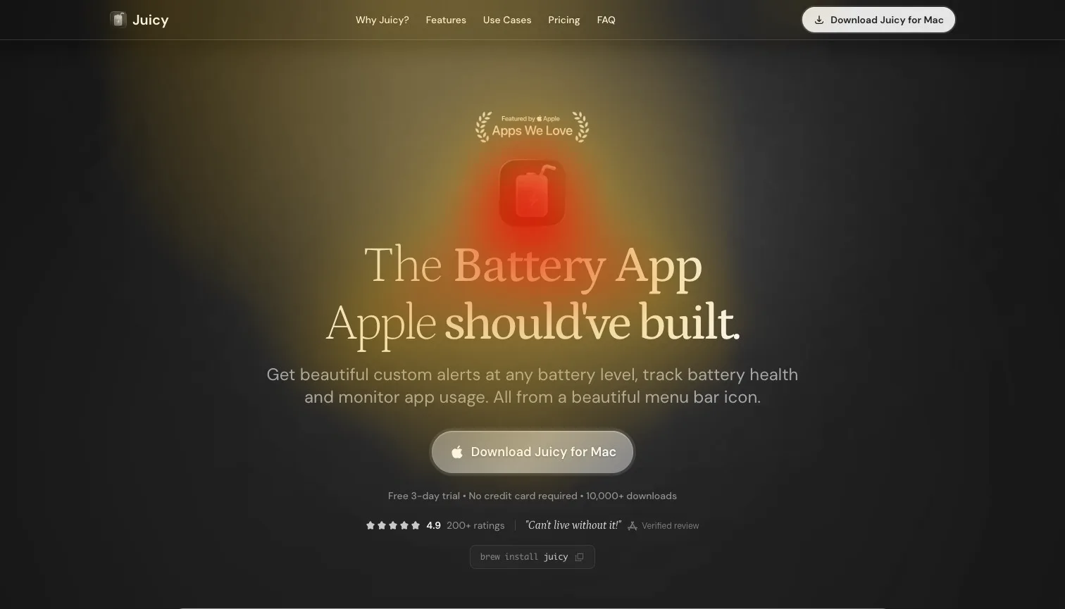
63% of the strongest attention lands on the headline and main button
- Could be better
A phone's first screen has no button to tap.
Bring the send-me-the-link field up to where a button would sit.
Use cases that deserve their own heading#
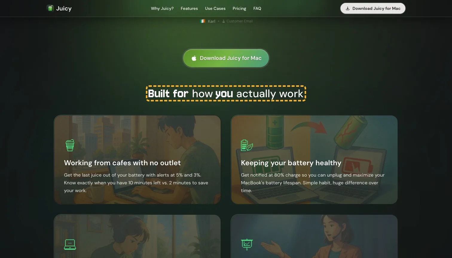
Under the first screen, four cards picture the moments Juicy is for: a cafe with no outlet, a long focus session, a client demo. Each card gives the exact alert levels to set. It's lovely, specific work, sitting under "Built for how you actually work", a heading that could top any app's page.
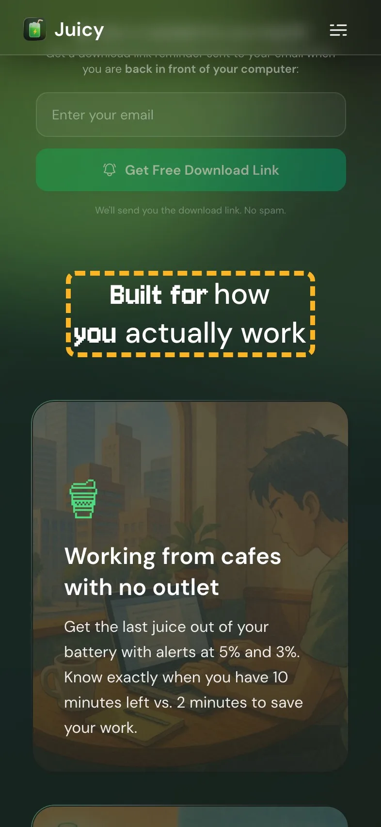
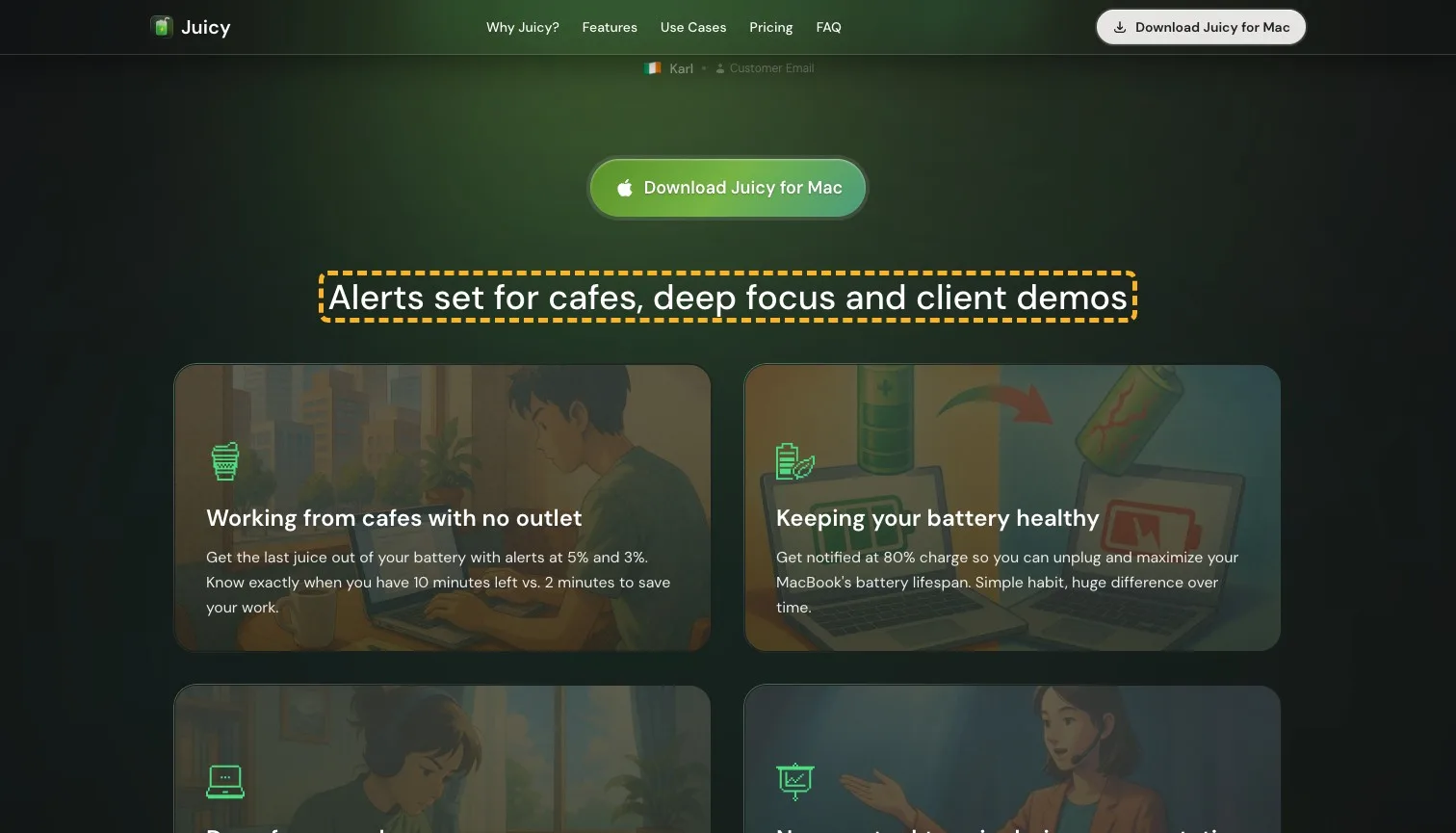
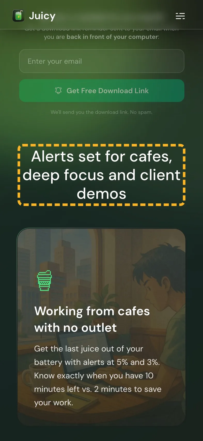
- Current
Built for how you actually work
Magpie recommends
Alerts set for cafes, deep focus and client demos
Why it works. It names the moments in the cards, so a skimmer sees themselves.
Put the rating in the reviews heading#
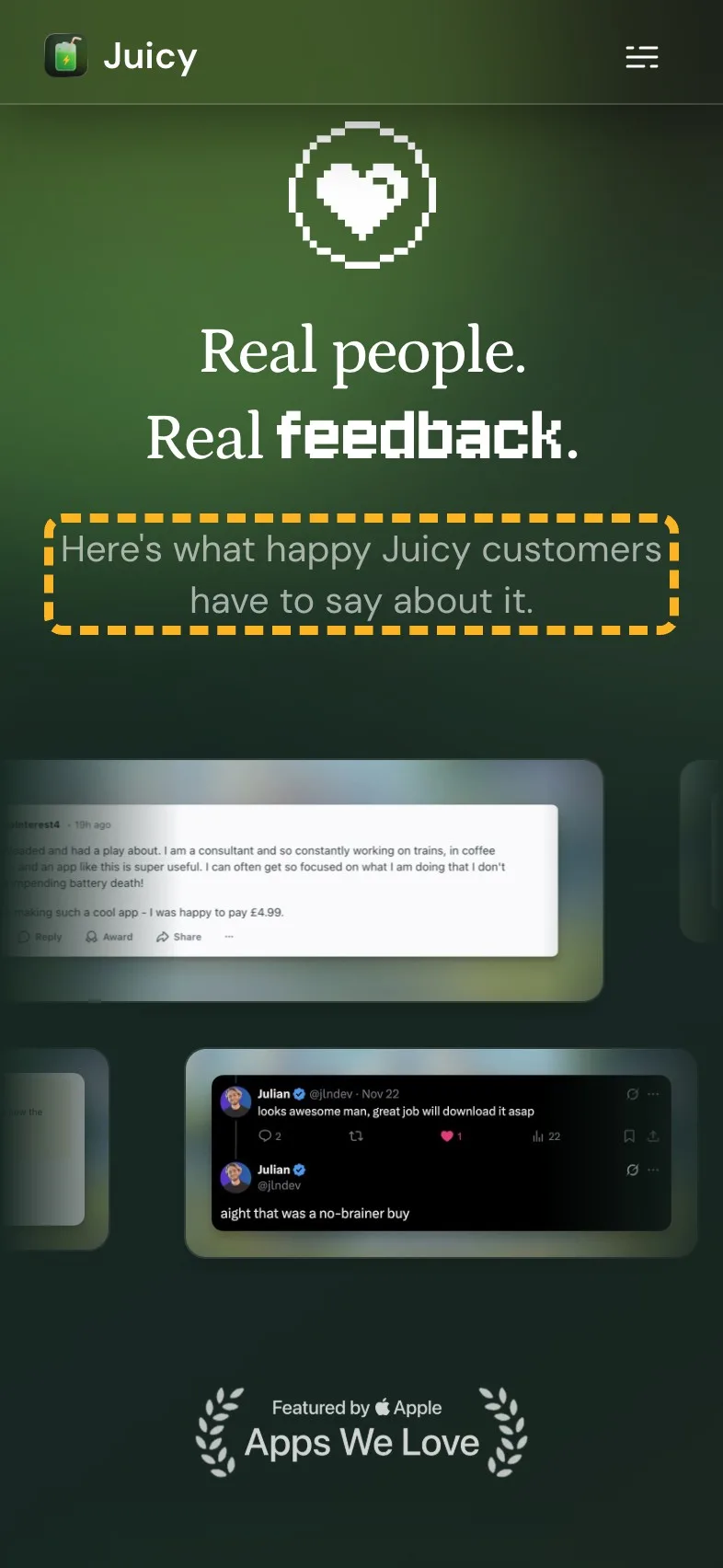
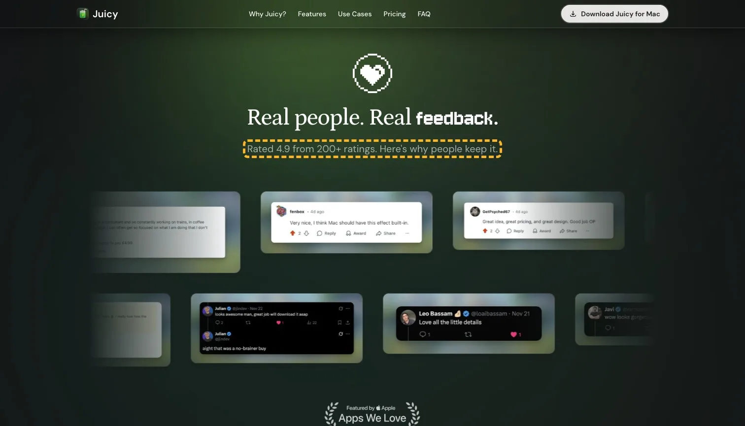
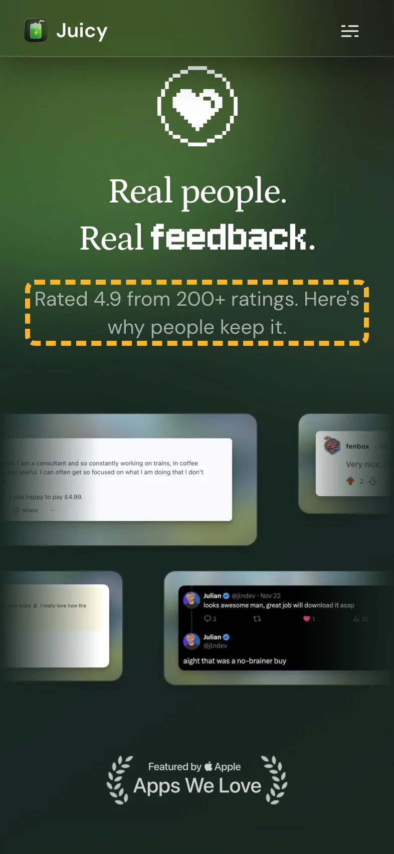
The reviews section opens on "Here's what happy Juicy customers have to say about it." The page already has a better line to lead with: 4.9 from 200+ ratings, shown by the button up top. Repeating it here lets a visitor who scrolled straight past the first screen see the score before the quotes.
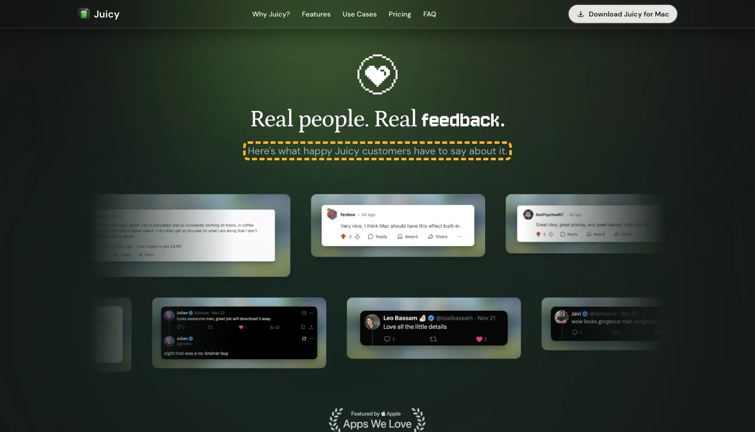
- Current
Here's what happy Juicy customers have to say about it.
Magpie recommends
Rated 4.9 from 200+ ratings. Here's why people keep it.
Why it works. It opens on the number, then lets the quotes explain it.
How the brand comes across#
This is where Juicy shines, and it's a feather in a one-person team's cap. The founder, Dominik, introduces himself and says why he built the app in a sentence anyone can picture. One line in the use cases pulls the other way.
- Builds it
“I'm an indie developer who built Juicy because I was tired of my Mac dying at the worst moments.”
A named maker with a reason you've lived through reads as someone who cares.
- Builds it
“Not an Electron app. A real Mac app that feels like it came with your system.”
It speaks the language Mac buyers use and shows the maker knows them.
- Costs it
“Never get rekt again during a presentation”
Internet slang sits oddly in a card about client meetings and demos.
What I can't judge from outside#
I can't see Juicy's downloads by source or any test it has run, and 200+ ratings at 4.9 say something is working. If the Apple line out-sells a plainer one, keep it.
Sources
About the author
Alex · Founder of Magpie AI
Alex founded Magpie AI and writes about turning a site's visitors into customers